Nothing inspires me more than travelling. For some reason, I open my eyes wider when I am in a new place. As an example, during these past few days in Los Angeles I toured some remarkable Canyon and Valley homes, took a blogshop course, and got to see some extremely cool restaurants and shops.
My point: It is amazing what you can learn and absorb by just looking around a new place with fresh eyes. Particular pieces will resonate with you and you just have to stop and ask yourself why it moves you. It definitely gives insight into your own feelings about design and style. Here are a few things that inspired me this past week.
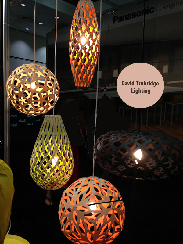
The Dwell On Design Modern design event at the LA convention Centre
[pinit]
David Trubridge lighting. David Trubridgeconsiders himself a “Cultural Designer,” one whose designs encourage sustainable living while also nourishing people spiritually and culturally. Each design is manufactured on site in New Zealand using sustainable practices throughout the process, from the harvesting of sustainably harvested timber to the use of non-toxic oil-based finishes to shipping each finished piece as a compact kit set for low-energy (and low-cost) shipping. (A beneficial side effect of this practice: Needing to assemble each piece at home makes the owner part of the cultural design process and serves to enhance the bond between the two.)
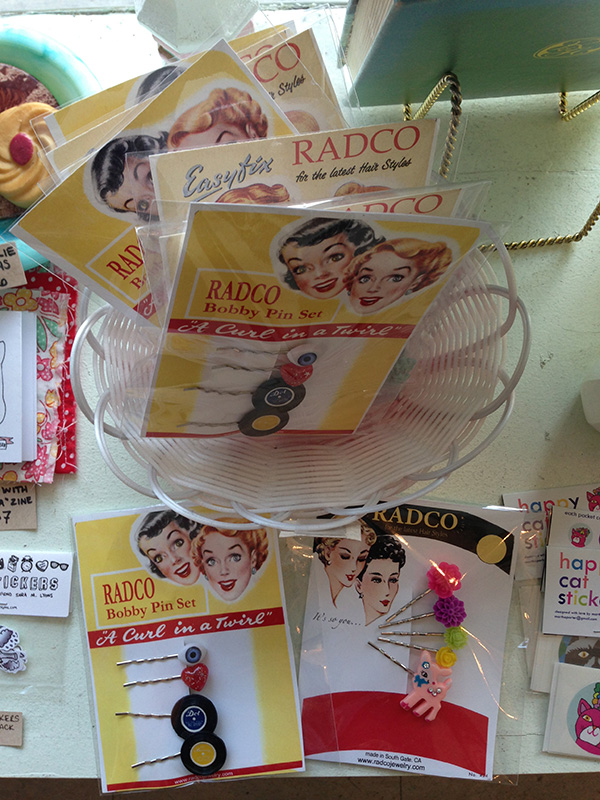
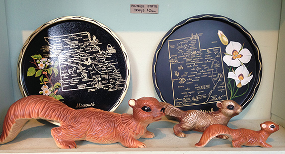
Pygmy Hippo Gift Store
Meet Emee. Emee has a lovely shop in the Fairfax area of Los Angeles. The shop is tiny, not more than 60 sf but is full of all kinds of interesting finds. From vintage books and cards, to jewlery and ‘zines’. Meeting Emee is worth the visit alone. Have a look below at some Emee’s stuff: hairpins in the shape of records, vintage squirrels and state plates. Emee is doing what she loves. This is inspiring!
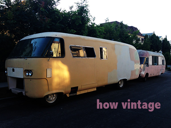
Street Life
These trailers were parked across the street from where I was staying. Not only did they look out of place, but the fact that there were two of them, made me wonder what their story was. Why? Who? What? The stories your mind can create with the right stimulus….
Got an invitation to make gingerbread houses at a friend’s. What fun! So many decorating options and so much pressure being the only Architect in the room. So I decided to just let my instincts and fingers do the designing and not think about the result at all. So here it is:
Constructing the house:
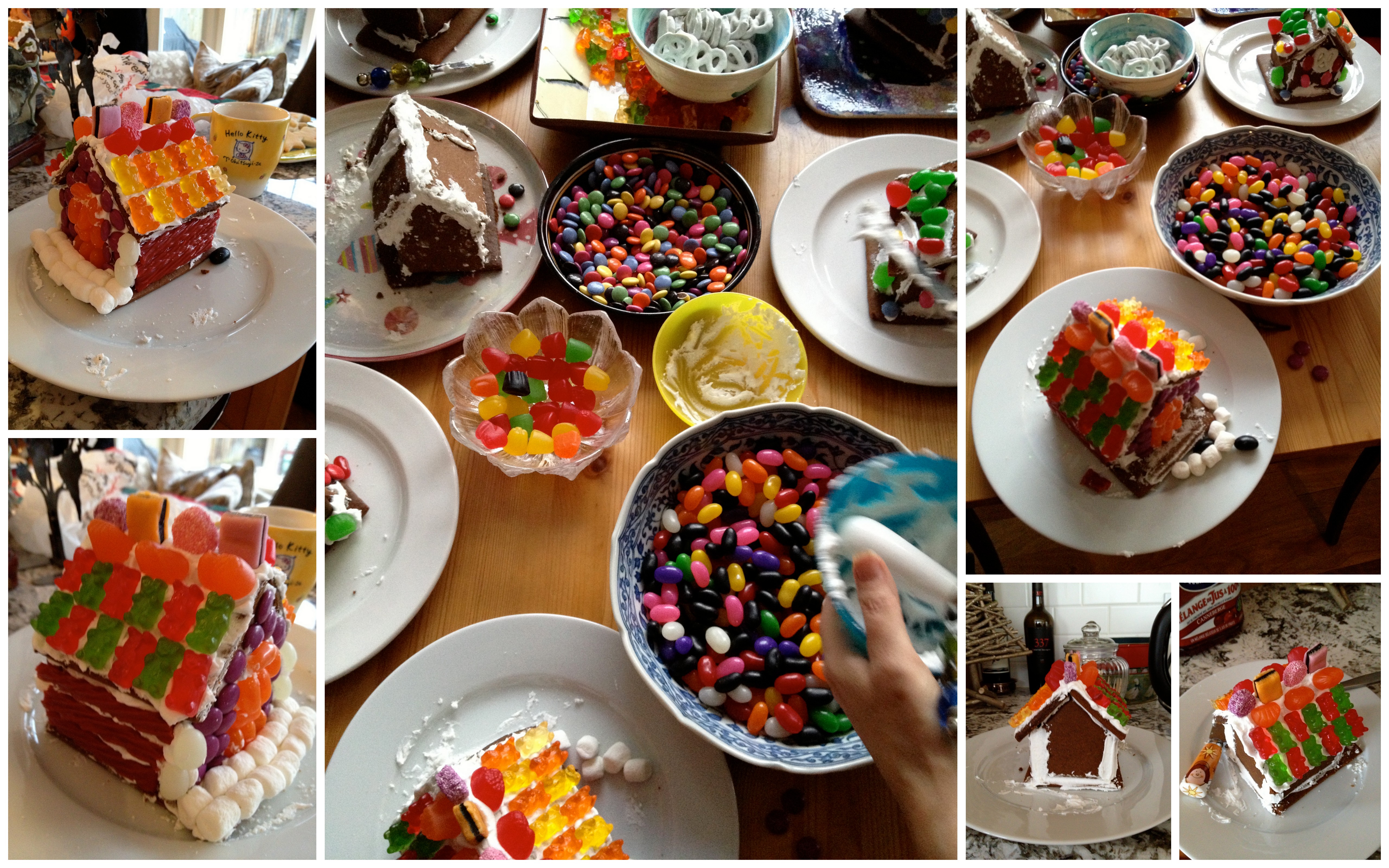
Decorating my ‘house.’ Â A fun and original way to express yourself, and have some holiday fun!
Today’s post is about ART inspired by engaged global citizens. Before I tell you about the art I want to tell you about these engaged citizens.
Our family has been involved with CISV (Children’s International Summer Villages), a wonderful organization, for over 12 years.  I feel fortunate to have found it when my children were young enough to benefit from its incredible leadership and peace education programs. CISV educates and inspires action for a more just and peaceful world.
CISV creates opportunities for all ages to experience the excitement and enrichment of cultural diversity through educational programs. It is founded on the belief that peace is possible through friendship – and that the real difference can be made by starting with children.
CISV has been around for over 60 years and has a presence in over 60 different countries worldwide. CISV is a charitable, independent, non-political, non-sectarian, volunteer organization promoting peace education and cross-cultural friendship and is a sub-organization under UNESCO.
I encourage those of you with children to find out more and give your kids this incredible opportunity to gain confidence, and become a global citizens and leaders. To learn more about CISV click here.
“We are the Roots of Peace,” by Artist Graham Smith.
Now back to the ART. We asked our CISV youth, called the JB (Junior Branch), to describe “what peace looks like†at a mini-camp this year. We then distributed these youth generated peace statements to emerging and established local artists. The only restriction was that the artwork had to be done on 10†x 10†cradle boards or deep canvases.
CISV is a peace education organization so it made great sense to call the art show, Peace by Piece (PxP). The pieces of art will be on display till April 30, 2012 at the Boulevard Coffee Roasting Co. (5970 University Boulevard) on UBC’s Point Grey Campus in Vancouver. You can also find out more on the PxP website.
The sale of paintings, will enable CISV Vancouver to host an international camp this summer, and more importantly, will draw community attention to CISV and our Peace Education programs.
Here are a few pieces of the art works and peace statements. Again, to see more art pieces, and read about the PxP peace project click here.
1. “Piles of smiles will take you miles,” artist: Norm Shearing; 2. Peace is a dance with the rest of the world,” artist: Helena Carter-Huffman; 3. “Life is messy and life is beautiful,” artist: Victor Mironenko; 4. “Peace is never being afraid to step outside,” artist: Graham Smith. Â
“Peace will be accomplished when everyone understands its real value,” artist: Constance Leung
Just bought some vintage new Mid Century Modern Bubble Beehive tripod lamps made of white molded plastic and teak. I wanted to see if I could find out more about them and discovered some variations that are equally beautiful. Sometimes they are referred to as Tiki Bubble Lamps, and seem to come in a variety of colours.
In 1947, George Nelson became inspired by a self webbing material used to moth-ball ships in New York and he convinced himself it would be perfect for lighting. He made a metal frame, tracked down the source of the webbing material and by the next day he created a big glowing sphere and the Bubble Lamp was born. You can see two examples of the George Nelson Bubble Lamp below in white.
Yarn bombing, also known as guerrilla knitting, is the latest thing in street art. This art form  uses colorful displays of knitted or crocheted yarn, or fibre, rather than paint or chalk. Yarn bombing’s popularity has spread throughout the world. While other forms of graffiti may be expressive, decorative, territorial, socio-political commentary, advertising or vandalism, yarn bombing was initially almost exclusively about reclaiming and personalizing sterile or cold public places (source).
I have seen yarn bombing interventions in my own neighbourhhod. Often it is where there is a chain link fence or some other unsightly urban reminder. There are yarn bombing community groups that bring together the work of guerrilla artists from all over the world.
ArtistMadga Sayeb, ‘bombs’ a bus in Mexico City. As you can see bombing takes time, concentration, and works around the artist’s design strategy. You can see many of her pieces are in fun but you can certainly see the socio-political commentary on some of her other pieces (see below. Photo Source: Time Photos). Look forward to hearing more about Madga Sayeb in future blog posts from tina + design.
The first 2 photos are from North Vancouver taken by Graham Smith. The Firefighters add knit cherry blossoms to a tree at Joy Kogawa House in Vancouver, Canada (Photo Source: Time Photos).
The yarn bombed tree, above, on Lonsdale in North Vancouver bears message tags from its creators; proud of their whimsical creation and proud to be part of an artistic community. To me yarn bombing is a subtler, softer form of subversive art than grafitti. I like the randomness of the intervention contrasted with the detailed work to execute it. Unlike graffiti, yarn bombing’s anonymity is somehow personalized by the homespun warmth associated with wool and, in this case, by these hand lettered name tags. The contrast between public art intervention with the harmless whimsicality of location, form and colour elicits a nuanced, amusing irony.
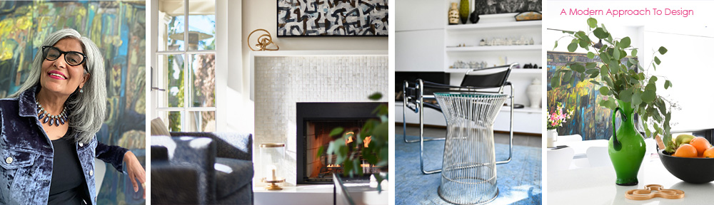
What inspires you? One way to find out is to put together a collection of images that you like, and see where you end up. I did this as a course assignment for the Blogging Your Way Bootcamp, on-line blogging course I am taking. This is what I did and what I found out about my own design aesthetic.
This Inspiration Board defines my style, shows what I personally love, and what I would like to share on my blog.
This was a very interesting and challenging exercise for me. I have wide ranging, eclectic tastes so when I had to chose what I personally love and how it reflects my personal style I had to be very selective about what I picked. So here it is.
I would call my style ‘simple with a twist’. I love white interiors because they accentuate architecture and provide a clean backdrop to all objects of art, including furniture, paintings or quirky collections, allowing them to stand out and be articulated. I love the calm and serene feel of a white room but I also love a splash of turquoise. I love how modern architecture is about the relationship between inside and outside spaces.
I love mid-century modern furniture with its modern lines yet so evocative of the past. In that same retro spirit I adore vintage finds from depression glass to dresses from the 60s. I collect vintage Hermes scarves, because to me they are wearable pieces of art.
Through this exercise I found out, to my surprise, I love Chinoiserie – in porcelain, fabrics, fashion, and art. I think that one can be stylish no matter what their age. The key is to keep it simple but always throw in a bit of bling or a splash of bold colour.
To reiterate, my style is ‘Simple With a Twist.’
Everyone from my generation remembers the original Rolling Stones ‘Sticky Fingers’ album. The photograph is of a male in tight jeans with a working real zipper that you could unzip to reveal a mystery.
(photo from http://garyrocks.wordpress.com)
Meet designer, Junie Osaki. Junie lives in a charming, and oh-so-fascinating cottage in the LA area. It’s the kind of place you want to spend some time snooping because everything she has collected, and has hanging on her walls, has incredible music history attached to it. Her place really resonated with me because I remember being a 14 year old obsessed with ‘rock and roll’ and Rolling Stone Magazine. Junie shared with me the story of the Rolling Stones, Stickey Fingers record Album.
Junie is a graphic designer who worked in the music industry in its heyday. She is an award-winning designer for the work she did on Art Direction and Design for TARANTELLA By Chuck Mangione for A&M Records. I met Junie through our mutual friend, Ann, and had an opportunity to connect with her on my last trip to Los Angeles. I have never met anyone like Junie. She has so much energy and has an incredible memory that can recount every detail of an event that happened years ago. Junie’s involvement in the recording industry enriches her stories as well her personal spaces as you will see. Before we take a tour of Junie’s place I wanted to share a very interesting piece of history I learned from Junie.
Junie is a close friend of Craig Braun, the Art Director who was involved in the design of the iconic Rolling Stones ‘lips and tongue’ logo and the famous album cover art of Rolling Stones Sticky Fingers in 1971. Craig Braun, Inc, created and produced an exclusive line of jewelry, and promotional items, that he named “LICKS” based on the album’s logo and was the official licensee for Musidor, the licensing company for the Rolling Stones. To coincide with the record’s release, an entire package of “Lips & Tongueâ€-based merchandise hit the stores.
Junie told me the story of the design behind the Rolling stones Sticky Fingers album. This is my interpretation of her story. I hope I have it right!.
The album’s artwork shows a close-up of a jeans-clad male crotch. The cover of the original (vinyl) release featured a working zipper and mock belt buckle that opened to reveal cotton briefs. Behind the zipper, the white briefs were rubber-stamped in gold with the name of American pop artist Andy Warhol. Junie informed me that while Warhol conceived the artwork, the design and concept was by Craig Braun, an Art Director in the music industry. Craig also developed the concept behind Alice Cooper’s School’s Out album, and a number of other concept albums.
The crotch shot was not Mick Jagger, but an artist from Andy Warhol’s Factory. The album was the first time the Rolling Stone’s used their new “tongue & lips” logo. There is some controversy as to who actually designed the logo but according to Wikipedia the logo was originally designed by Ernie Cefalu and it was this version that was used for much of the merchandising, and  the design that was originally shown to the band by Craig Braun. The design used for the album was a further refinement, and was done by John Pasche, who Craig Braun actually credits for designing the logo. Craig does not endorse the idea that Cefalu was the logo’s designer. What is interesting is the coming together of talents in the production of one rock n roll artifact. Like rock n roll itself, it is not a one person proposition, it takes a team. The same can be said for ‘design.’
Junie’s design sensibility goes further than the recording industry. Her cottage is charming and so full of iconic American rock and roll history. Have a look for yourself.
Limited edition print of ‘Puff the Magic Dragon’ hand written out by Peter Yarrow, of Peter, Paul and Mary.
Limited edition print of ‘Our House’ hand written out by Graham Nash, of Crosby, Stills, Nash and Young.
Junie’s cottage is small so she has moved her ‘living space’ outdoors. Her outdoor room is beautiful and totally appropriate for the warm weather of California.
Junie’s cottage is an example of one of those hidden gems that are tucked in amongst conventional suburban landscapes all over North America, and especially in artistic communities like Los Angeles. I have learned that many of us have remarkable stories under seemingly conventional facades.
The coffee was great, the pastries came on old vintage silver pieces and the whole experience felt just right. One would think this was enough - a great Mother’s day with my husband and daughter. But it gets better.
This is where it gets interesting. Talk about being in the right place at the right time! Follow me on a tour of what was upstairs. Enjoy the designs of Patricia Larsen and her daughters.
Patricia Larsen is presently living and painting in the southern tip of the Baja, in Pascadero Mexico, In her words: “Beauty is in the juxtaposition of things, its energies working together in harmony and disharmony. Sometimes beauty is in the resistance and the tension, and sometimes it’s in complete surrender.” PL
Watts is a working class community in South LA with a reputation as a violence-prone and impoverished area, known for gang violence and riots. Â In recent years community leaders have tried to give extra attention to museums and the landmark Watts Towers, hoping to bring visitors to the community, and help lift the negative stigma that Watts has had.
The Watts Towers have become a sculptural and architectural landmark that has attracted many artists and professionals to the area. Museums and art galleries have opened near the towers as part of a community revitalization strategy.
The Watts Towers, now a nationally recognized historical landmark in Los Angeles, is a collection of 17 interconnected structures. They were built by Italian immigrant construction worker, Sam Rodia in his spare time over a period of 33 years, from 1921 to 1954. The work is clearly is evocative of the work of Spanish Architect Antonio Gaudi.
The sculptures’ armatures are constructed from steel pipes and rods, wrapped with wire mesh and coated with mortar. The main supports are embedded with pieces of porcelain, tile, and glass. They are decorated with found objects, including bed frames, bottles, ceramic tiles, scrap metal and sea shells.
At the time Rodia’s neighbors did not appreciate his towers, and thought they were ugly. Others, thought it was some kind of secret government spy antennae. This resulted in Rodia being harassed, and the towers being vandalized. Sick of it all, Rodia eventually gave the property away, and moved to Martinez, CA never to be seen in Watts again.
The city was all set to demolish the Watts Towers, Rodia’s home had burned down, and it seemed like the end for the Watts Towers, but a Curator from LACMA and prominent actors, film editors, artists and architects formed the Committee for Simon Rodia’s Towers in Watts, and negotiated with the city to test the structure’s stability, and eventually were granted permission to restore the site.  The Committee negotiated with the city to allow for an engineering test to establish the safety of the structures. (for more info).
I apologize for being M.I.A. for the last month or so. However, I will be filling you in on what I have been up to and, at the same time, keep up my commitment to blog more frequently.
The holiday season was busy with two of my children preparing to go off to study in international locations. One is off to do an exchange at Trinity College Dublin. The other is starting her M.F.A. at the University of Southern California. Today’s blog is about my trip to LA to help her settle in.
Anticipating our impending LA adventure I lost sleep thinking about the two of us alone in the vast and sprawling LA. I must admit one of my biggest fears was the thought of driving in Los Angeles. After picking up our rental car our first priority was to find my daughter a place to live. As a spring session admission she didn’t get a spot in graduate housing and, with scant knowledge of the LA neighbourhoods, we were scrambling.
 Despite my fears the trip started smoothly enough. We found housing, the rental car was awesome and driving around LA was actually quite easy. What made the trip so wonderful though was the sunny, warm weather of Southern California. I finally got it! ‘It’ being why snowbirds head to the warm climates of the southern United States. There is an energy and optimism that comes from being in the sun. You can feel this when dealing with the people who are all so warm and friendly.  This is less common in Vancouver, where the service is so often indifferent or worse.  This openness and friendliness is where the Americans get it right.
Seems I’ve often heard that kind of talk before

It never rains in California

But girl don’t they warn ya

It pours, man it poursâ€
I found this vintage postage of the Beatles in California at a street market in Amsterdam.
Yes, LA can be ‘a great big freeway’ but this perception is the result of trying to find a centre which simply does not exist. It is more useful to see LA a series of individual communities tied together by the freeway like a string of pearls.
 [pinit]
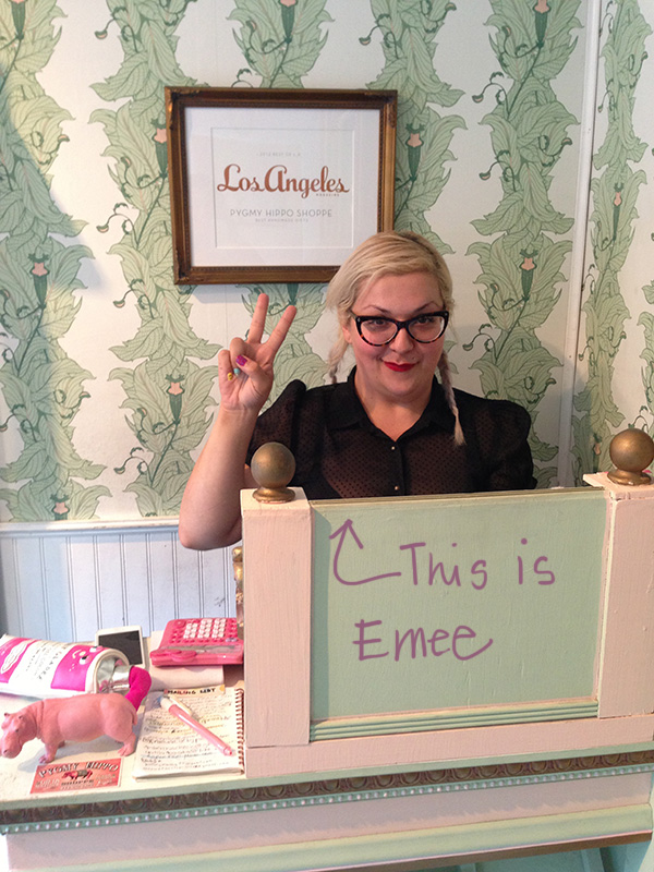
 Who? What? The stories your mind can create with the right stimulus….
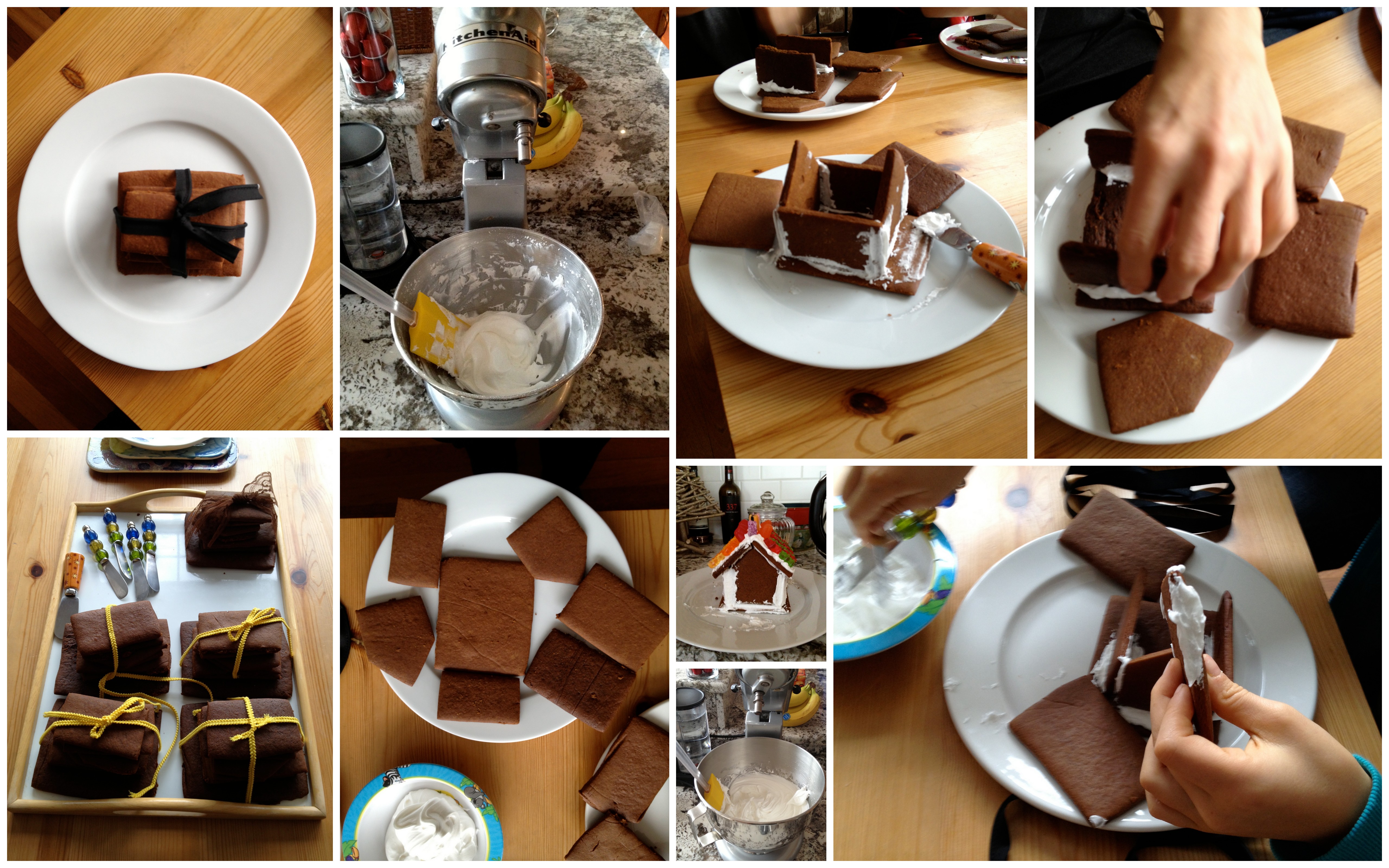


 Just bought some vintage new Mid Century Modern Bubble Beehive tripod lamps made of white molded plastic and teak. I wanted to see if I could find out more about them and discovered some variations that are equally beautiful. Sometimes they are referred to as Tiki Bubble Lamps, and seem to come in a variety of colours.


 The coffee was great, the pastries came on old vintage silver pieces and the whole experience felt just right. One would think this was enough - a great Mother’s day with my husband and daughter. But it gets better.


