A Designer’s Take on the Ultimate Desert Wedding: A Rave
 Discovering Beauty in Diversity and Design at My Daughter’s Palm Springs Wedding
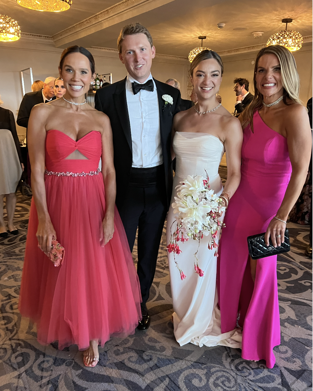
Scarlett and Sam Wedding in Palm Springs
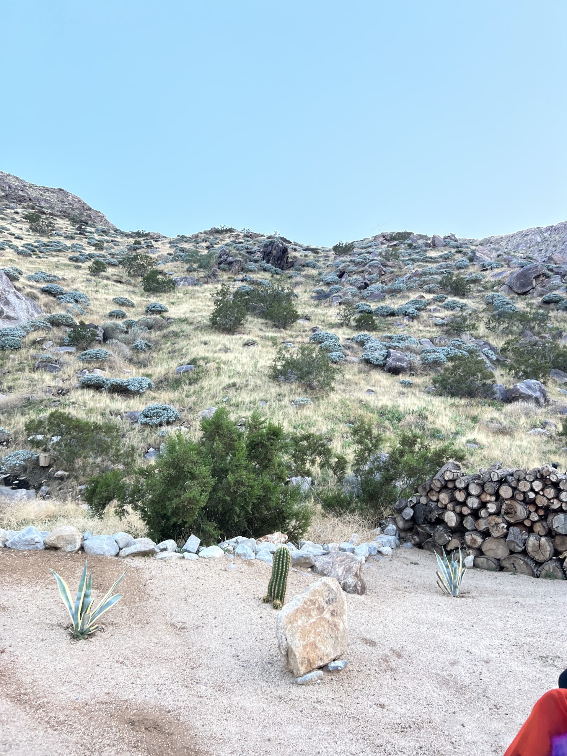
In the sprawling, serene deserts of Palm Springs, a location known for its picturesque landscapes and tranquil ambiance, my daughter Scarlett’s wedding unfolded as a vibrant celebration of love, culture, people and design. It’s Not A Rave, It’s A Desert Wedding where the theme embraced the unconventional. As a professional designer accustomed to the nuances of aesthetics and style, I found myself completely captivated by the beauty and originality of this unconventional wedding. This was a day that not only celebrated the union of two souls but also the fusion of diverse cultures, modern design, and electronic music, all set against the stunning backdrop of the Californian desert.
A Canvas of Natural Beauty

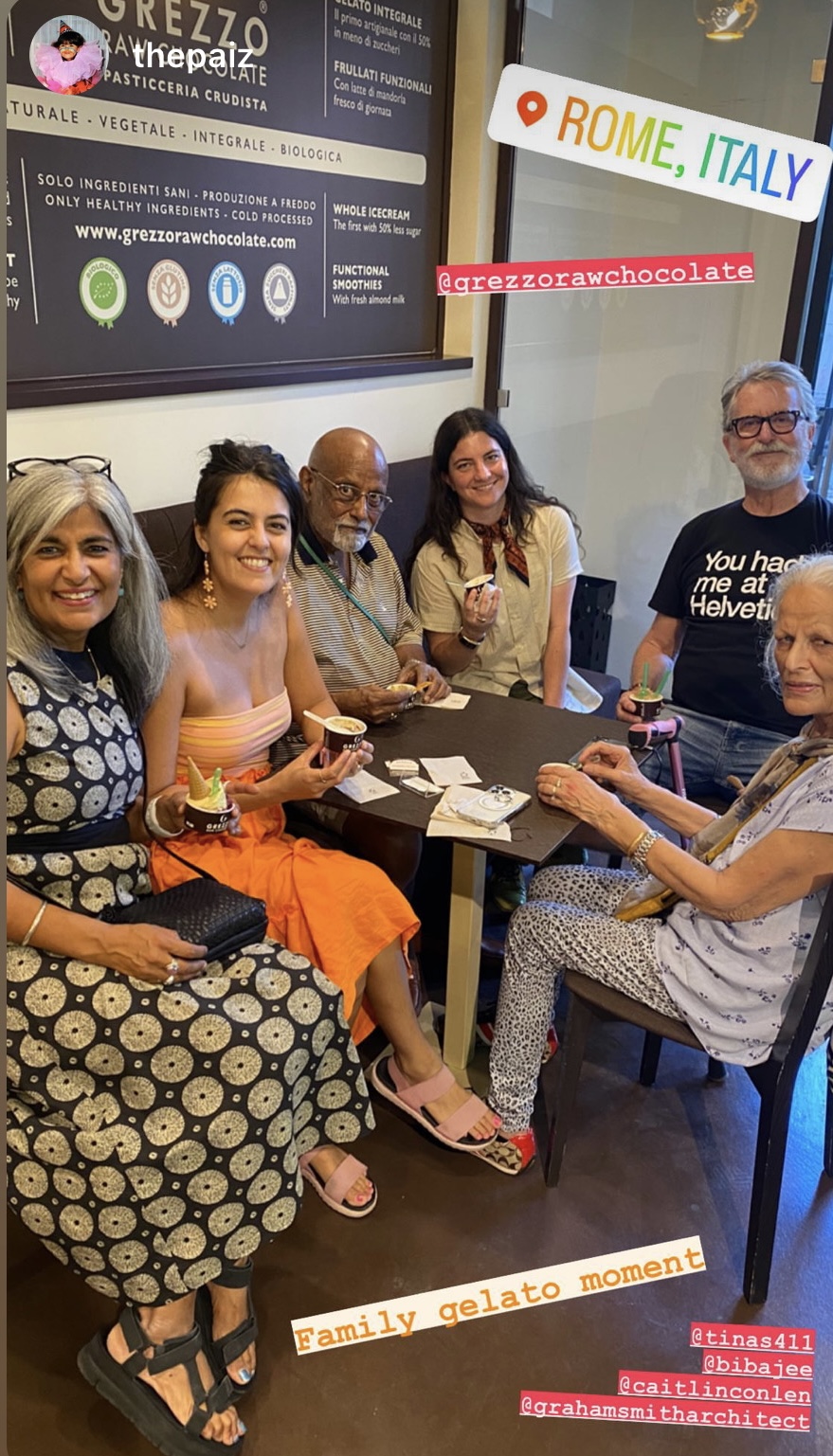
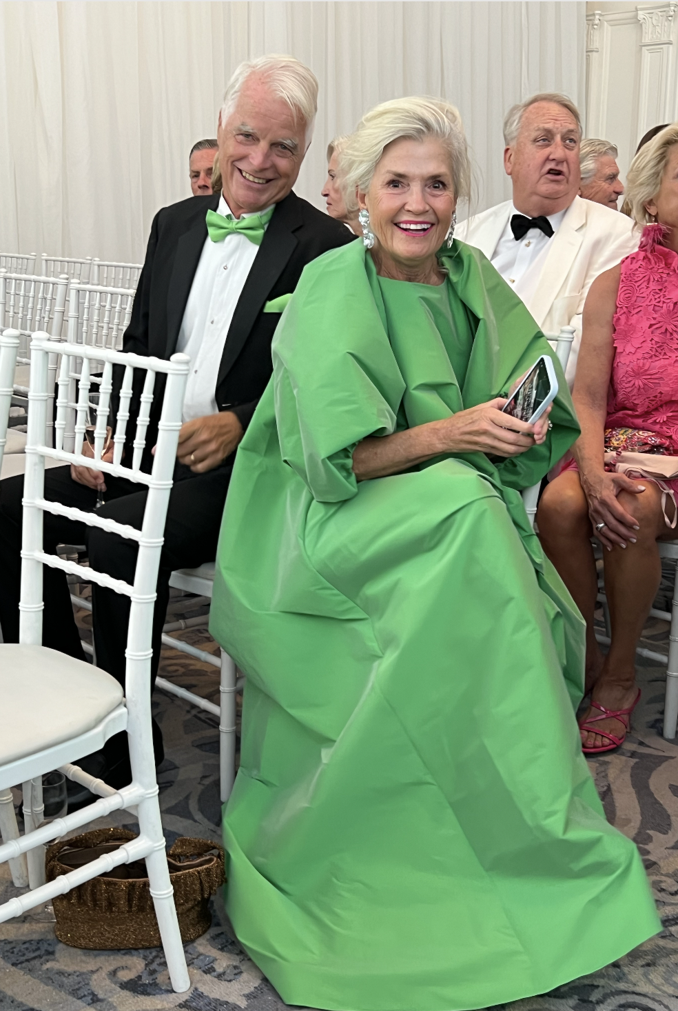
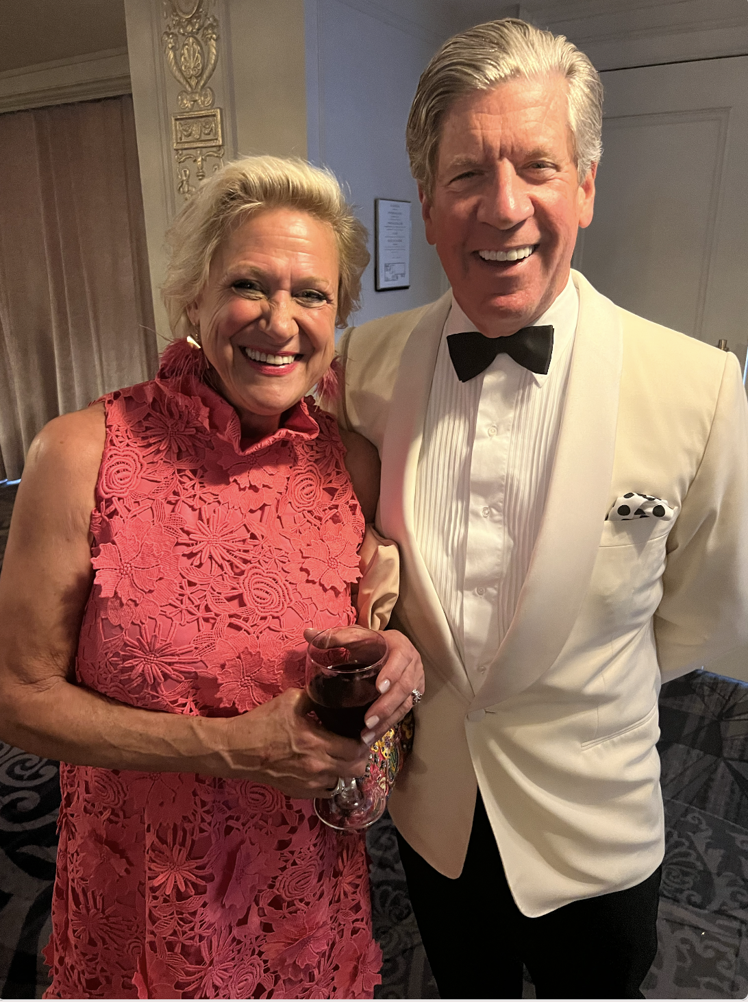
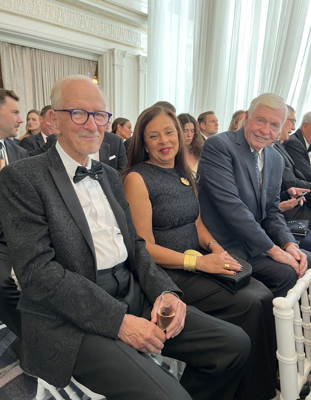
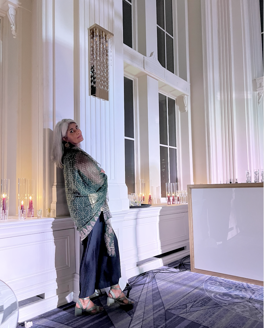
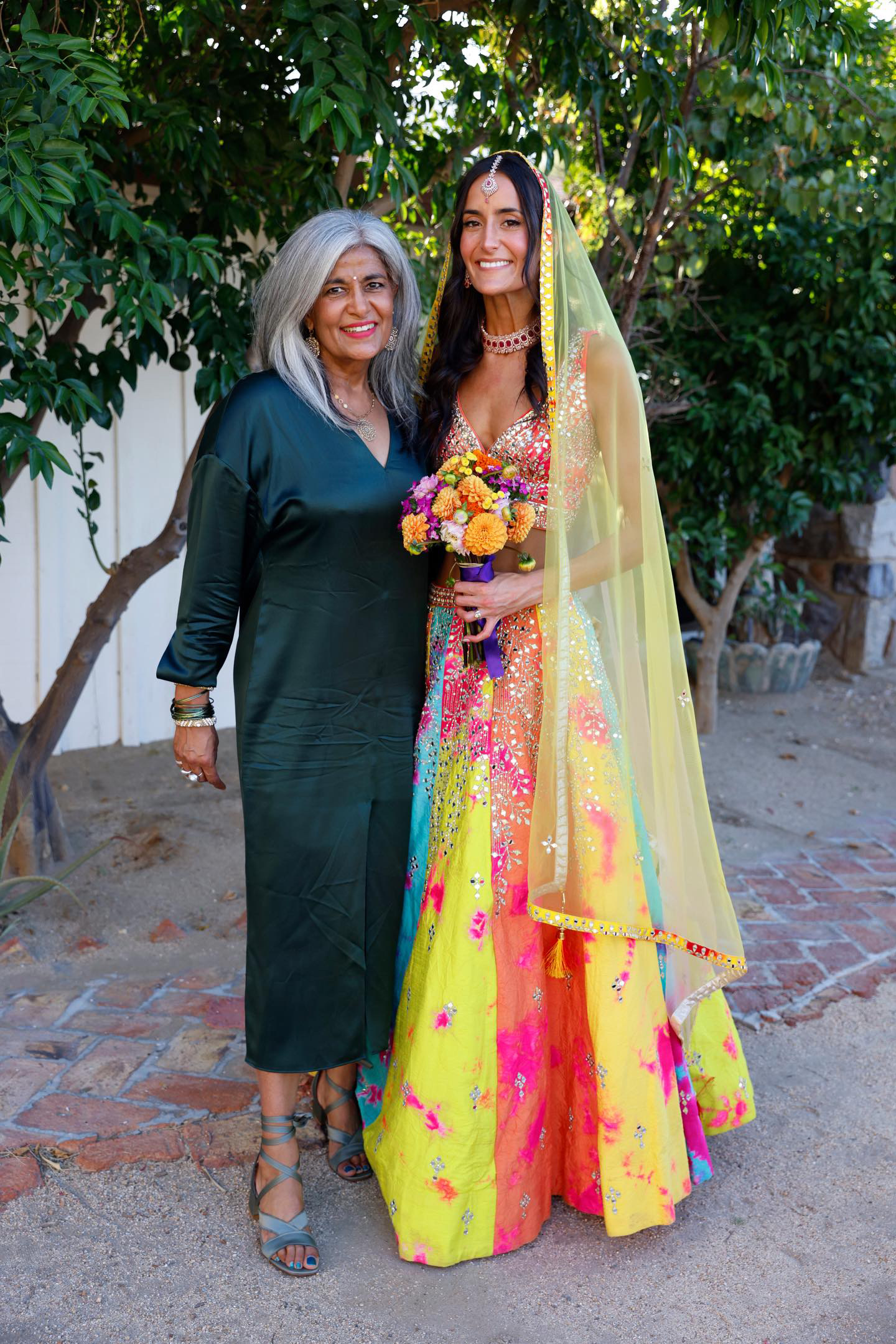
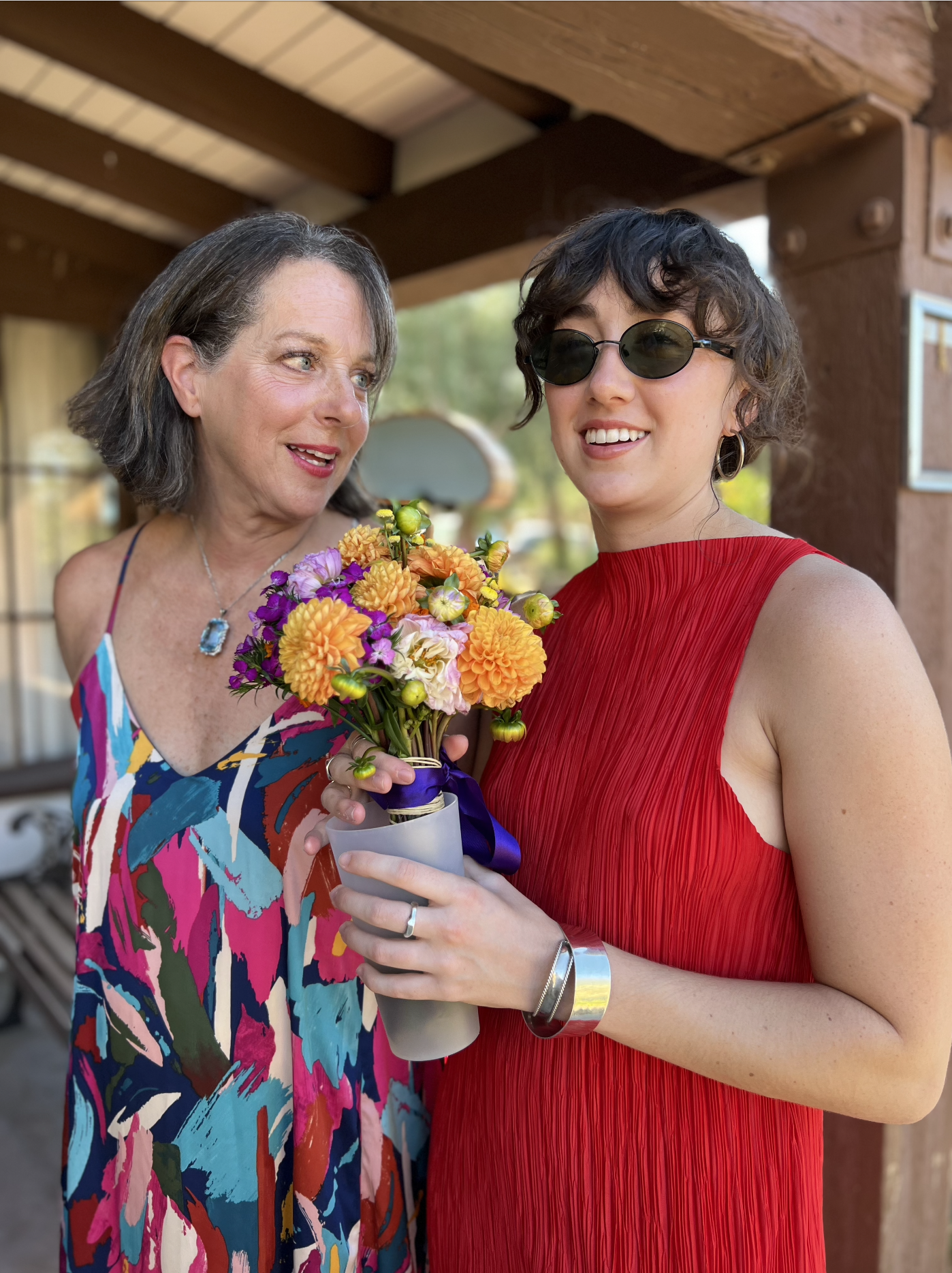
Parents of the Bride
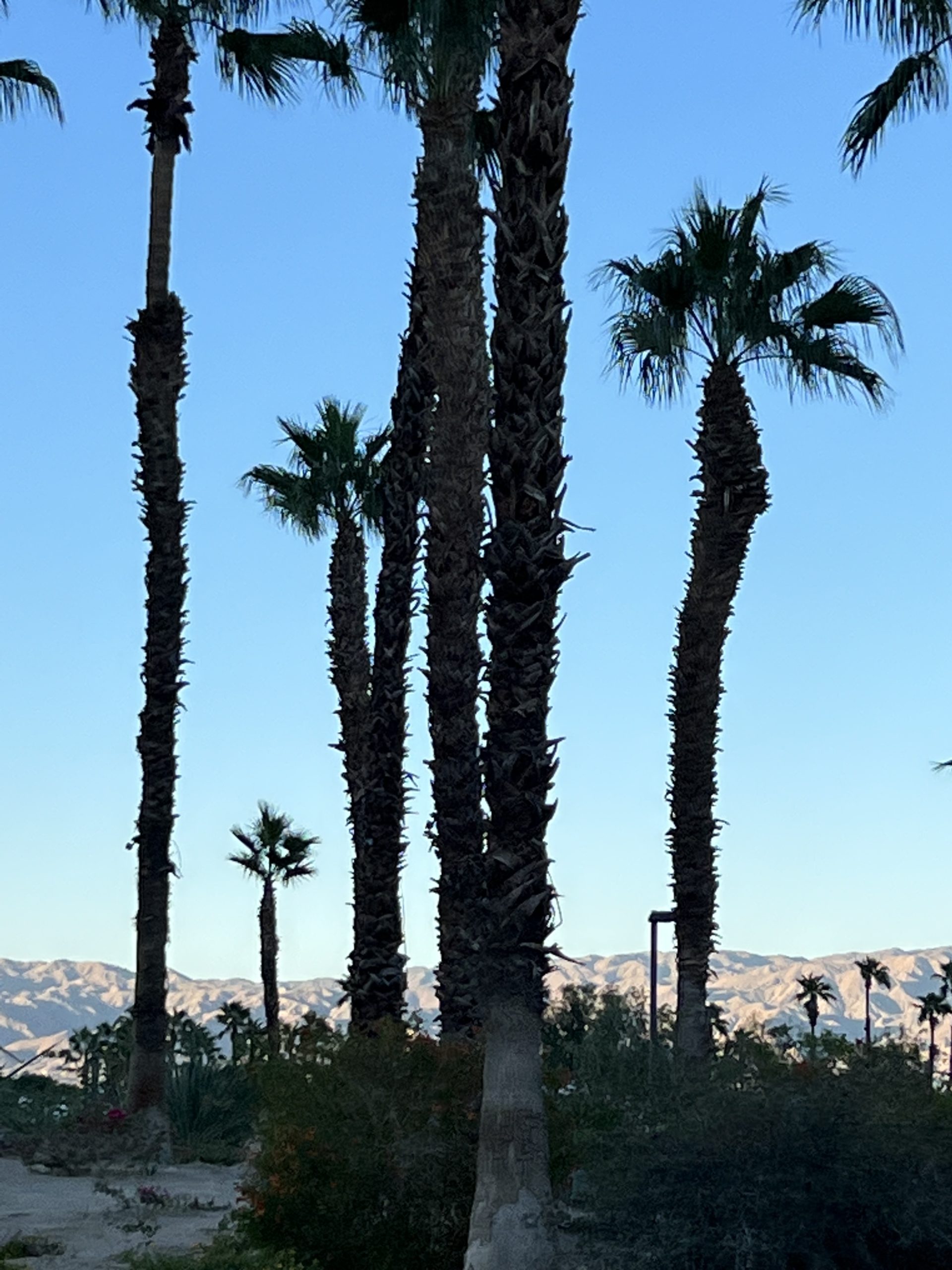 The choice of Palm Springs as the venue was nothing short of inspired. Known for its serene desert landscapes and clear skies, it offered an idyllic setting for an outdoor wedding. The natural beauty of the area provided a perfect canvas, allowing the couple’s unique vision to come to life.
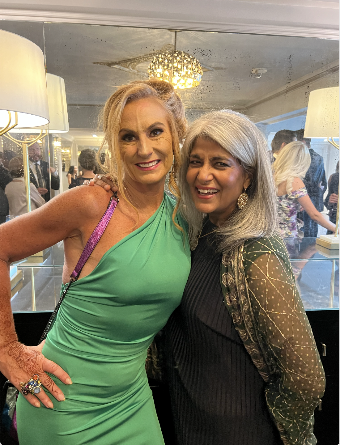
A Melting Pot of Cultures
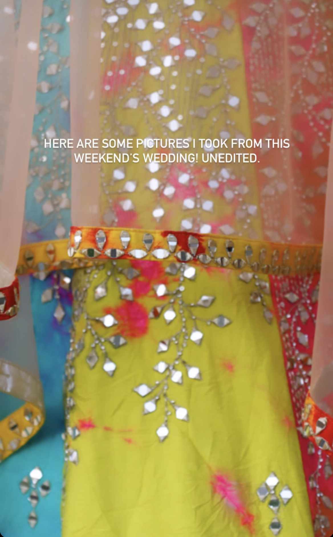
photo by Molly O’Keefe @what_molly_sees
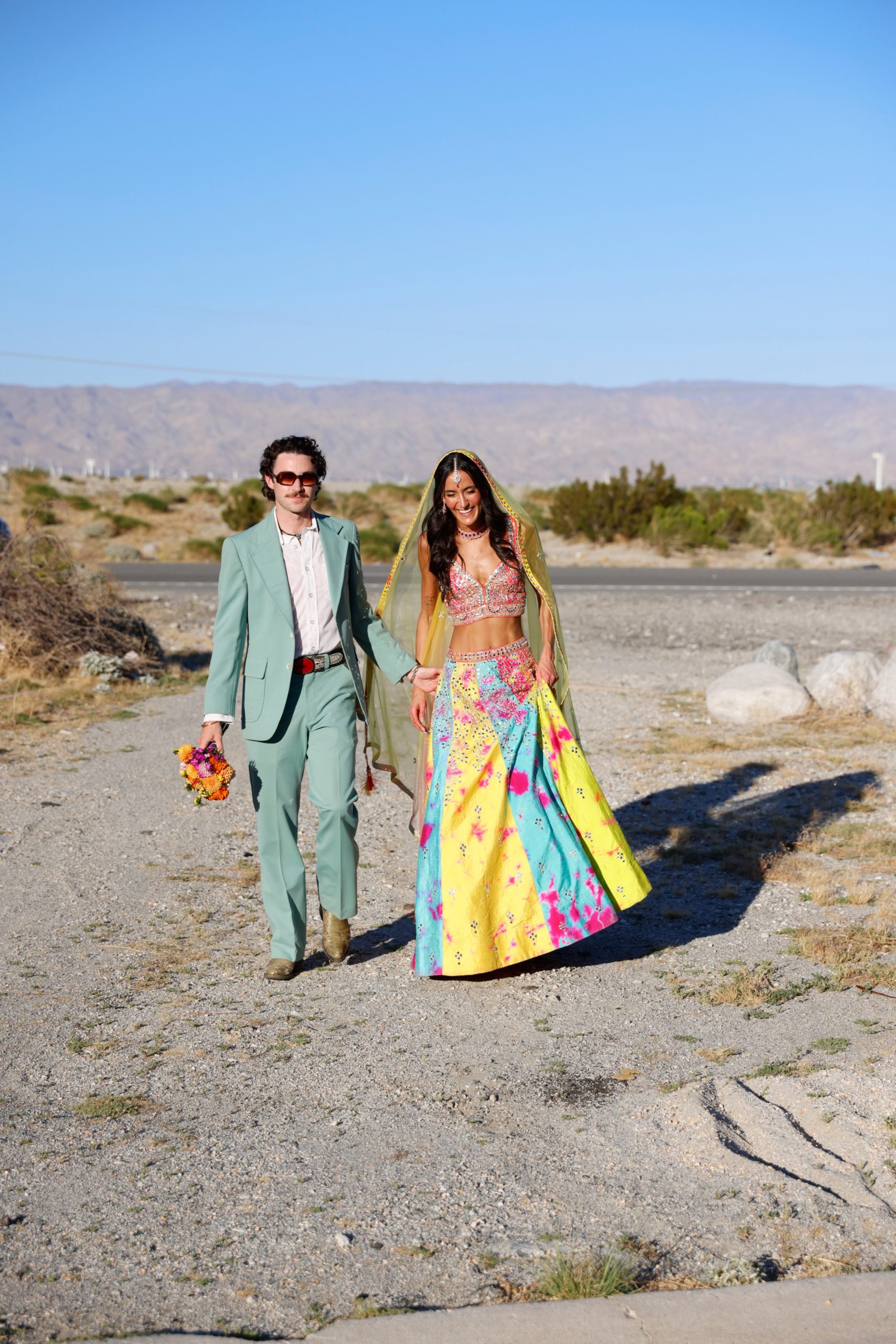
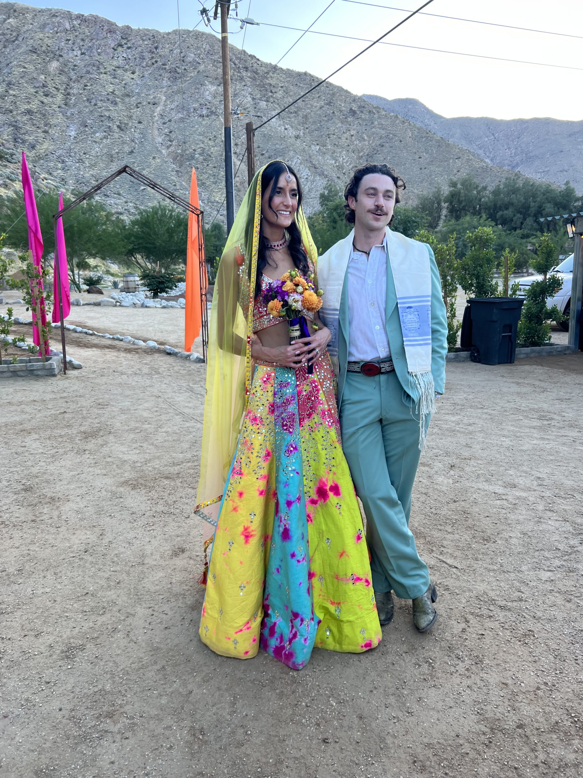
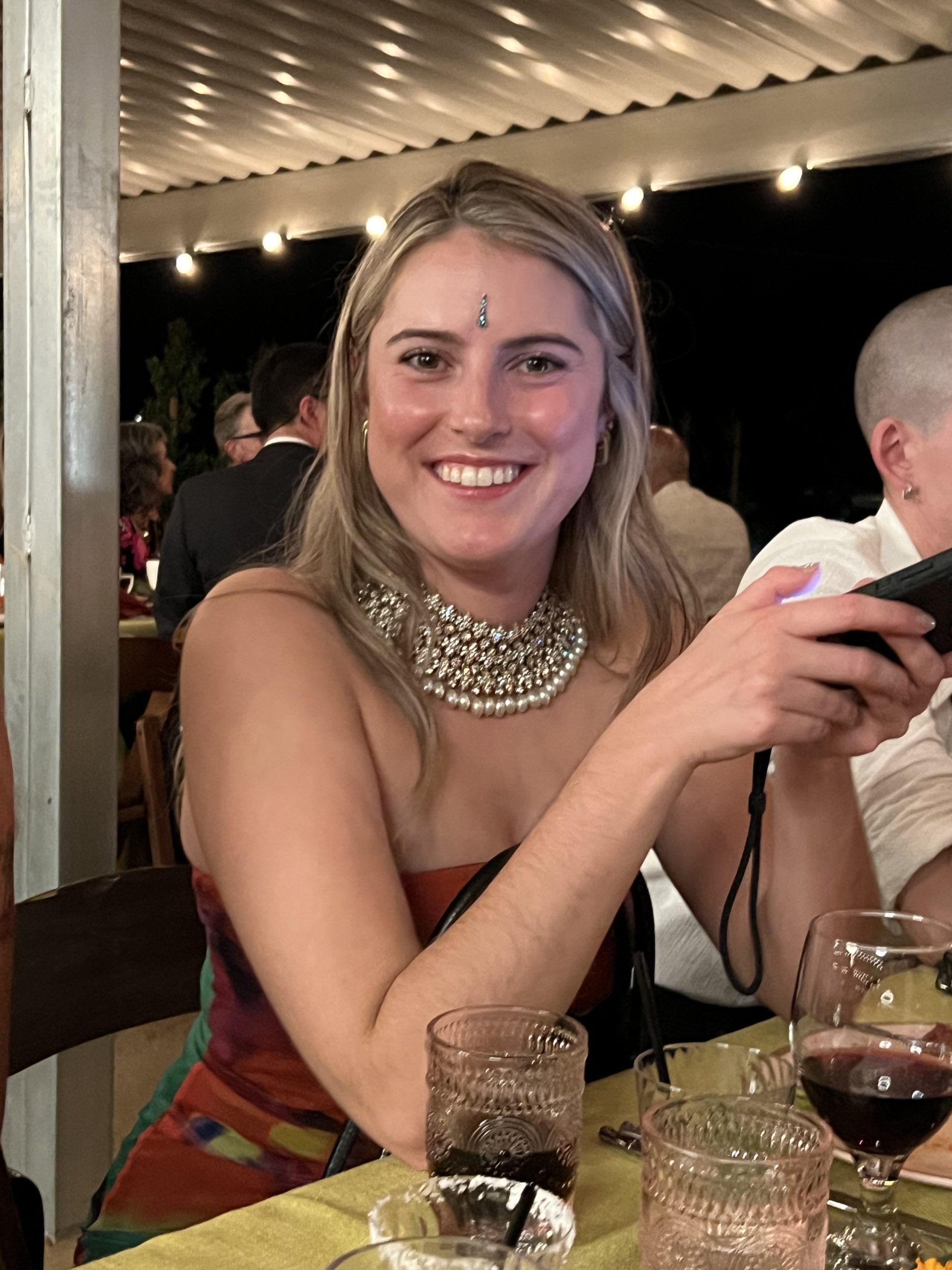
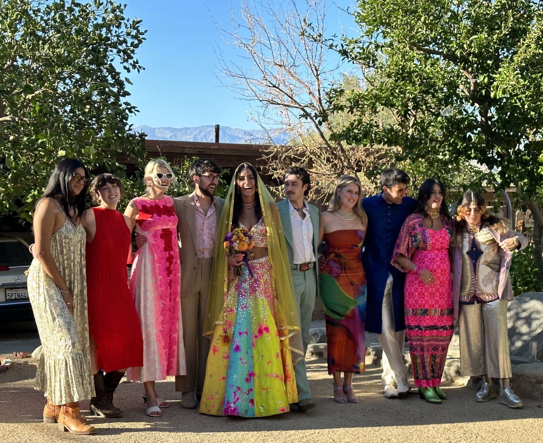
 What struck me the most was the beautiful blend of cultural traditions. Scarlett, embracing her South Asian heritage, dazzled in a traditional Indian lengha, vibrant with Palm Springs colors. Her husband complemented her in a coordinated suit, adding a personal touch with his grandfather’s Tallit, a Jewish prayer shawl. This blend of cultural elements, from attire to ceremony, reflected a deep respect and appreciation for their diverse backgrounds.
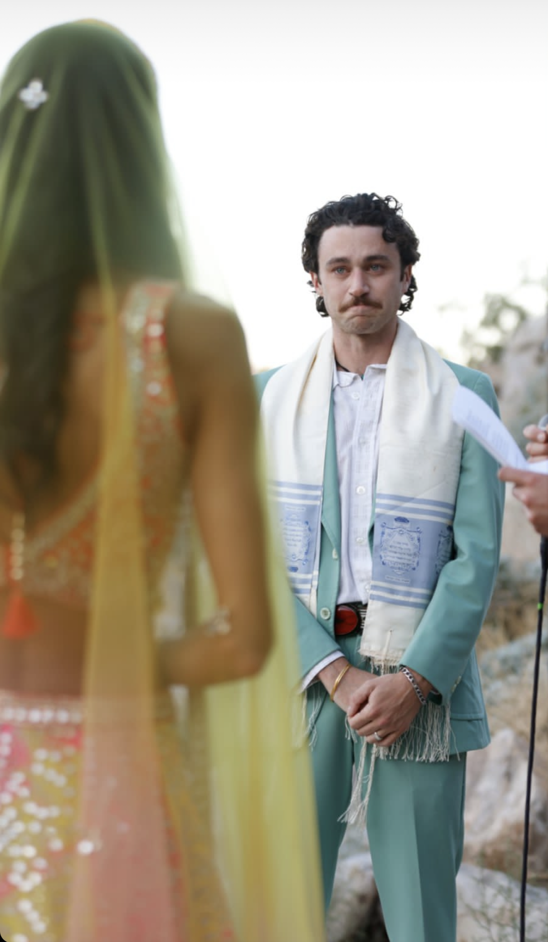
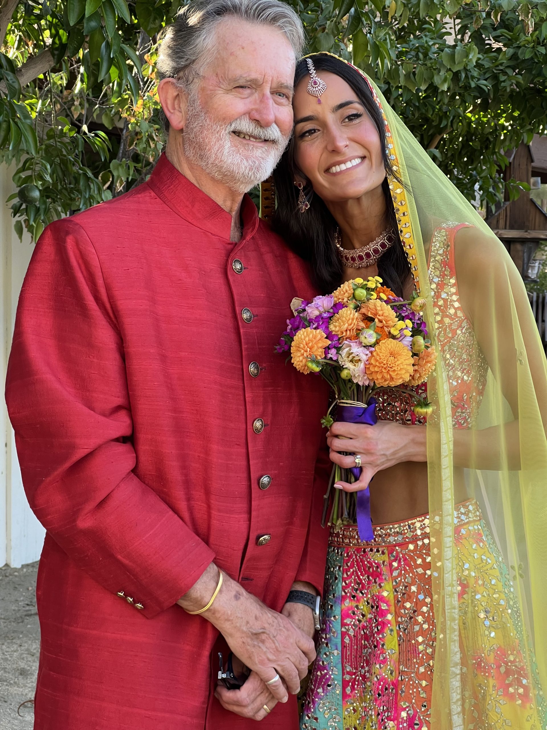
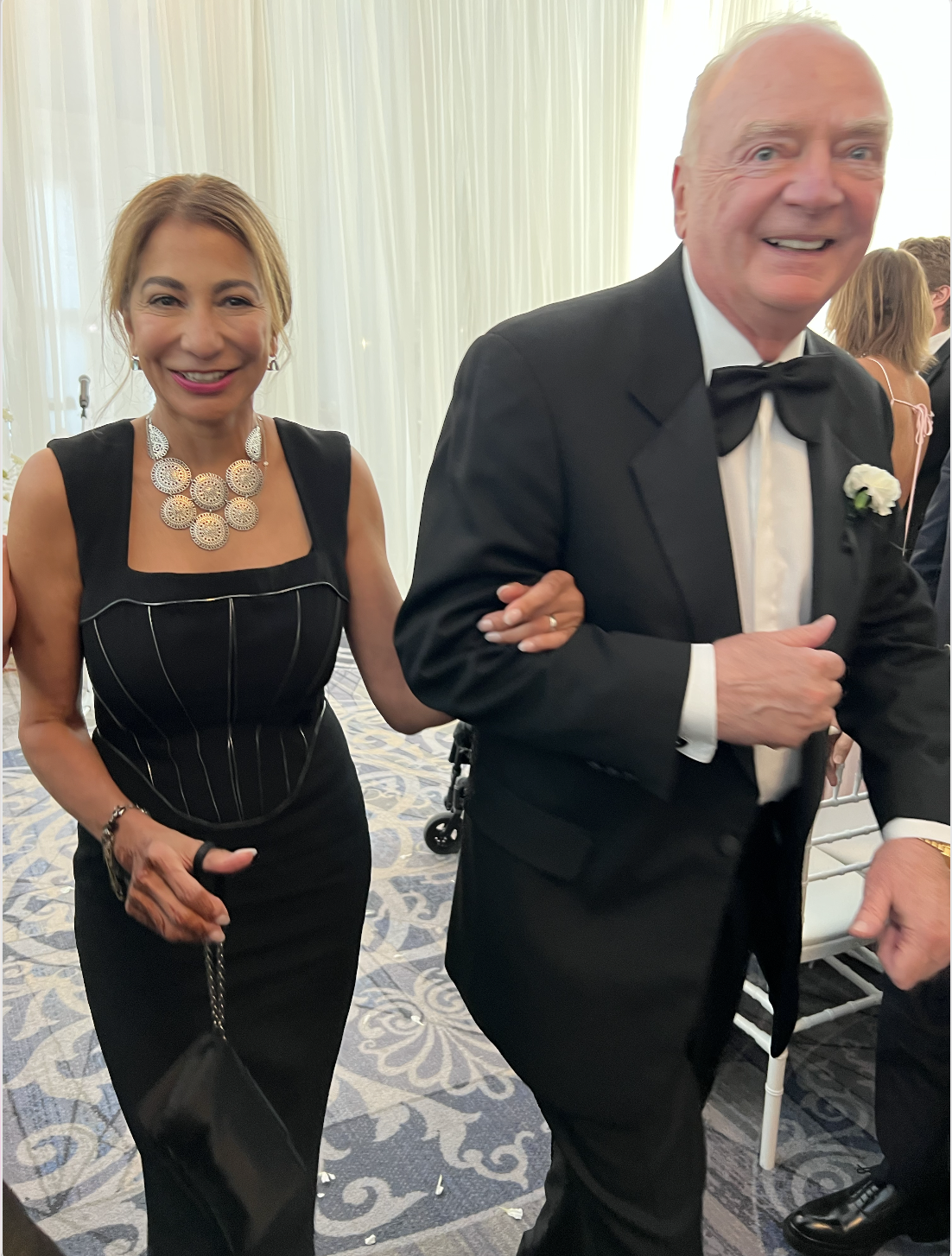
Bride and Dad
Design and Aesthetics: Bold Simplicity in the Desert
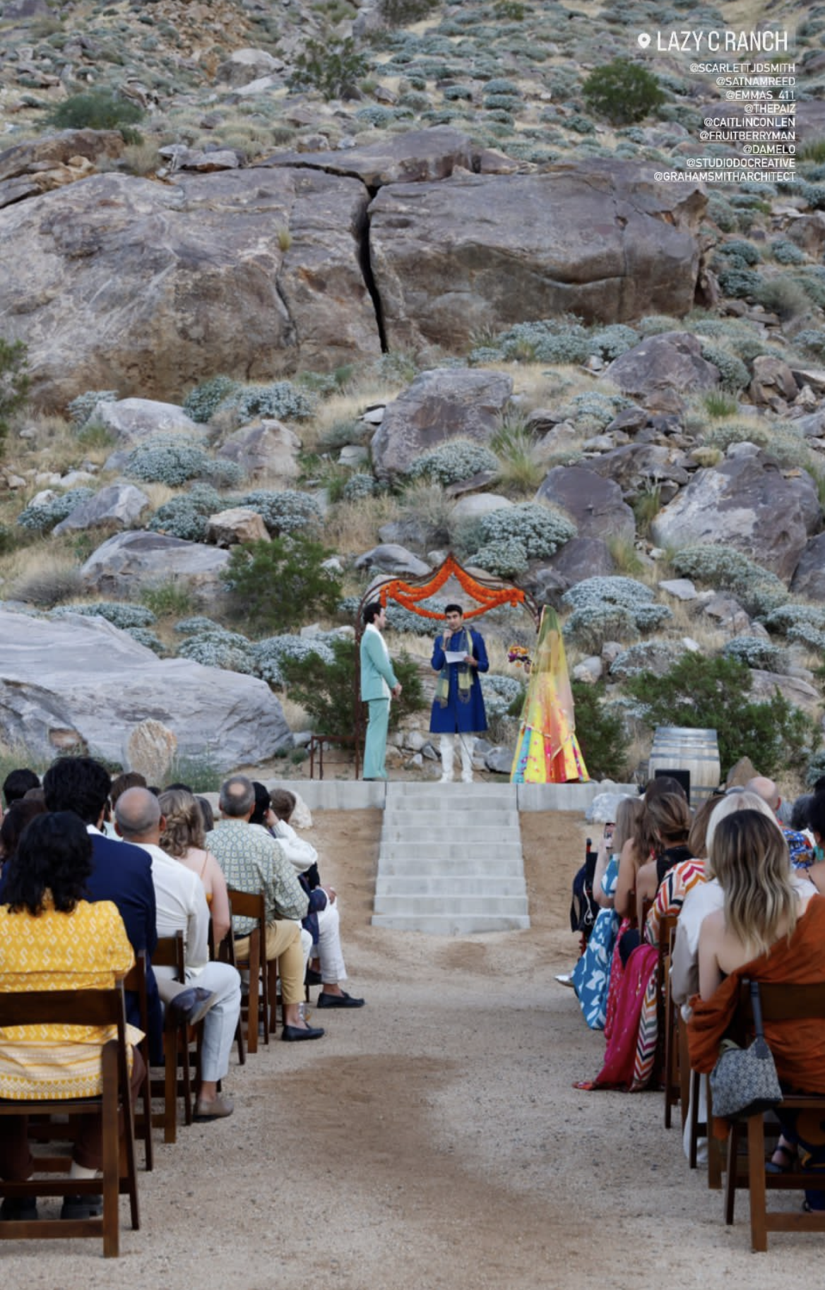
Photo by Molly O’Keefe
As a designer whose style voice resonates with bold simplicity, I found Scarlett’s wedding to be a perfect embodiment of this aesthetic. The setting itself, amidst the sweeping vistas of the Palm Springs desert, became a focal point, with its natural beauty setting a serene yet striking backdrop. The outfits of the bride and the guests, were vibrant and culturally rich, stood out against this backdrop, becoming highlights of the visual experience.
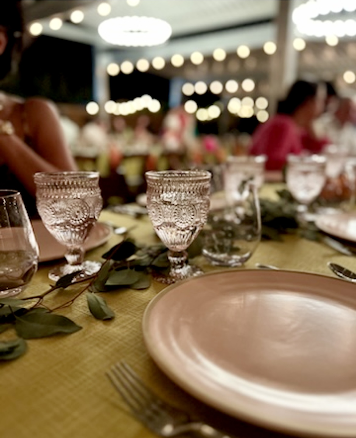
The decor of the wedding was kept intentionally simple, allowing the natural setting and the people themselves to shine. The colour scheme on the tables was thoughtfully chosen to complement the desert environment, creating a harmonious blend that was both elegant and understated.
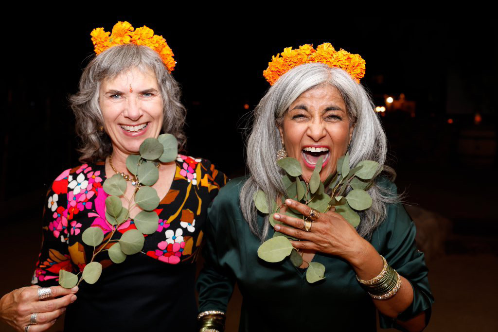
From table decor to crowns
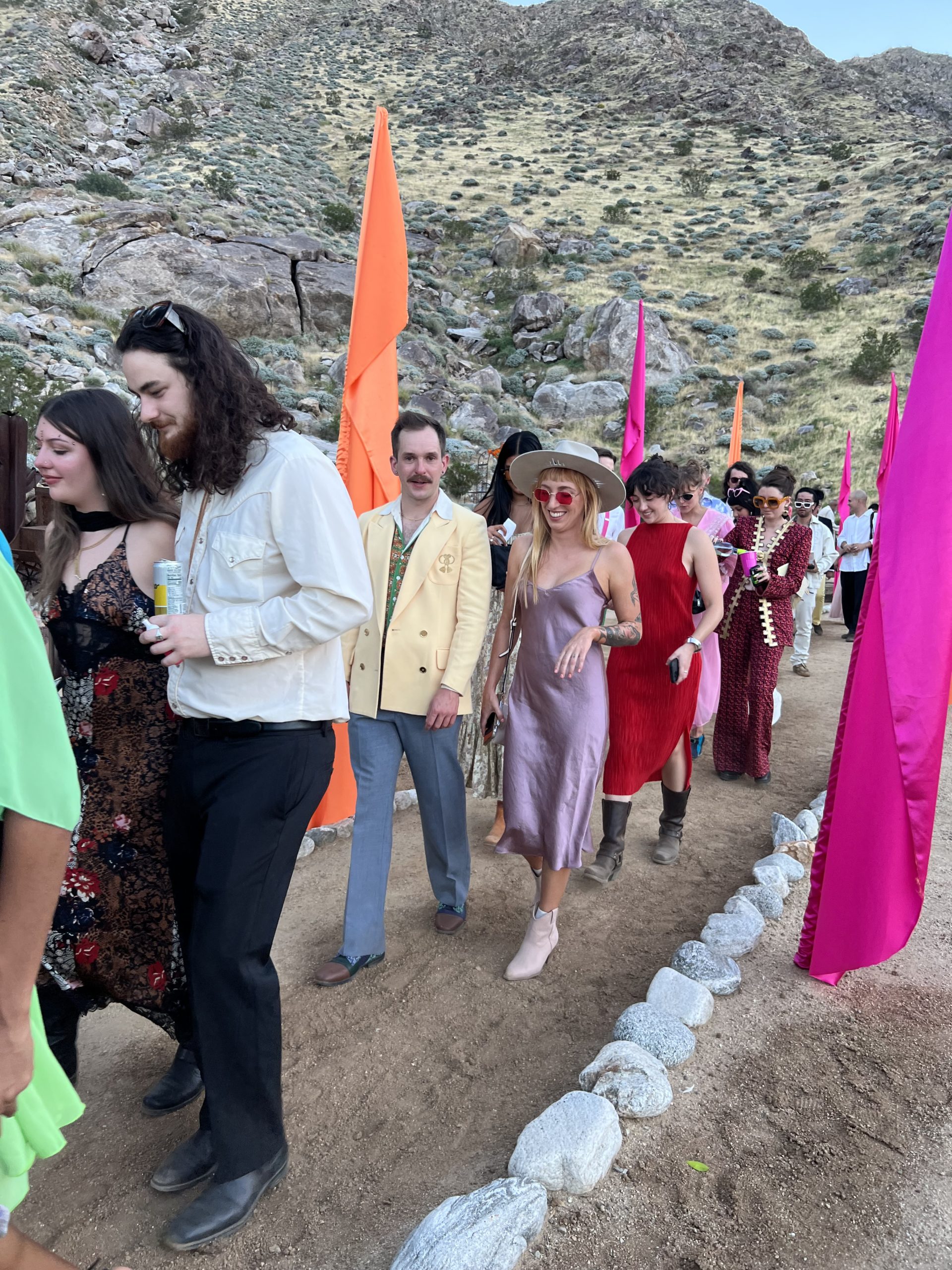
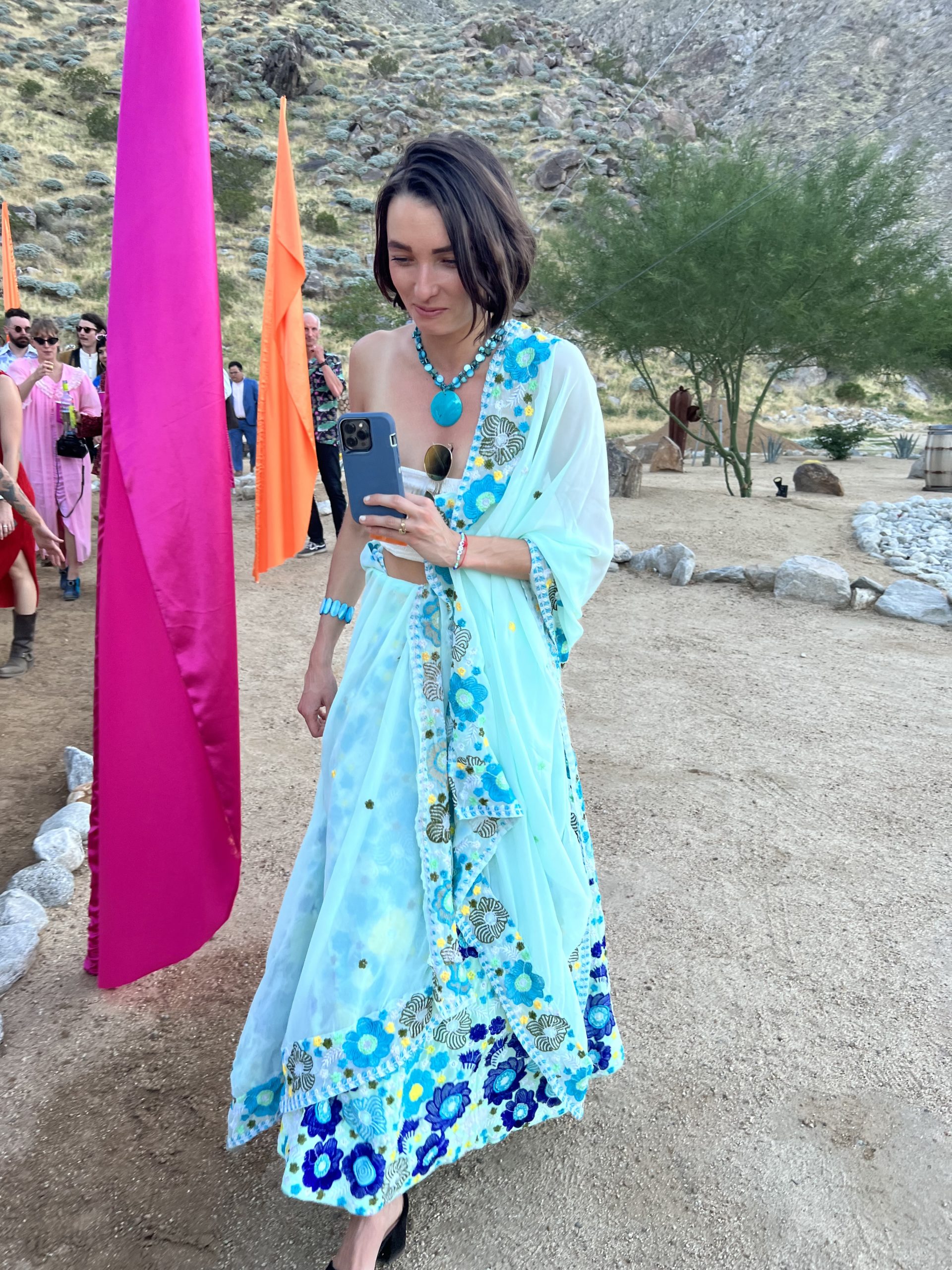
 To add a touch of vibrancy, banners were strategically placed to mark walkways and various areas. These banners were eye-catching, designed with vivid colours that stood out in the desert landscape, guiding guests through the celebration and adding an element of playful discovery to the event.
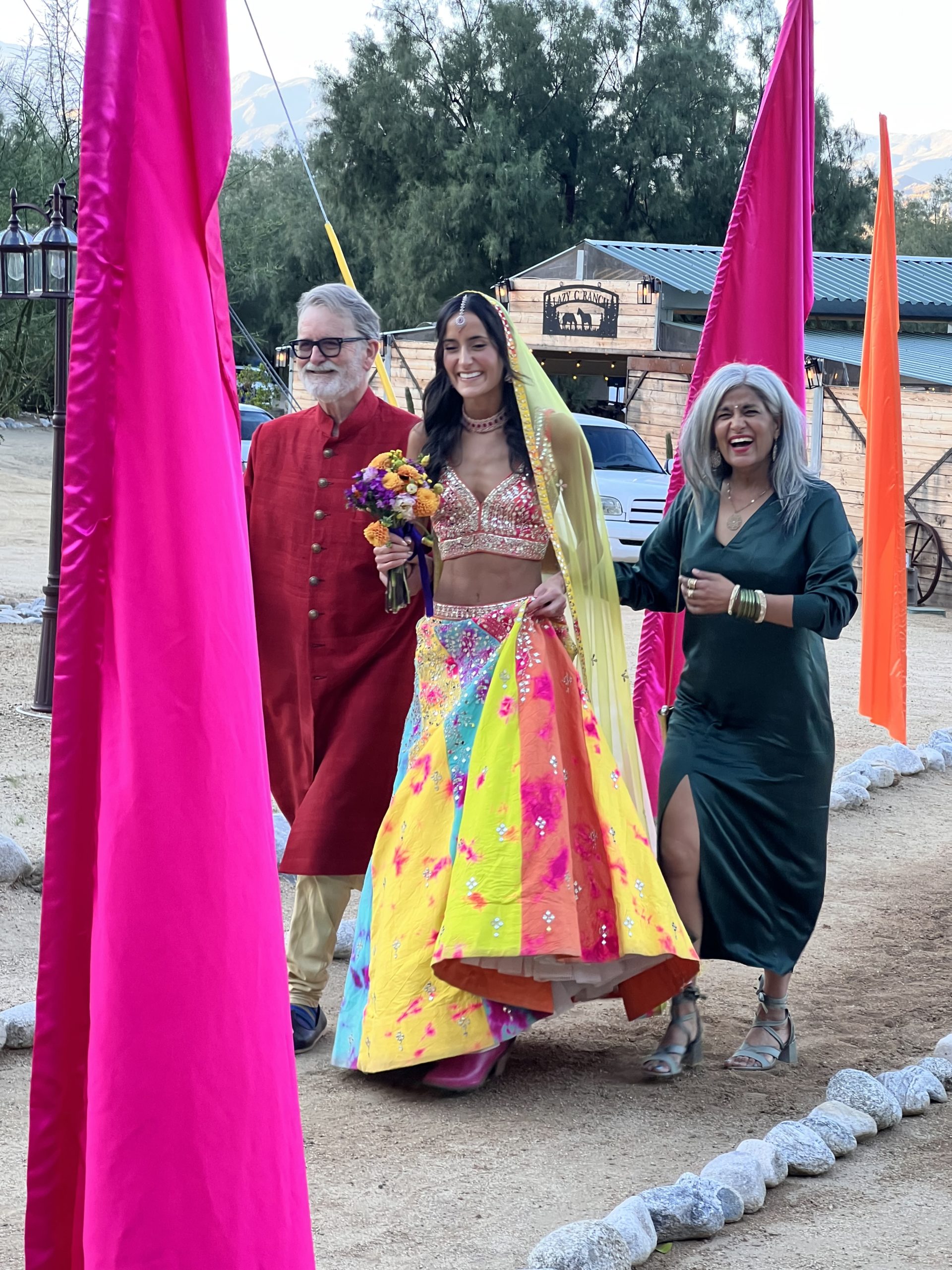
Interestingly, while I admired every detail, I cannot claim credit for any of the design choices. Perhaps, my personal aesthetic has subtly influenced Scarlett over the years, but this event was entirely a reflection of her and her husband’s vision and taste. This approach to design created an atmosphere that was both inviting and impactful. The simplicity of the decor did not compete with the natural beauty of the setting or the personal styles of the attendees, but rather enhanced them, making the wedding a true celebration of bold simplicity.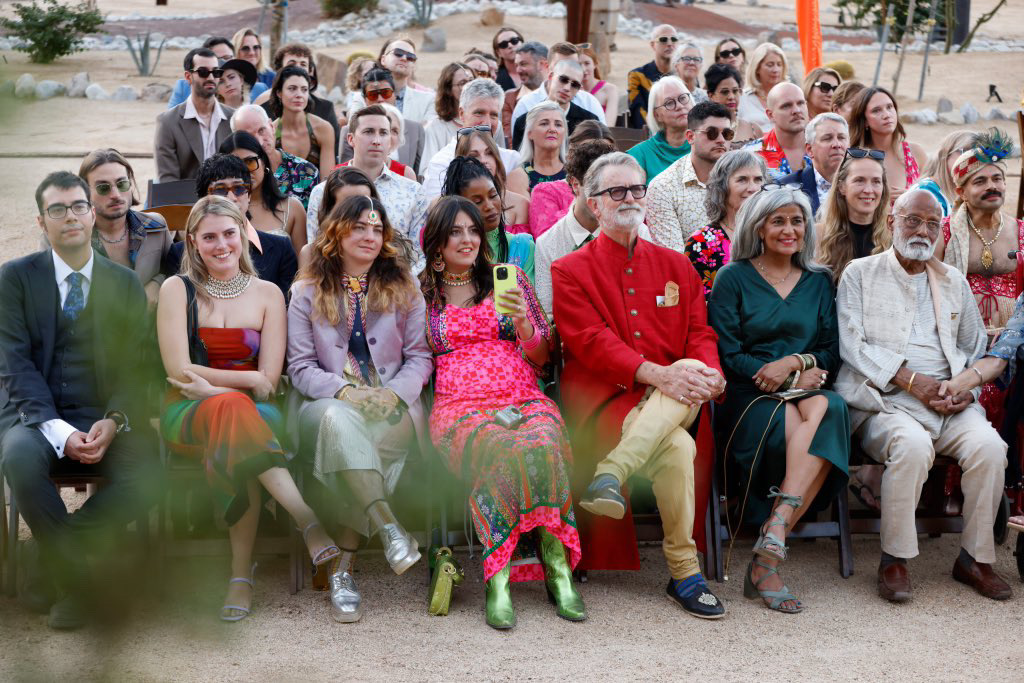
Scarlett and Sam’s Wedding in Palm Springs
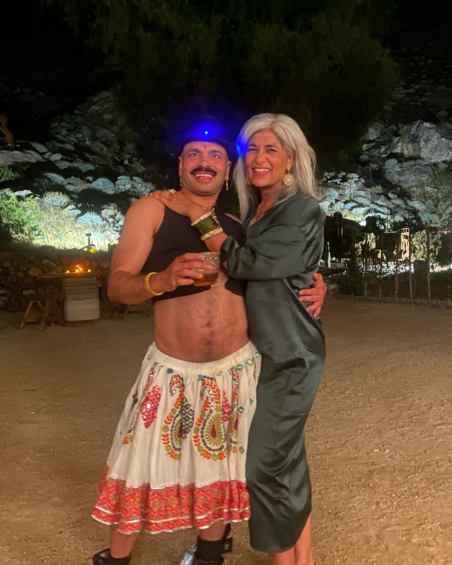
As a designer, I was particularly attuned to the aesthetics of the wedding. The décor was a riot of colours, echoing the joy and vibrancy of the occasion. It was a delightful contrast to the desert’s earthy tones, creating a lively and inviting atmosphere.
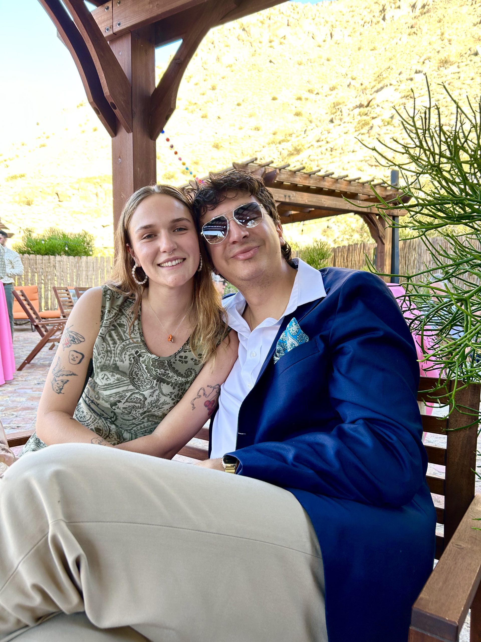
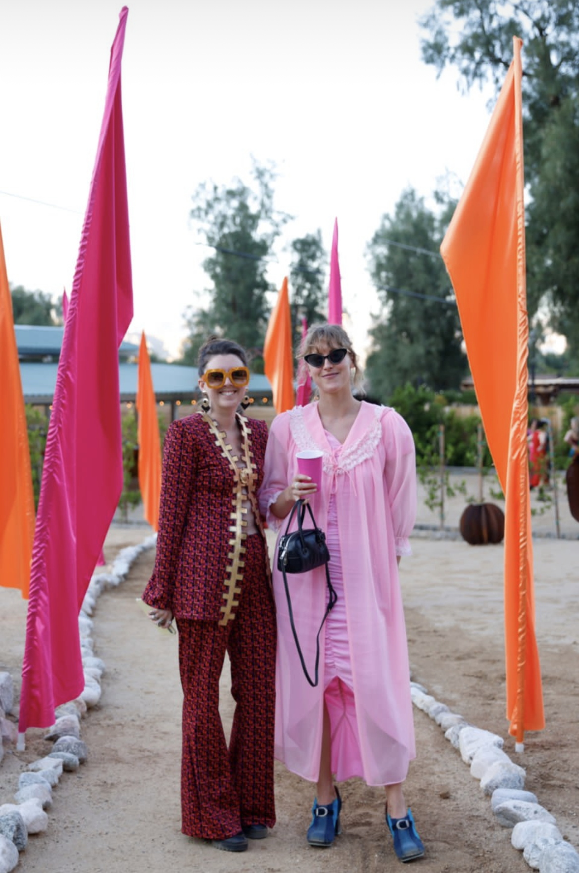

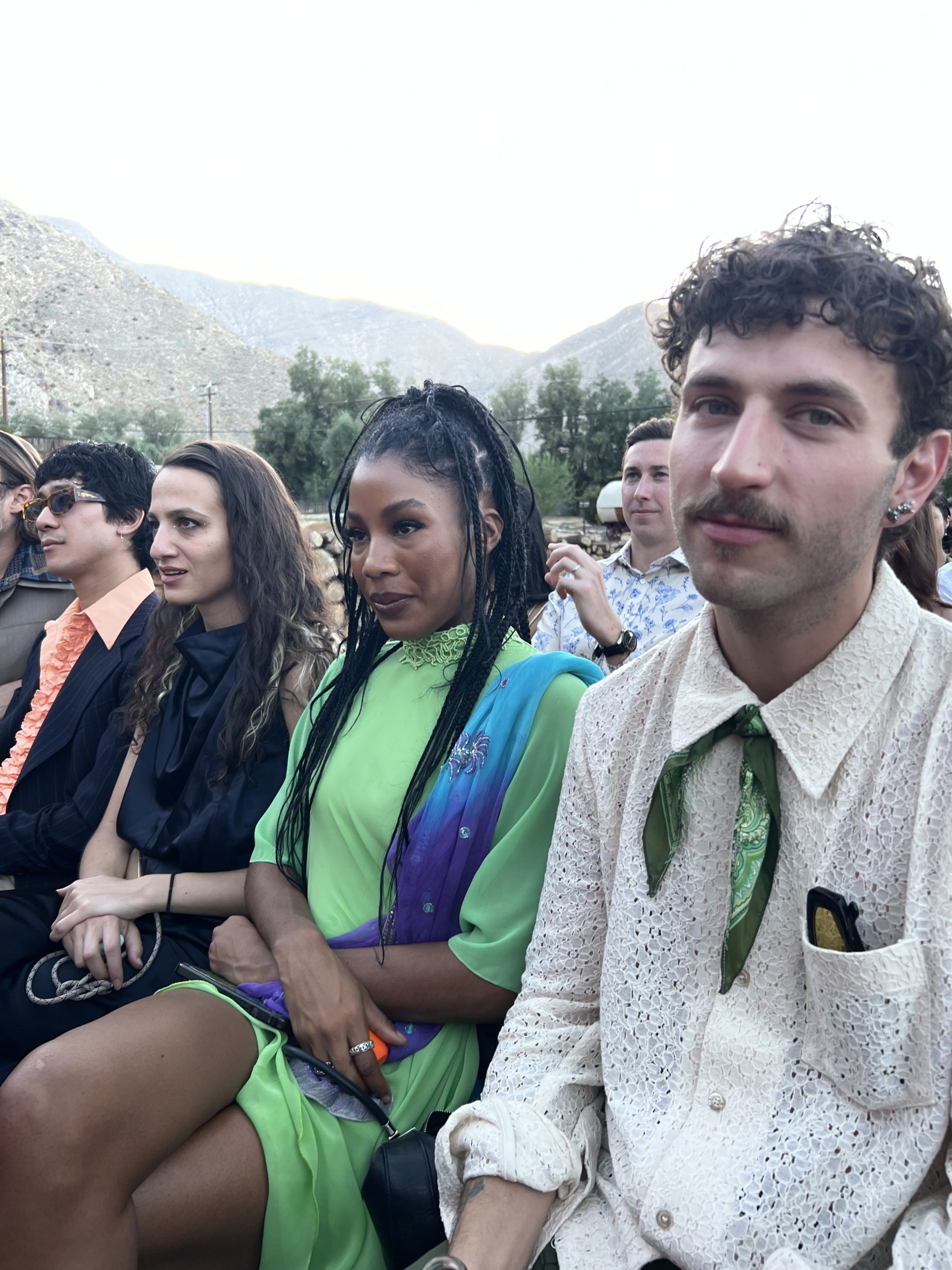

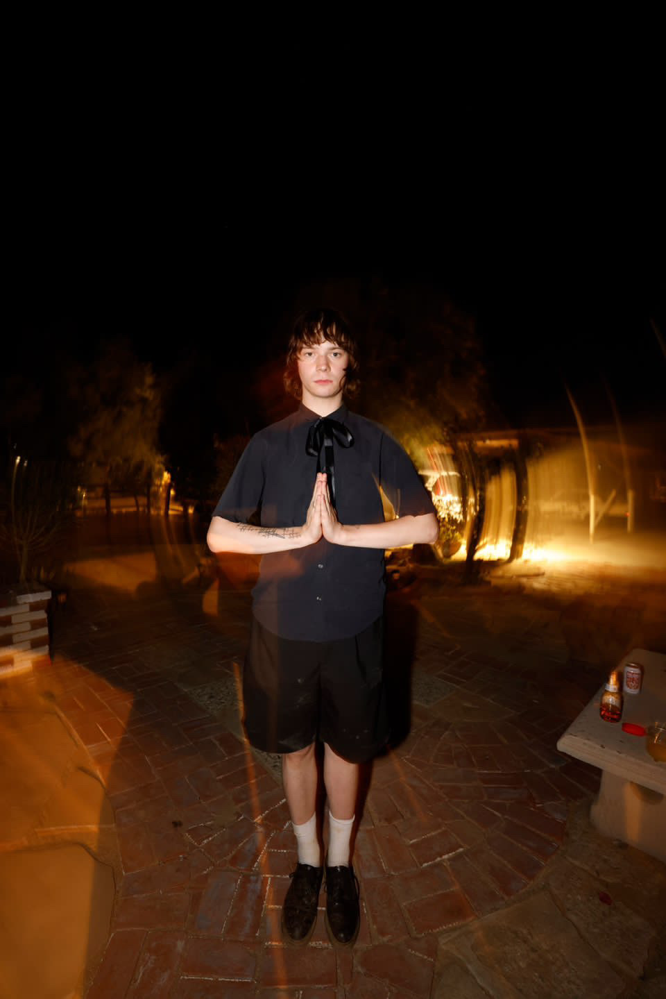
 The eclectic mix, including an abundance of tattoos among guests, which I struggled with but what the hell its not my body, added a modern and personal touch that was both refreshing and visually stimulating.
The Unifying Power of Music: A Rave in the Desert
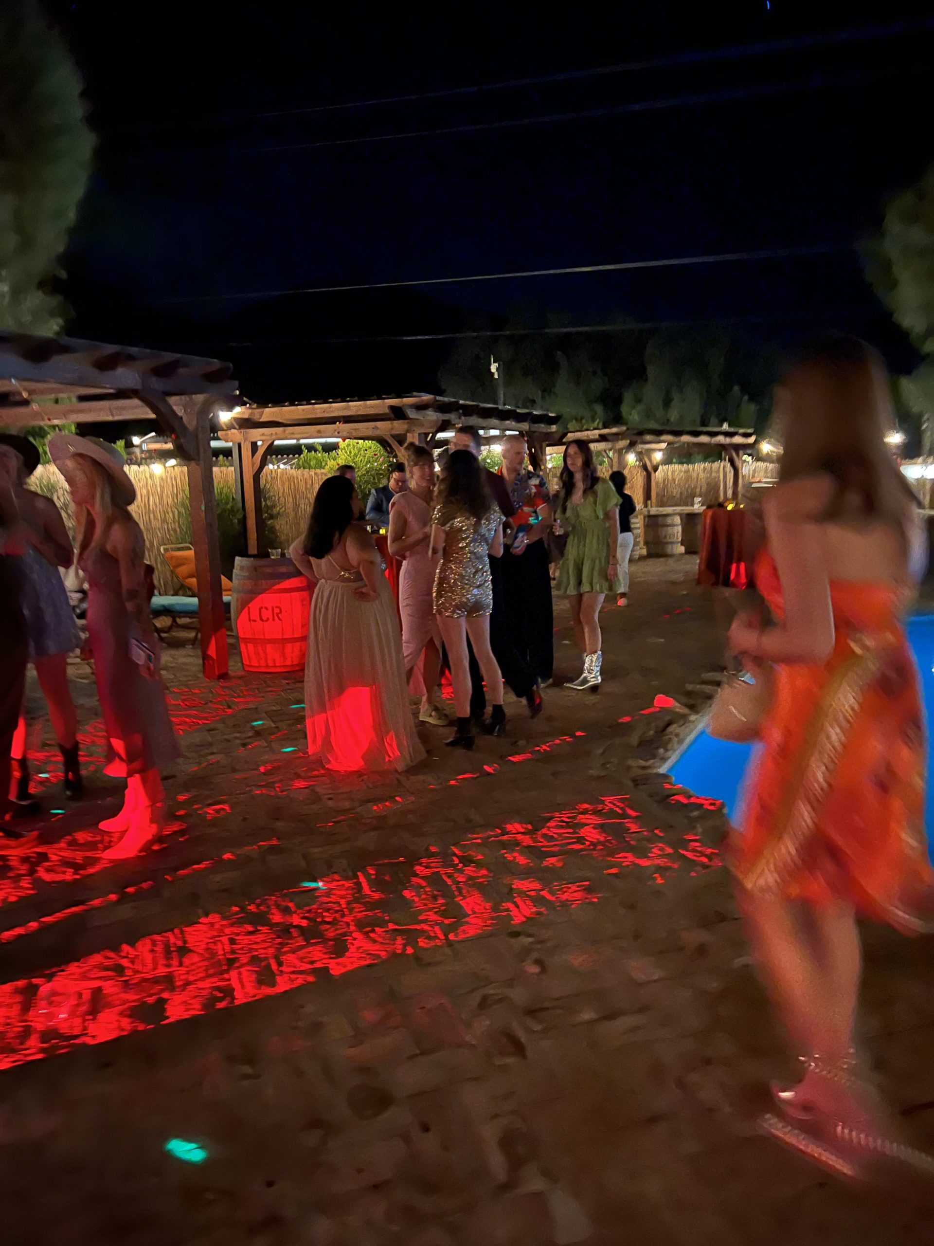
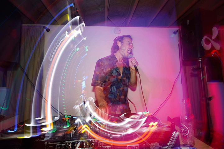 Central to the festivities was the electrifying pulse of electronic music, setting a tone that was more akin to a desert rave than a traditional wedding reception. The groom, a DJ himself, and his circle of DJ friends took turns at the equipment, each adding their unique flair to the musical landscape. It was an exhilarating ‘music-off’, where they playfully competed in spinning the wheel, infusing the night with a dynamic and vibrant energy.
 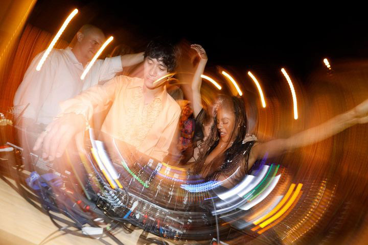 This aspect of the celebration not only highlighted the universal appeal of electronic music but also its power to transform a conventional gathering into an extraordinary, shared experience of euphoria and unity. The dance floor was alive with movement, with guests of all ages letting loose in a celebration that blurred the lines between a wedding and a festival, embodying the spirit of a true rave.
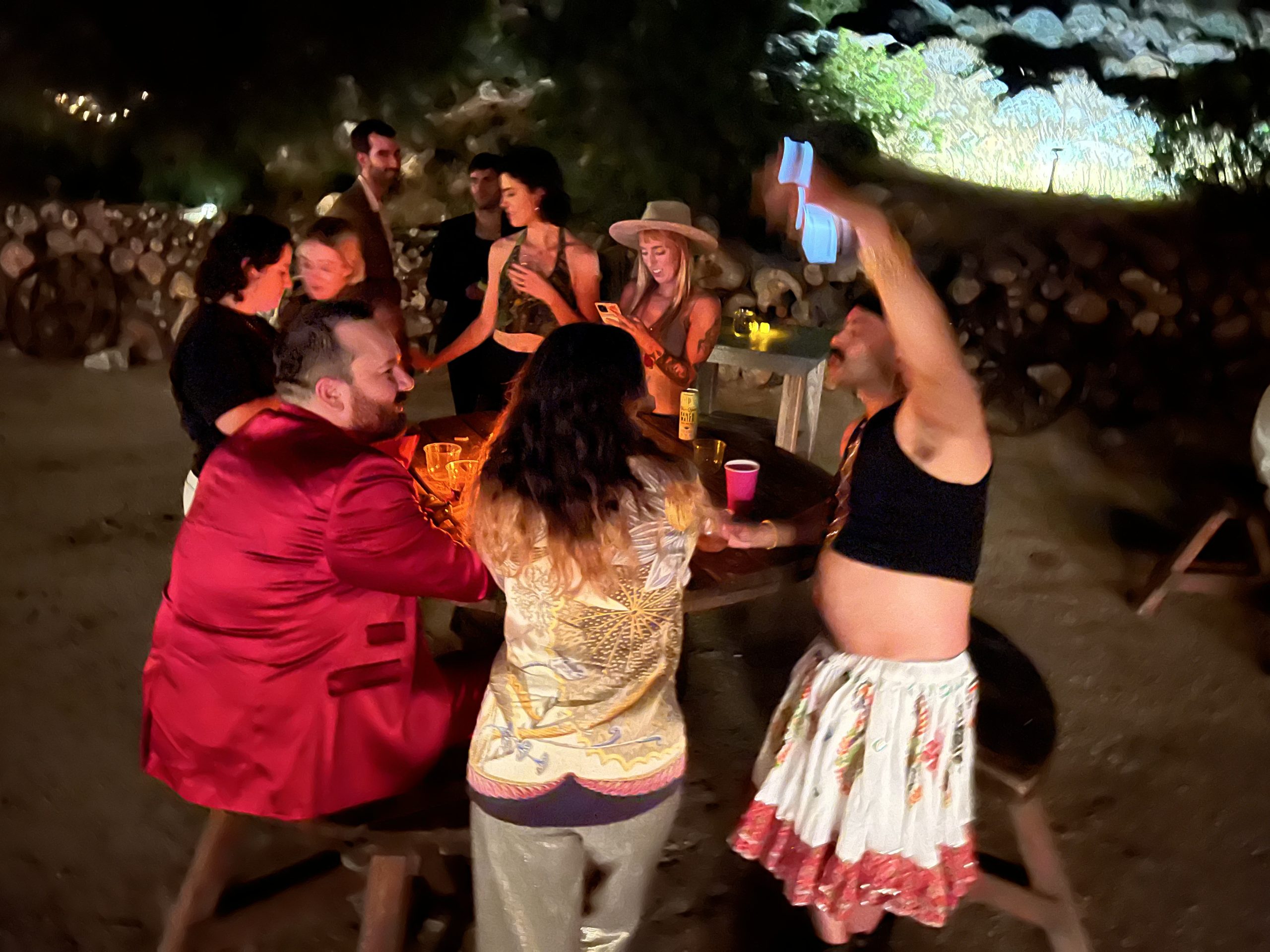

 Inclusivity and Joy
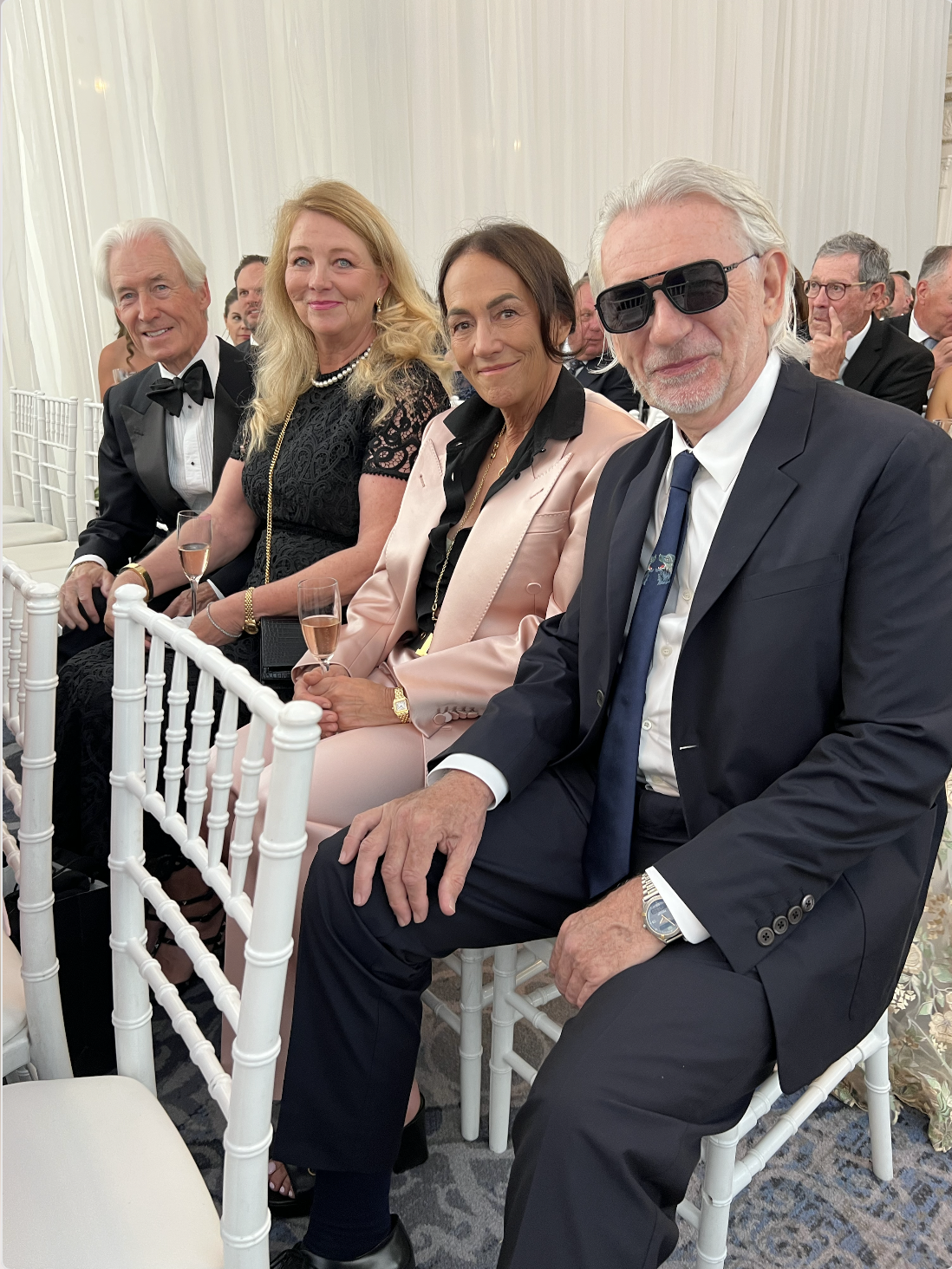
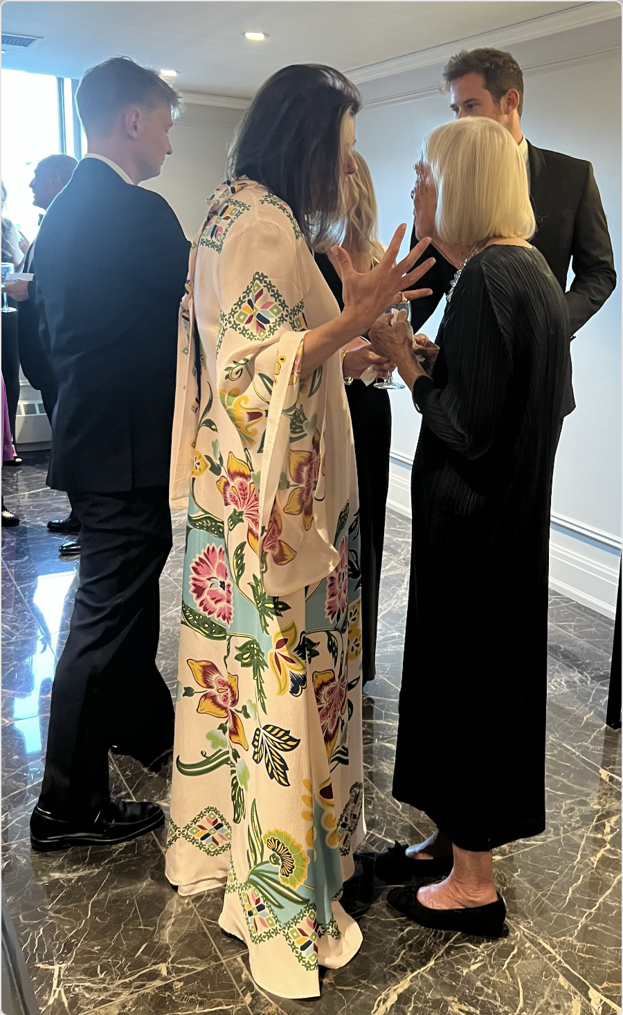
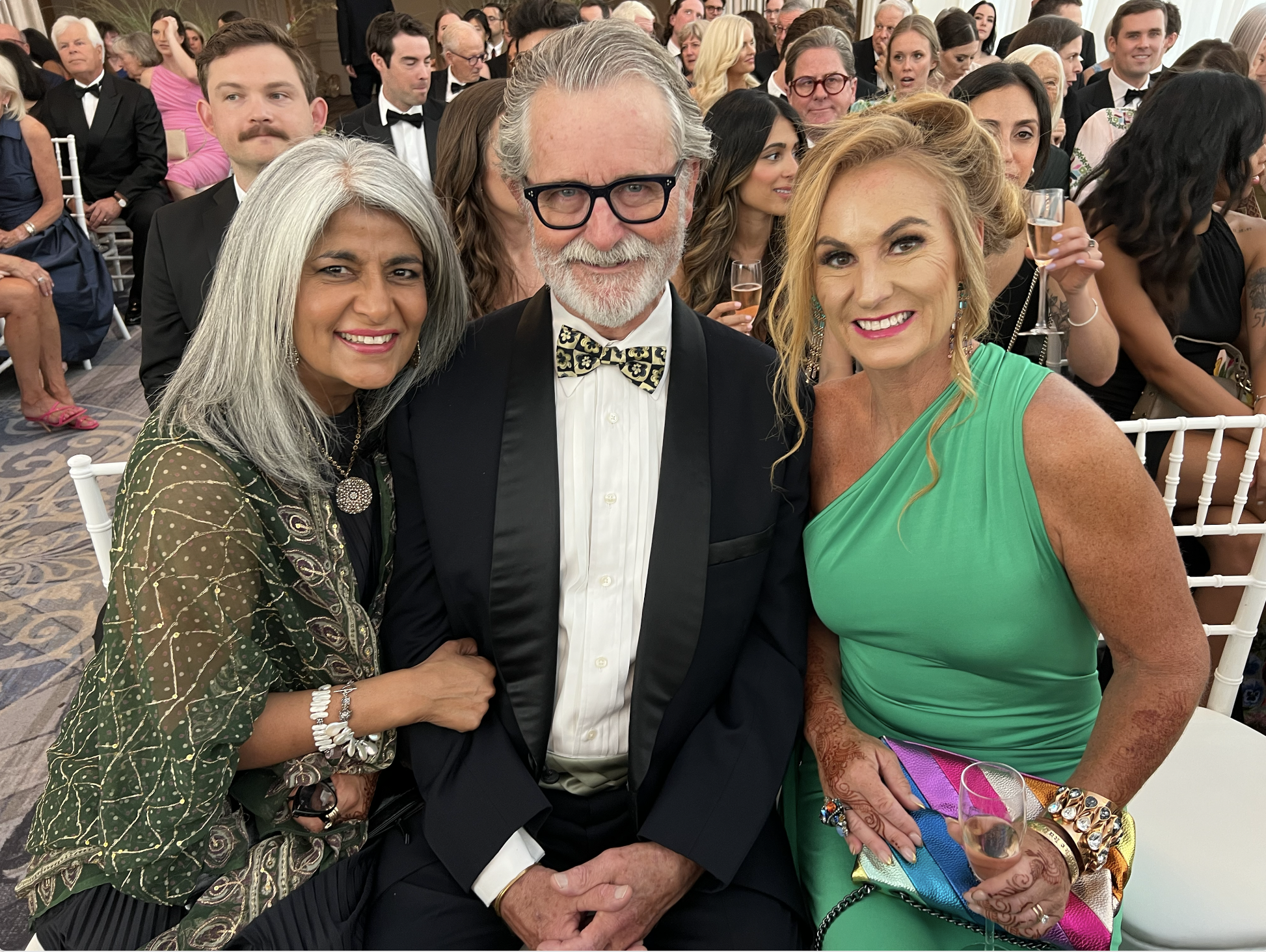
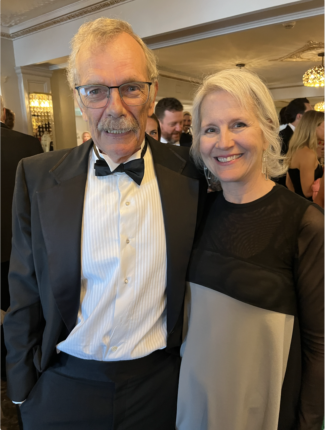
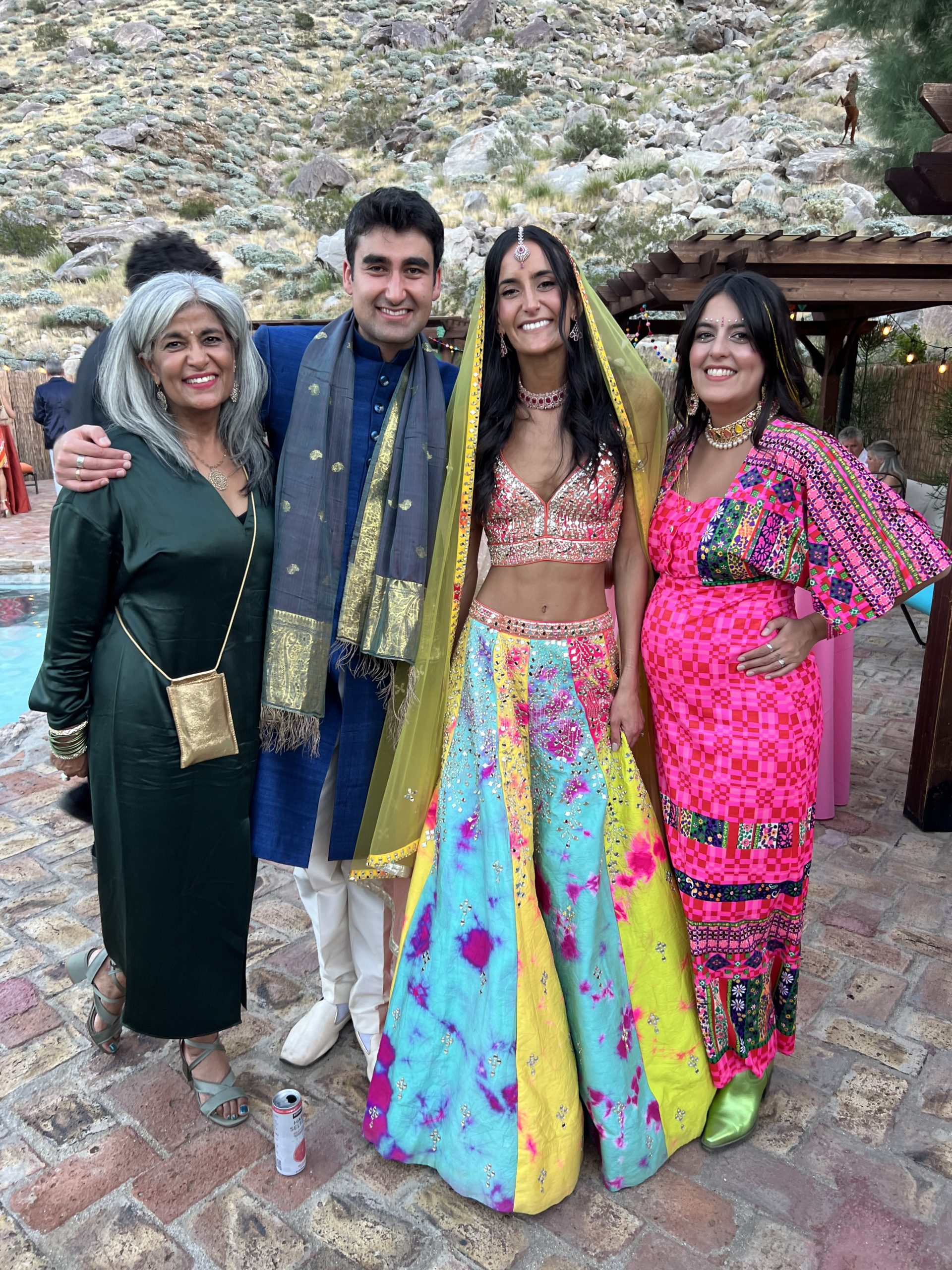
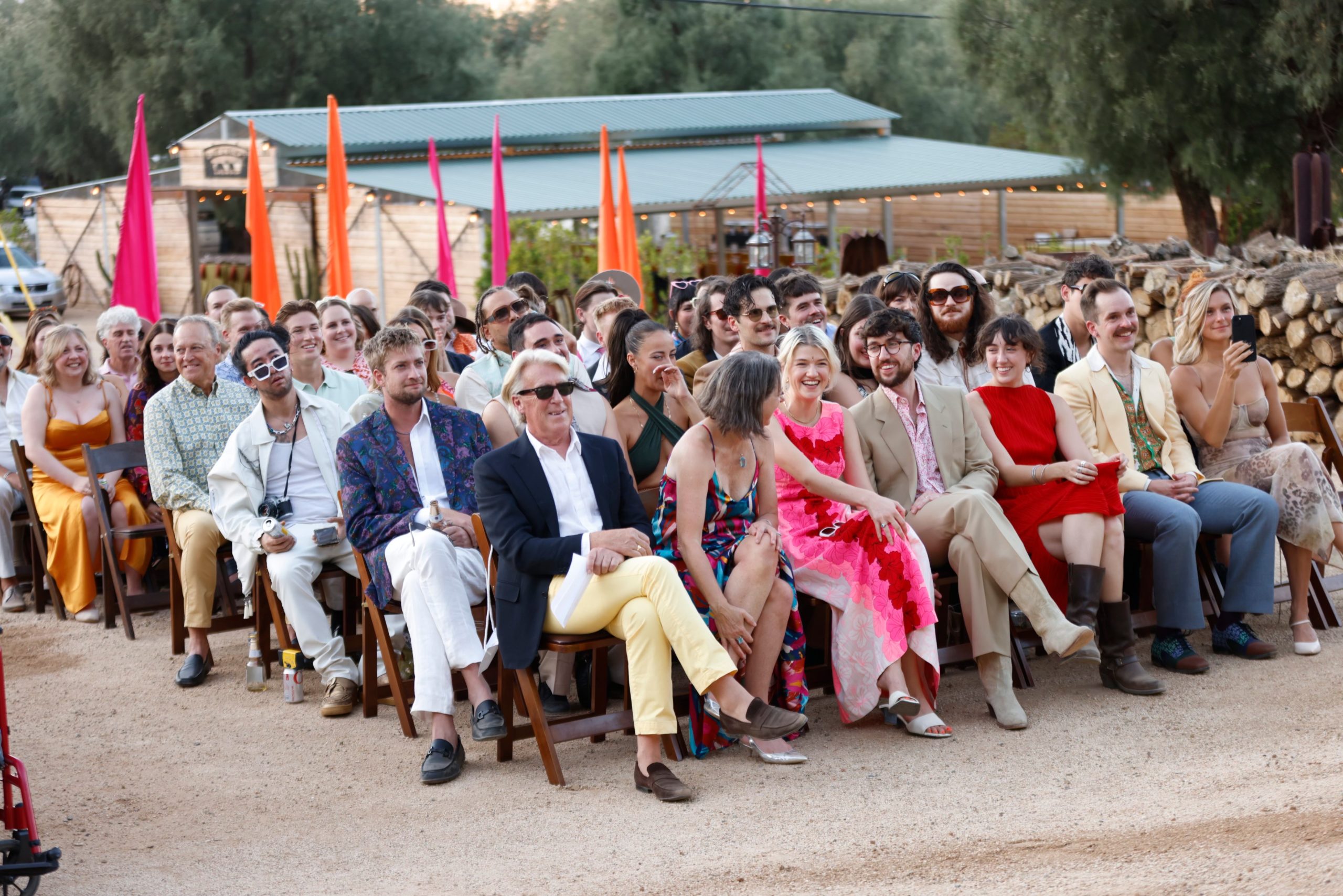
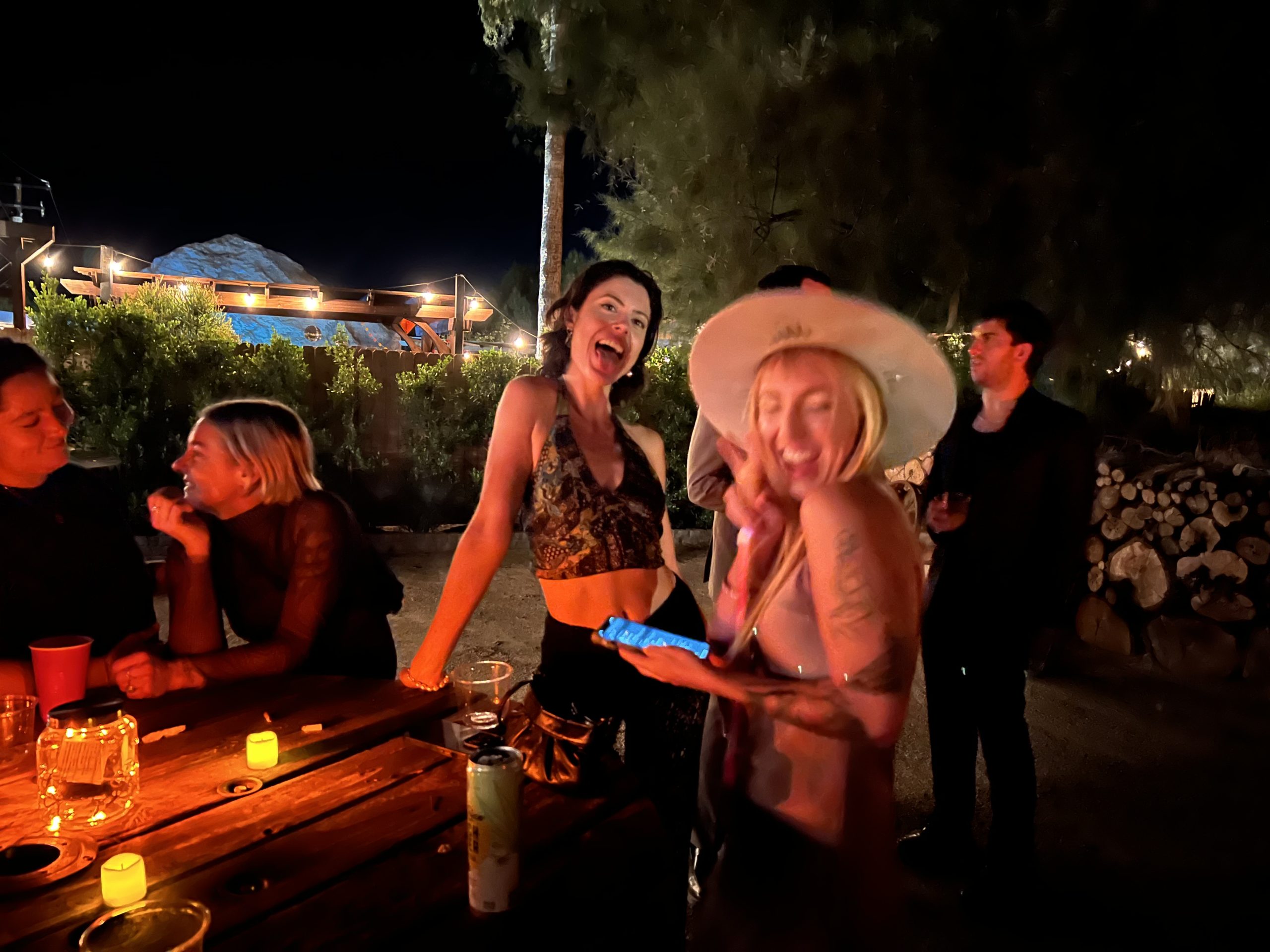
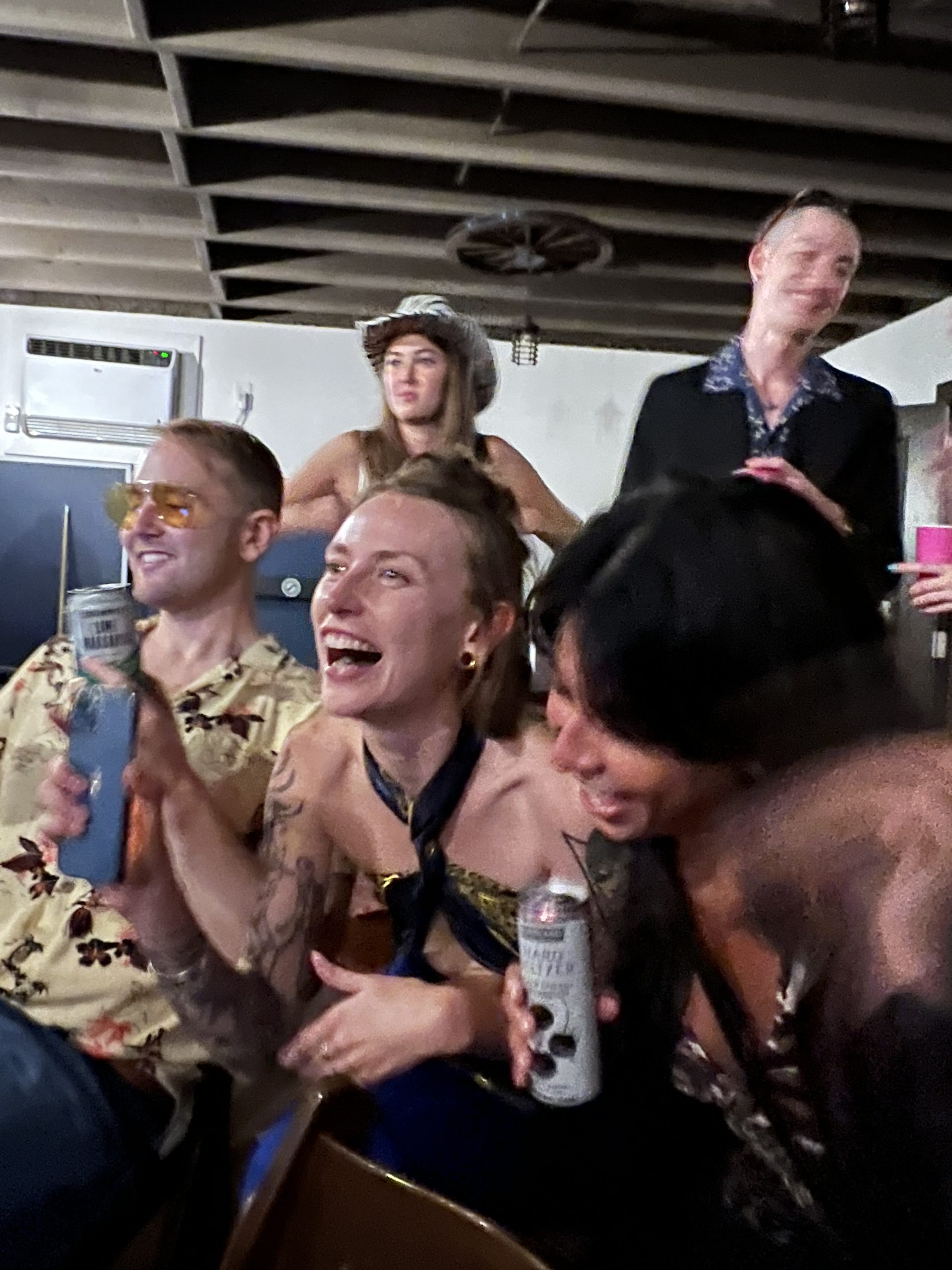
The guest list was as diverse as the event itself, featuring family members from different generations and a wide circle of friends. This blend of ages and backgrounds added to the richness of the celebration, creating a tapestry of stories and relationships that underscored the inclusive nature of the event.


The Spirit of the Celebration: Ageless Revelry
As the night progressed into the early hours of the morning, a remarkable aspect of the celebration became vividly apparent: age was simply a number at this desert rave. The energy and joy of the party defied generational boundaries, creating an atmosphere where everyone, regardless of age, was immersed in the spirit of the celebration.

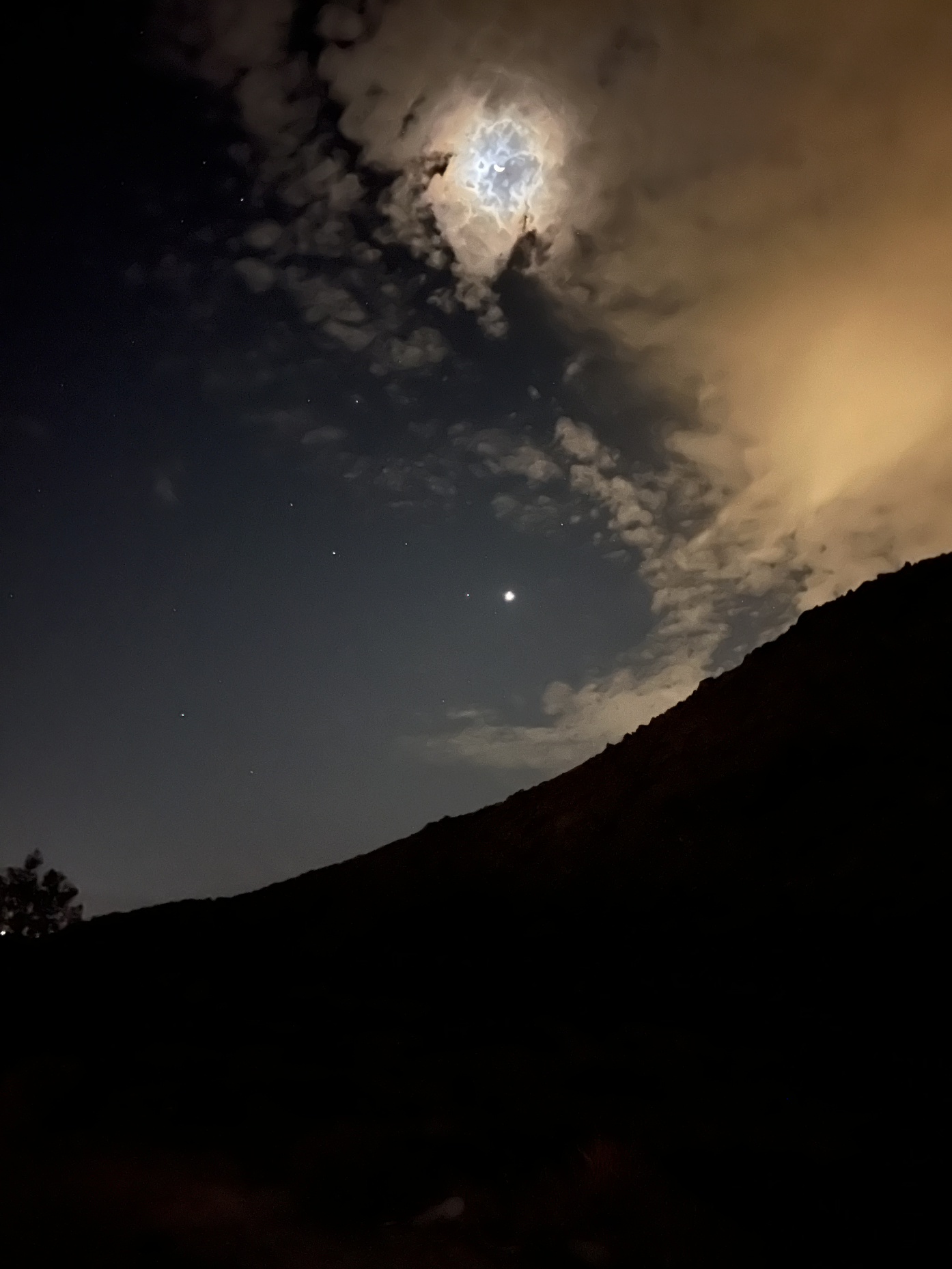 Even at 5 am, as moms, including myself, looked for their Ubers down the hill to head home, there was a palpable sense of exhilaration in the air. The surrounding darkness of the desert, with the vast sky above barely lit by the stars and the early hints of dawn, added an element of mystique to our departure. This was not just a wedding; it was a testament to the timeless and universal appeal of music, dance, and joy. The very essence of the event echoed the sentiment that when it comes to celebrating love and life, age truly is thrown out the window, leaving only the pure, unadulterated enjoyment of the moment.
Conclusion: Celebrating Individuality and Love
Scarlett’s wedding was more than just a beautiful day; it was a bold statement about the beauty of embracing individuality and breaking free from traditional norms. The fusion of different cultures, the eclectic design elements, and the inclusion of contemporary music created an unforgettable experience that was as unique as the couple themselves. As a parent and a designer, witnessing this celebration was not just a source of immense pride but also an inspiration. It was a vivid reminder that when it comes to celebrating love, stepping out of the norm can lead to the most extraordinary and meaningful experiences. The best photos are by Molly O’Keefe (@what_molly_sees)
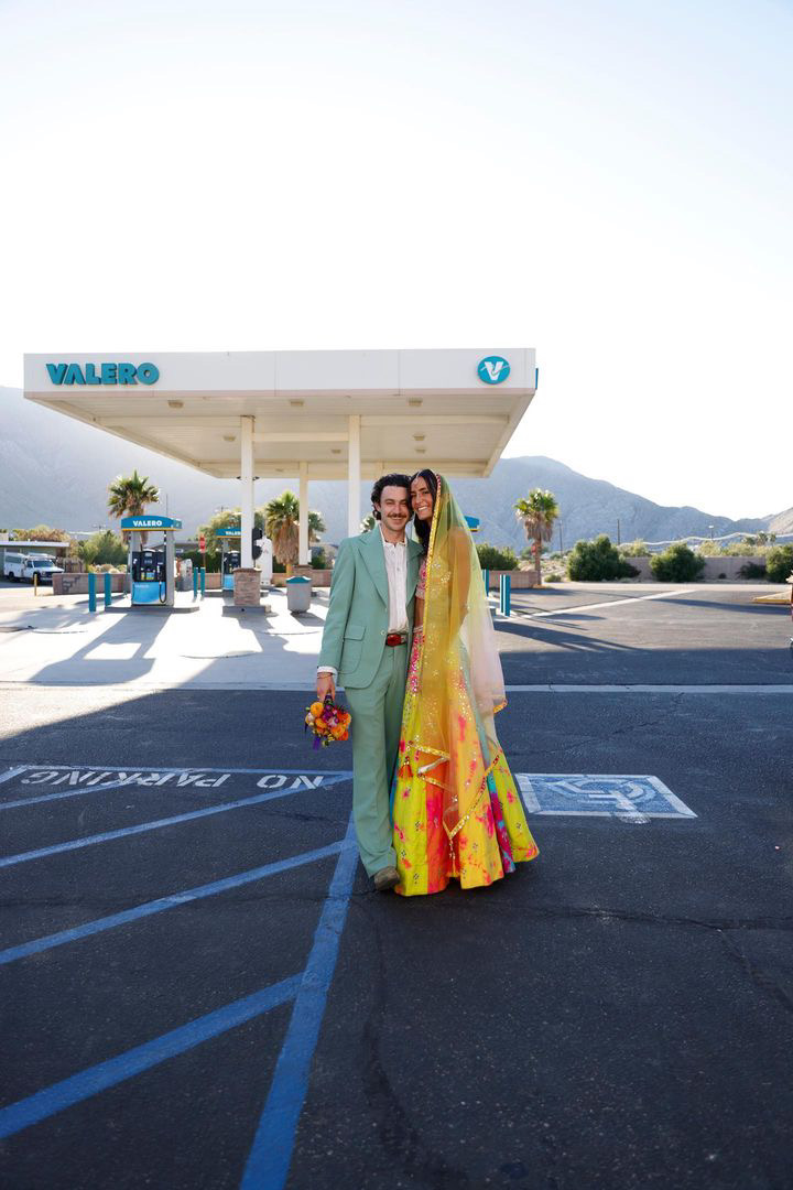
Photo by Molly O’Keefe