Building A Home – A Long, Layered Approach.

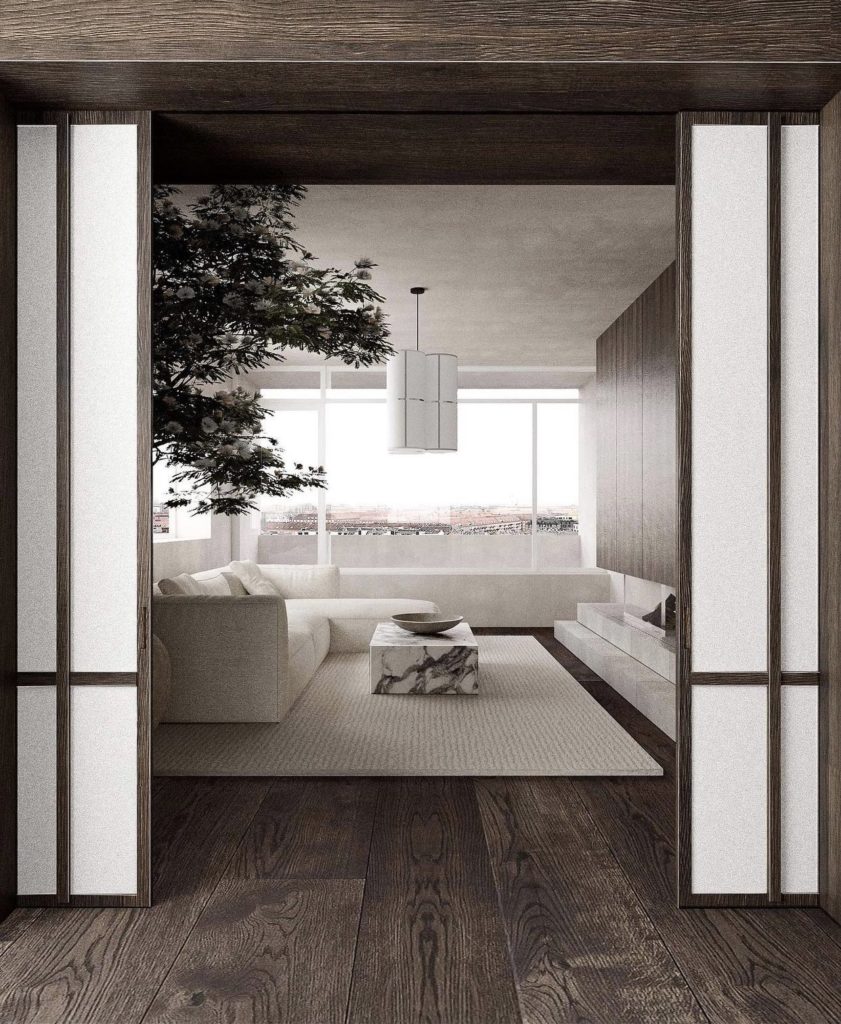
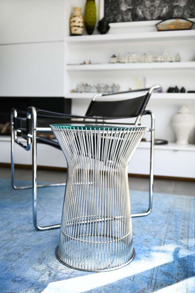
Room designed by Lassel Fragtrup. The focus is on the entire space. The furniture melts into the room so that the fireplace and coffee table take centre stage.

“Ornament is Crime” Adolph Loos

Architects are not decorative. Our focus is on the spatial. That is, how can we make our spaces better. How can we make them appealing without any decoration at all. While part of an architect’s practice absolutely focuses on dressing interiors and adding finishing touches for clients (myself included!) there is always an eye fixed on the bigger picture. The form, the function, the relationship of built areas and voids, each space as it relates to and works with the other spaces– it’s always there in the back of my mind. The dip into some HGTV buzz words, the bones of the house are equally important (and influential on the space) as the finishing touches to make a space feel yours, feel authentic. And, any decoration that is added to a space has a reason to be there. It is meaningful.
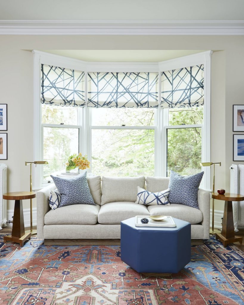
A ‘decorated’ room by Sarah Richardson. The symmetrical end tables, lamps and pictures and the matchy-matchy accessories make the room feel decorated rather than evolved. The carpet is the most spectacular thing in the room and gives some hints about the owner’s personality. I’d like to see more personal items in the space to make it feel more authentic.
This room feel more authentic. There is no symmetry or matchy-matchy in the space. The neutral backdrop allows the owner’s of objects of art to speak on behalf of the owner.

Speaking of HGTV– I’ve been thinking a lot about the many, many, interior design shows that have been on in the last 10 or 20 years. For a lot of people, either design lovers, the design curious, and (before Netflix and Hulu… HGTV is vintage!) those stuck watching TV on the couch at 2pm when sick and nothing else in on… these design shows are the first taste of ‘interior design’. 

The shows typically all work the same. You get a tour of a home that the owners love, but it needs a ‘refresh’. The TV design team comes in and whirls around with tape measures, fabric samples, a carpenter with a pencil behind their ear, and an interior designer with fantastic hair. Then, the house is a construction zone and everyone wears a hardhat (can it even be done in time?!). When the paint is dry (our first glimpse into the “makeover”) we get a lot of short and quick shots of people bringing in furniture, a pillow gets fluffed and placed just so, maybe some new candlesticks are tastefully added to a mantel or bookcase (perfectly styled), and usually a photo of the couple/family is placed somewhere with a wink and the host exclaiming ‘time to show the homeowners!’. Then we have the REVEAL. The home owners see their new home and often it’s a lot of ‘oh wow!’.

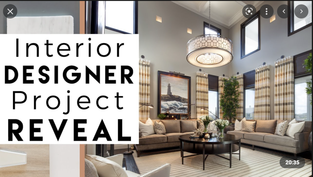
From Youtube to exemplify the idea of the ‘reveal’

I really dislike the reveal. Also called the ‘install’ by Interior Designers.

Think of it this way: It’s difficult to smooth a layer of textiles and trendy furniture (we cannot forget the ultimate trendy Matisse print!, framed or unframed, you know the one) over a room and expect it to work. It’s like trying to ice a cake in delicious home-made buttercream when the cake itself is half-cooked or tastes like cardboard. It just won’t taste the way you want it to, nor will it last (will you think back and say, hey– that cake worked great last time, let’s do it again with a bigger budget?). 

The ‘install’ feels a little like this cake. Homes feel staged. Inauthentic. Devoid of personality. The owners are presented with an ‘instant’ room. Over time I have come to learn to treat interiors with as much consideration and thought for the occupants/owners as we do the structure. It is difficult to go down a checklist of what is popular now and build a room that both feels like you and will still look good and still feel authentic in 5 or 10 years. There is a focus to make this transformation instant and exciting (which makes for good TV…) rather than considered and layered. How many people really fit and love the current trends of shiplap, a sheepskin throw, muted neutrals, and an abstract painting that a consultant selected without input? You deserve a home beyond trendy and decorative.

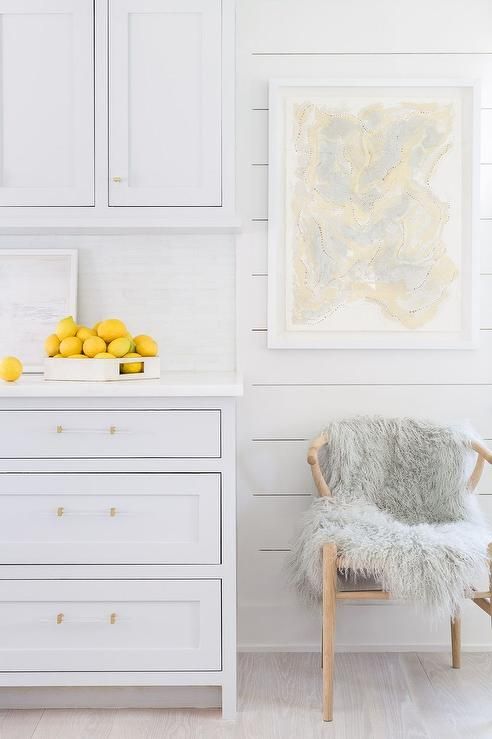
A room we have seen over and over. Shaker cabinets with sheepskin and lemons. Styled to offend no one.

Your home should feel relevant. Truly, the only way to make your home more authentically you and different from everyone else’s is to have your home evolve from your experiences, history, culture etc… The most interesting and exciting homes are those that display these unique aspects and spark questions and interests and can be the basis for a great story.

As I said, architects are not decorative. Certainly, one thing may be chosen over another for aesthetics or great lines (we all have our weaknesses), but the idea of pure decoration is a classic architectural no-go. I love homes where people have a really good foundation (great space, good colour palette, wonderful furniture– think a great cake recipe) and over time layer it with all those finishing touches a la HGTV that come from family, travels, art that you picked because you loved it– not the closest Ikea or Target (a good icing).

Everything has a connection and a story. The lamp was found next to a garbage bin in New Delhi. The sculpture is by an Indian artist found in a gallery in Varanasi.

In my own home, things are a bit idiosyncratic. But it works. We have a mix of collected ceramics, art, family photos that blend with a modern home because we made space to highlight the things that are important to us. Our personal touches get pride of place and everything has a story and a connection to my family.

Slow collecting over years from our travels. Put collections on trays to frame them.

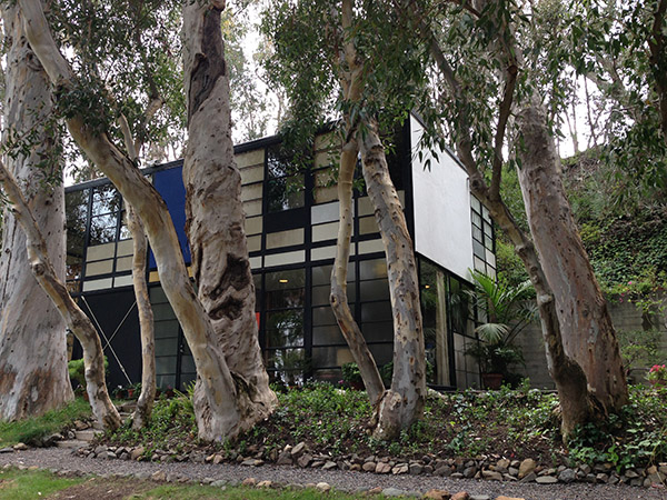
Consider the Eames Case Study house in the Pacific Palisades– a completely modern home, an absolute machine for living. And yet, it feels lived in and loved because it is filled with personal items and things from the Eames’ travels. A classic modern box dressed with absolute personality.

Outside of the Eames Case Study House
Inside the Eames Case Study House in Pacific Palisades
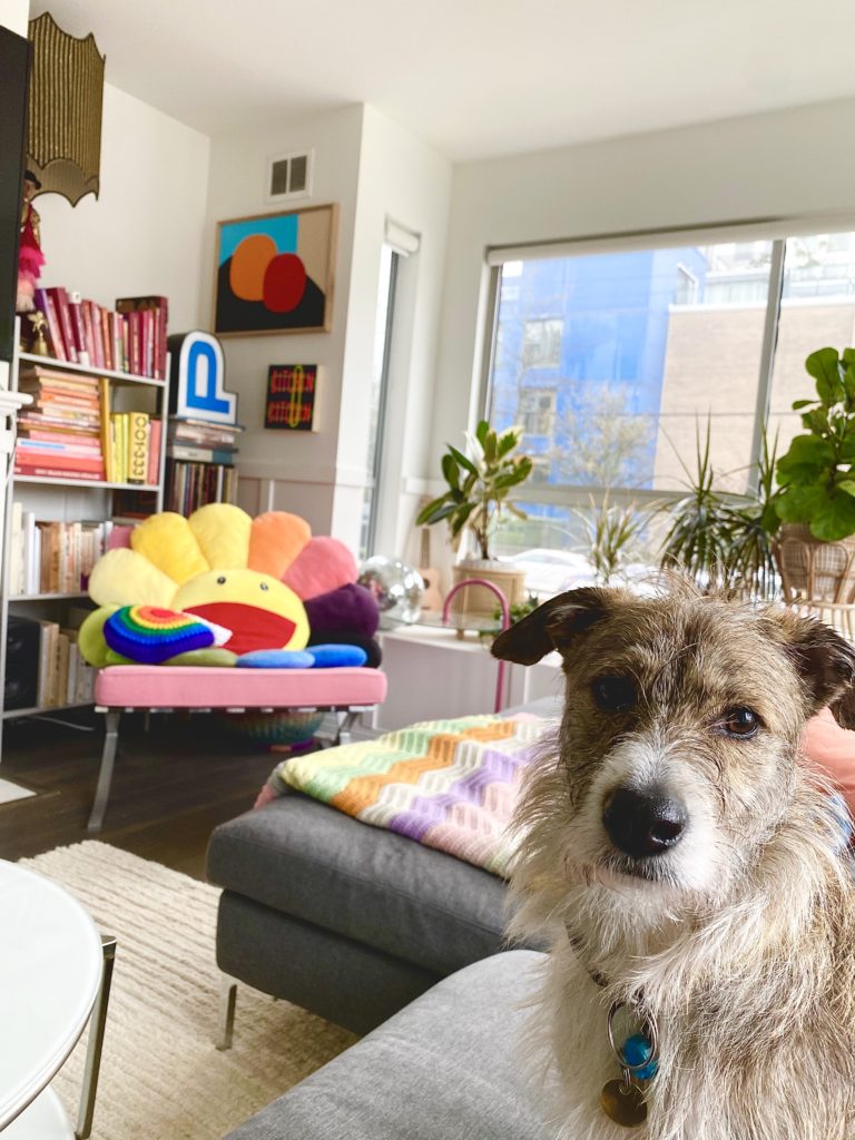
A great example of how this couple has added their personality to their home.

Another family friend has an equally striking home– lots of white and neutrals and softness that complement the taste of the owners, but the entire space is punctuated with objects they find beautiful.They set a strong foundation that showcase the things they love.

It bears repeating, architects are not decorative. We can’t help but see the relationship between everything in a space, it’s what we’re trained to do! To really build a space that works, it is a slow and involved process that should feel like you each step of the way. 

The obsession with instant fixes and trendy makeovers that build up to a ‘big reveal’ might make a space feel fresh, but does it really work? Do you really love it? Do you feel like you’re living in a magazine shoot that wasn’t built for you?

In summary, your home does not need to be perfect from the get-go. There is no downside to taking your time and layering yourself into a space with colours you like and things you love. It may not happen over a weekend, or make for great TV– but you will slowly build a space that reflects your taste, your experiences, your story. 

Local Is the New Black: ADDRESS for a Fine Home

Sorry I’ve been MIA, but I’ve been busy working on a number of different projects that I hope to share with you soon.

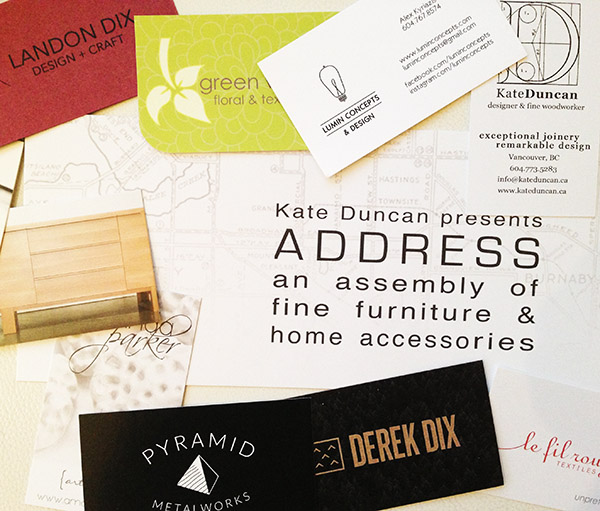
Today I did some design sleuthing. The Chinatown Experiment showed up on my Instagram feed so I headed down to 434 Columbia street to see ‘ADDRESS’ an assembly of fine furniture and home accessories put together by Kate Duncan. ADDRESS is a carefully curated display of locally designed and crafted furniture, lighting, textiles, artwork, as well as natural and sculptural home accents.

business cards

I met Kate and was very impressed by the wood furniture and accents which she personally designed and made. There were beds, coffee tables, cutting boards, dressers, and an amazing bathroom cabinet made from a number of different maple finishes.

chinatown expirement bed

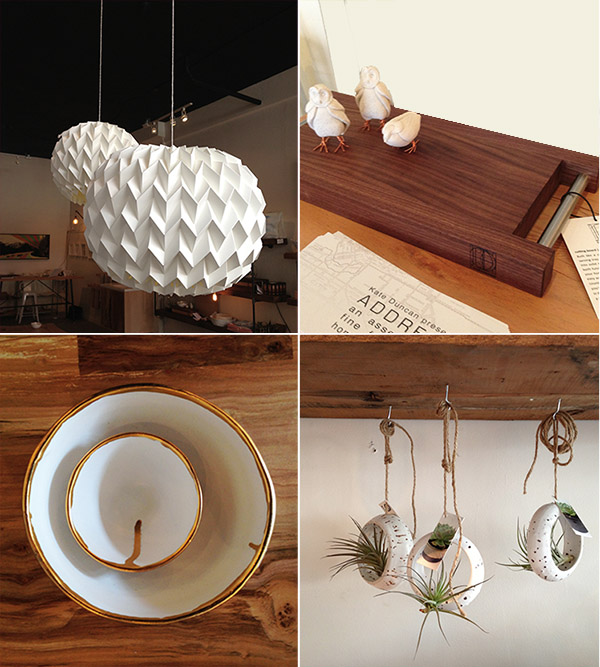
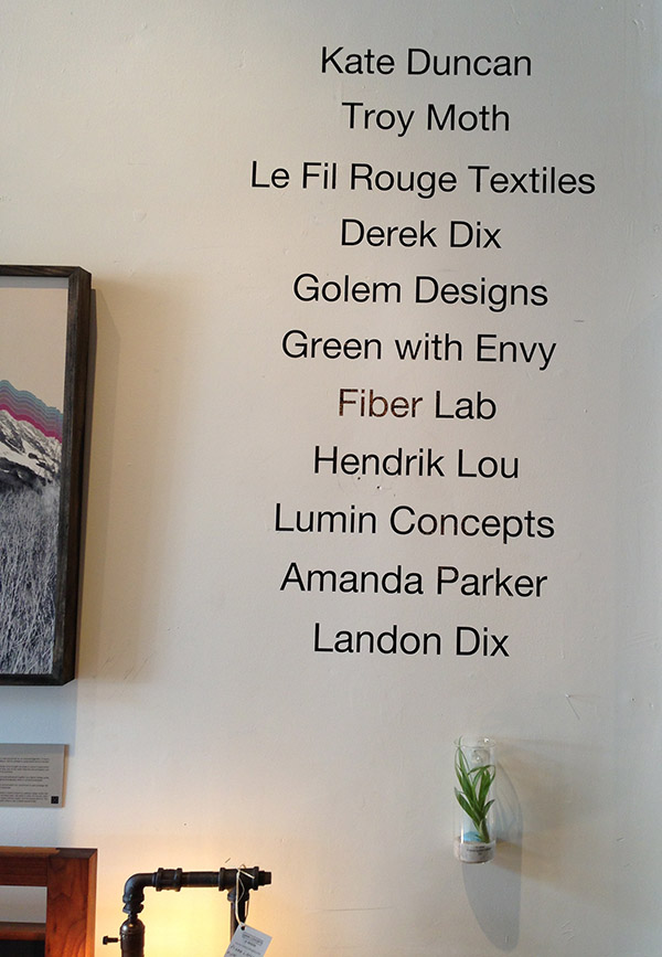
The lighting here by made by Alex Kyriazis out of plumbing pipe, wood and a very good looking bulb. Ceramics are by Golem Designs. The knit blankets are by Hendrik Lou, Painting by Derek Dix

bathroom cabinet

Maple bathroom vanity by Kate Duncan. Terrarium by Green with Envy.

details

Cutting board by Kate Duncan, owls on cutting board by Amanda Parker, ceramics by Golem Design, Terrarium by Green with Envy. Textiles by Le Fil Rouge. Hanging sculpture is by Justina Yang of Fiber Lab. Justina is a one-time structural engineer who “uses math and science to create beautiful things.”

pillows plusThe watercolour effect pillows are by  Le Fil Rouge Textiles, terrarium by Green with Envy, ceramics by by Golem Designs.

coffee tables

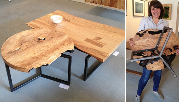
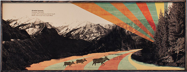
Kate showing me the quality of the metal work on the maple coffee tables she has made. Painting below is by Derek Dix and is a collage of evocative outdoor images.

painting by Derek Dix

artist namesADDRESS is at the Chinatown Experiment until June 3. Come down, have a look and support our local artisans and craftspeople. The work is so impressive!

Designing the Gingerbread House

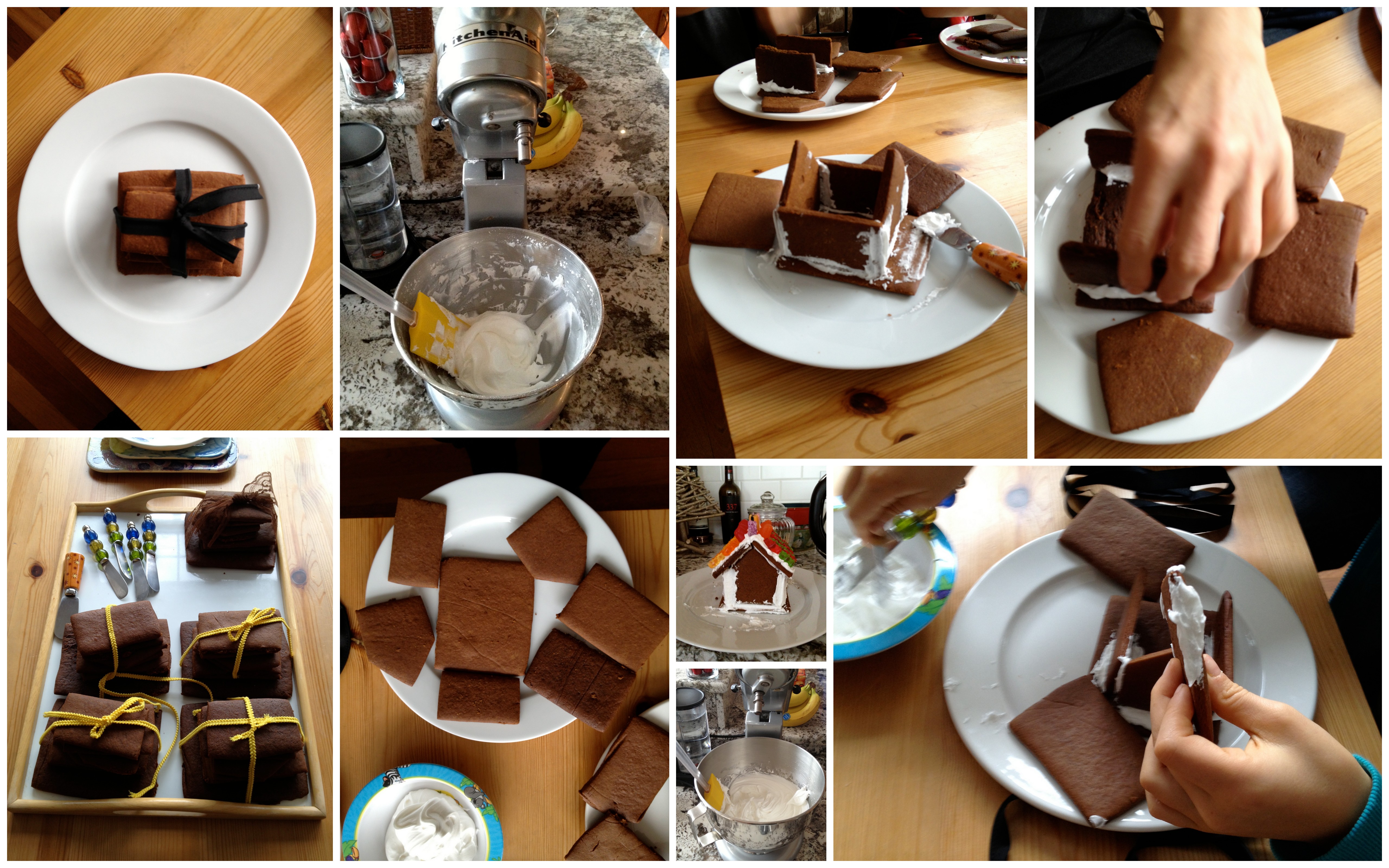
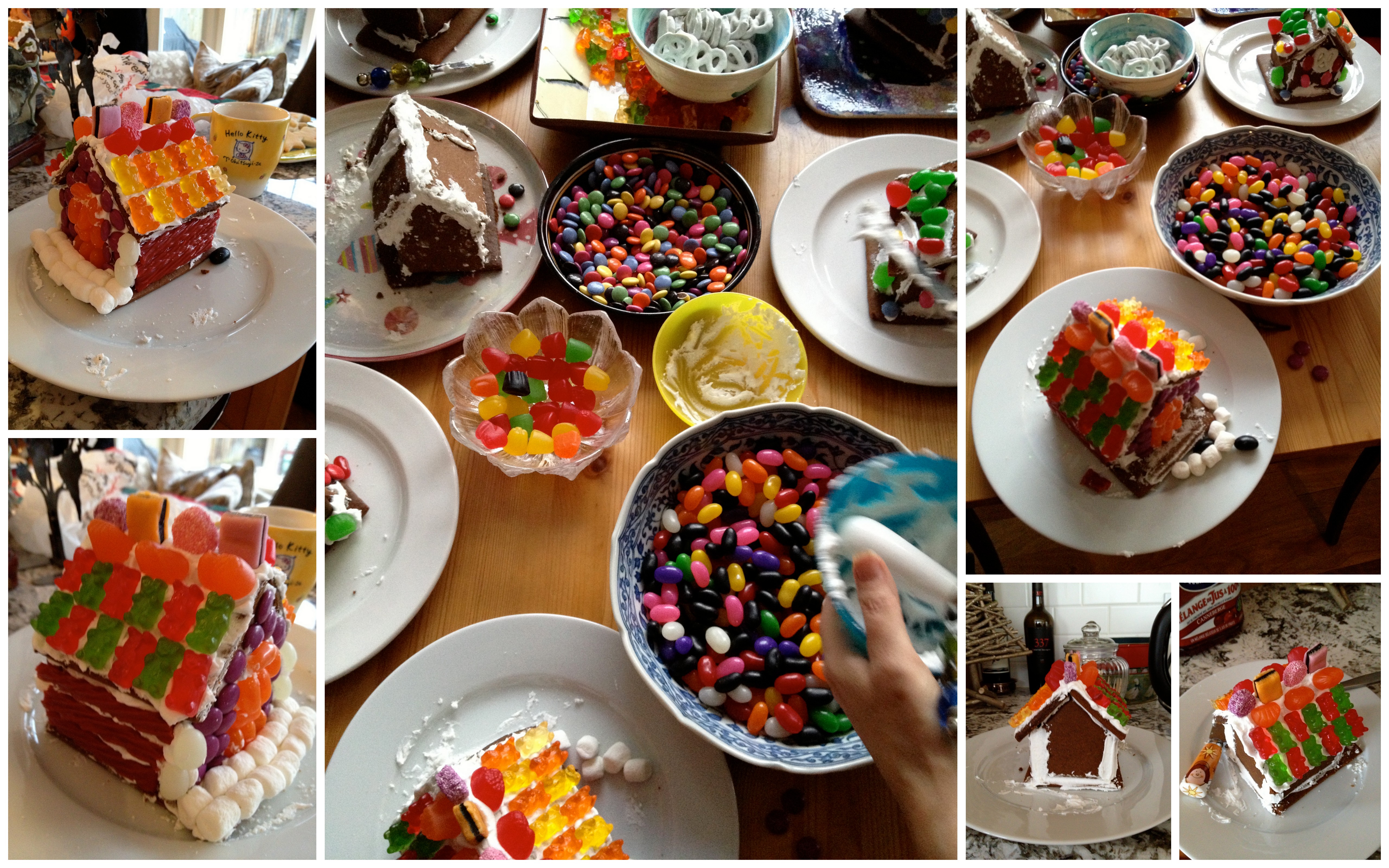
Got an invitation to make gingerbread houses at a friend’s. What fun! So many decorating options and so much pressure being the only Architect in the room. So I decided to just let my instincts and fingers do the designing and not think about the result at all. So here it is:

Constructing the house:

gingerbread collage 1

gingerbread 2

Decorating my ‘house.’  A fun and original way to express yourself, and have some holiday fun!

What’s Behind the Sticky Fingers Zipper?

What’s behind the Sticky Fingers zipper?

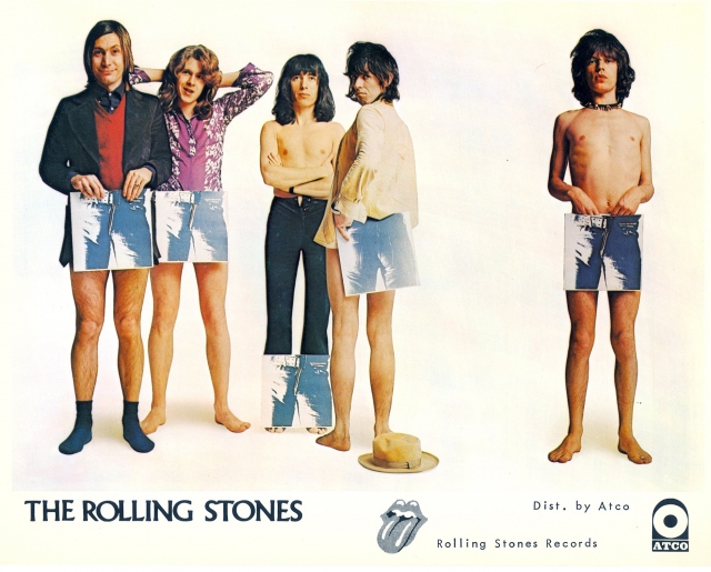
Everyone from my generation remembers the original Rolling Stones ‘Sticky Fingers’ album. The photograph is of a male in tight jeans with a working real zipper that you could unzip to reveal a mystery.

(photo from http://garyrocks.wordpress.com)

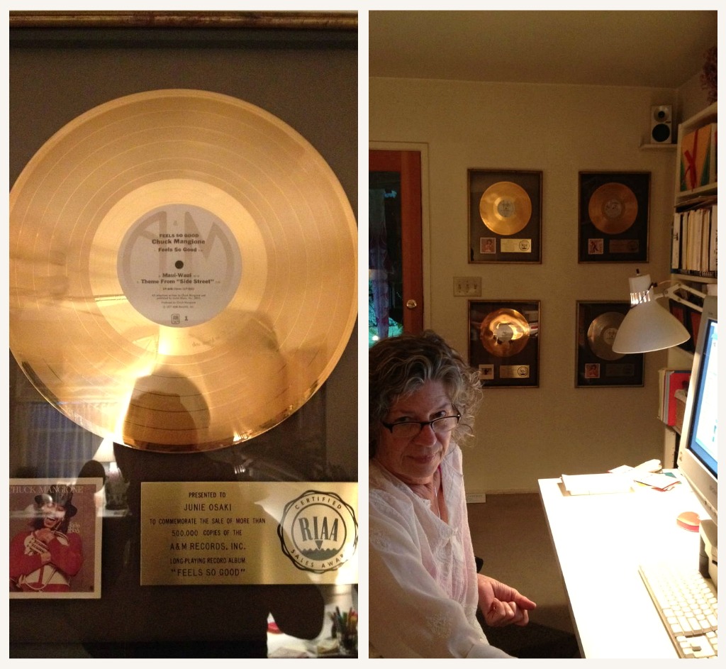
Meet designer, Junie Osaki. Junie lives in a charming, and oh-so-fascinating cottage in the LA area.  It’s the kind of place you want to spend some time snooping because everything she has collected, and has hanging on her walls, has incredible music history attached to it. Her place really resonated with me because I remember being a 14 year old obsessed with ‘rock and roll’ and Rolling Stone Magazine. Junie shared with me the story of the Rolling  Stones, Stickey Fingers record Album.

Junie is a graphic designer who worked in the music industry in its heyday. She is an award-winning designer for the work she did on Art Direction and Design for TARANTELLA By Chuck Mangione for A&M Records. I met Junie through our mutual friend, Ann, and had an opportunity to connect with her on my last trip to Los Angeles. I have never met anyone like Junie. She has so much energy and has an incredible memory that can recount every detail of an event that happened years ago. Junie’s involvement in the recording industry enriches her stories as well her personal spaces as you will see. Before we take a tour of Junie’s place I wanted to share a very interesting piece of history I learned from Junie.

Junie is a close friend of Craig Braun, the Art Director who was involved in the design of the iconic Rolling Stones ‘lips and tongue’ logo and the famous album cover art of Rolling Stones Sticky Fingers in 1971. Craig Braun, Inc, created and produced an exclusive line of jewelry, and promotional items, that he named “LICKS” based on the album’s logo and was the official licensee for Musidor, the licensing company for the Rolling Stones. To coincide with the record’s release, an entire package of “Lips & Tongue”-based merchandise hit the stores.

Junie told me the story of the design behind the Rolling stones Sticky Fingers album. This is my interpretation of her story. I hope I have it right!.

The album’s artwork shows a close-up of a jeans-clad male crotch. The cover of the original (vinyl) release featured a working zipper and mock belt buckle that opened to reveal cotton briefs. Behind the zipper, the white briefs were rubber-stamped in gold with the name of American pop artist Andy Warhol. Junie informed me that while Warhol conceived the artwork, the design and concept was by Craig Braun, an Art Director in the music industry. Craig also developed the concept behind Alice Cooper’s School’s Out album, and a number of other concept albums.

The crotch shot was not Mick Jagger, but an artist from Andy Warhol’s Factory. The album was the first time the Rolling Stone’s used their new “tongue & lips” logo. There is some controversy as to who actually designed the logo but according to Wikipedia the logo was originally designed by Ernie Cefalu and it was this version that was used for much of the merchandising, and  the design that was originally shown to the band by Craig Braun. The design used for the album was a further refinement, and was done by John Pasche, who Craig Braun actually credits for designing the logo. Craig does not endorse the idea that Cefalu was the logo’s designer.  What is interesting is the coming together of talents in the production of one rock n roll artifact. Like rock n roll itself, it is not a one person proposition, it takes a team.  The same can be said for ‘design.’

Junie’s design sensibility goes further than the recording industry. Her cottage is charming and so full of iconic American rock and roll history. Have a look for yourself.

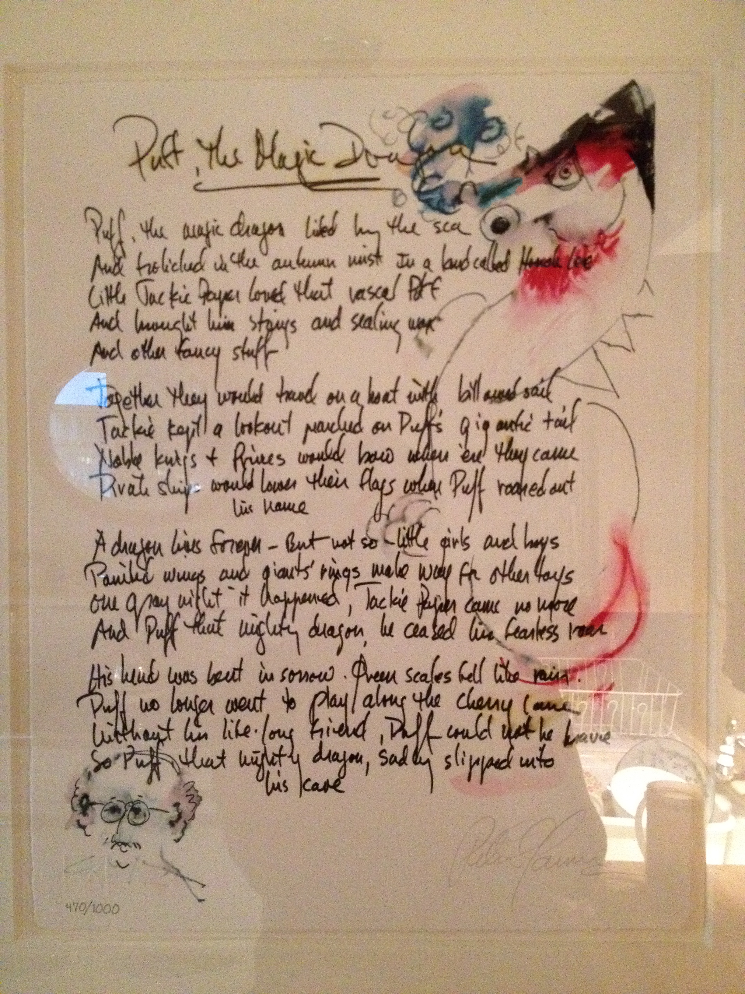
Limited edition print of ‘Puff the Magic Dragon’ hand written out by Peter Yarrow, of Peter, Paul and Mary.

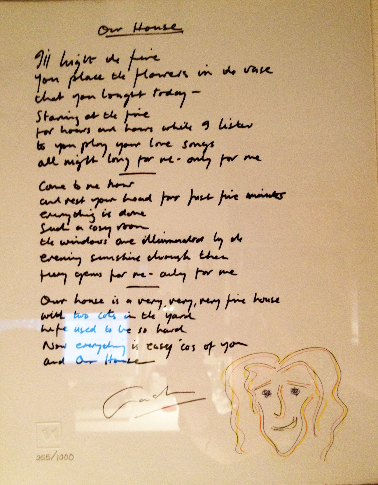
Limited edition print of ‘Our House’ hand written out by Graham Nash, of Crosby, Stills, Nash and Young.

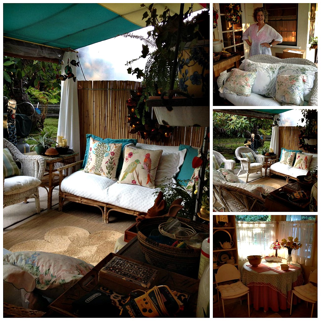
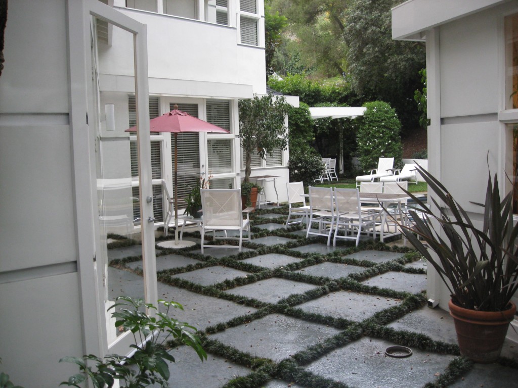
Junie’s cottage is small so she has moved her ‘living space’ outdoors. Her outdoor room is beautiful and totally appropriate for the warm weather of California.

Junie’s cottage is an example of one of those hidden gems that are tucked in amongst conventional suburban landscapes all over North America, and especially in artistic communities like Los Angeles. I have learned that many of us have remarkable stories under seemingly conventional facades.

Vintage Love: Vancouver

If you read my last blog you will know that I love buying vintage.  This includes clothing, jewelry, home furnishings or interesting chachkas. These two items came from a great shop on the west side of Vancouver. The punchbowl, made of turquoise milk glass, is probably from the 30s but I have been told it could be a late as the 40’s or 50s.   The punch bowl has a grapevine pattern and comes with 10 matching cups. Although I am very drawn to the colour and shape of the bowl, I can’t justify paying the hefty $750 price tag.  When I shop vintage I am looking for really good deals!

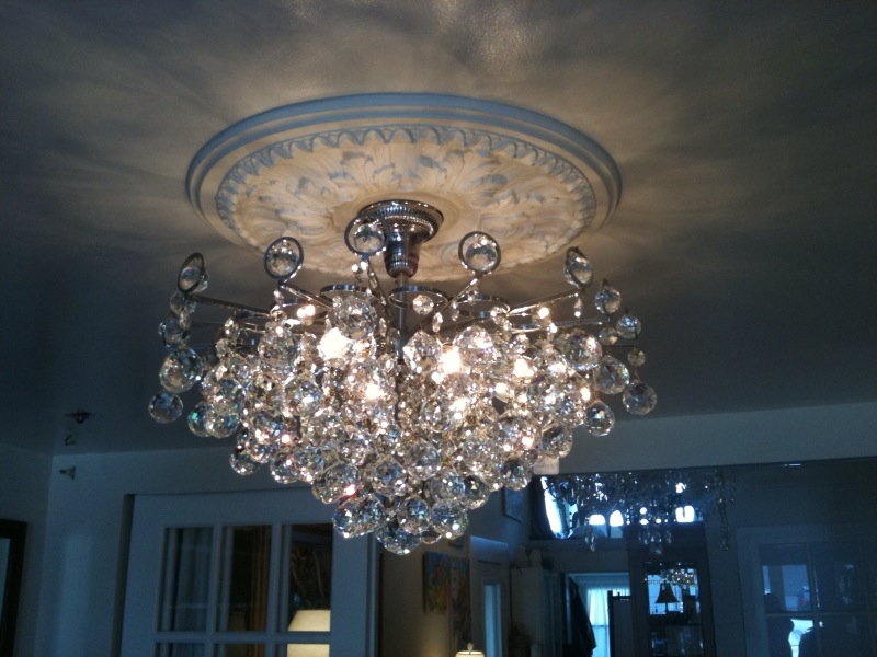
The chandelier has hanging crystal golf balls mixed with circular chrome details giving the light a modernist look. This light would definitely add some sparkle to any modern room.  What do you think?

Had any interesting vintage buys lately?  I’d love to hear about them!

Vintage Love: The Tourist

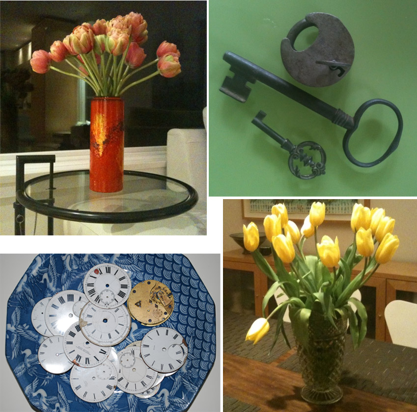
One of Graham’s and my favourite things to do when we travel is to visit flea markets, vintage shops and thrift stores.  We have visited these in Santa Barbara, Berkeley, Los Angeles, and Seattle as well as many Canadian cities.  In Europe, we have been to the famous Amsterdam flea market, the seemingly endless Portobello Road in London and riverside markets by the Seine in Paris, to name a few.  You may well wonder WHY do we do this.  Well, I think it is part of our tourist curiosity. It is part of really exploring a place in that it tells us something about the city we are visiting.  There is something intimate and unique about looking through peoples discarded treasures. You learn something about the place and the people who live there that conventional retail just doesn’t offer.  The Good Will in Santa Barbara was full of designer clothes and wet suits.  I bought my favourite vase for $5.00 from here.  Graham was not keen on traveling with glass but I told him I would put it in my carry on and would not leave the store without it.  I use that vase regularly and always think about Santa Barbara and how I must get back to that Good Will soon. 

We also bought a pair of beautiful oriental figurines from an antique store in Berkeley, California. They were $25.00 and I had to have them.  I love these Kitschy Chinoiserie figurines from the late 50’s with their incredible verdigris green and gold colour combination. In Paris we bought vintage keys in a used building supply yard and old pocket watch faces in the riverside market in London.

Of course, the main reason we love vintage shopping is the treasure hunt. We secretly hope we are smarter than the average local and will cleverly discover an unrecognized, unappreciated treasure. Or, we imagine that others may find the activity unsavory yet we will sally forth and heroically find the treasure. At any rate, travel is not about consuming generic, prefab souvenirs (Did I get this at the Chicago or San Francisco Macy’s?) Authentic tourist-vintage-love is about bringing home a unique item that is specific to its place.  Let’s face it, a chain store item can be found almost anywhere but a vintage piece from a quirky, backstreet shop is a one-of-a-kind memento.

It’s also a great way to meet interesting people, either shoppers or shopkeepers who share your interest in the unusual, esoteric world of vintage.  They often have a sophisticated appreciation of a piece’s history and origins and this inevitably leads to a bit of local lore – sometimes even a touch of celebrity – like when we happened upon Leonard Cohen’s daughter’s shop in L.A.  So next time you travel be bold and venture off the main drag.  Look for that charming down-market area, with that dowdy/funky little shop to discover something unexpected, fun and most likely affordable.  You’ll find yourself with a cool souvenir plus a great story to go with it.

Those with ‘It’: Pati’s House


Pati and her husband live in the Brentwood area of Los Angeles.  The empty nesters have a modern home with a fabulous art collection.  We met Pati, an interior designer, in Vancouver and had the opportunity to see her wonderful home in L.A. when we were invited to attend her annual Hanukkah celebration. Click on images to enlarge.

Pati asked me if I knew what the metal art piece on the left was. She felt because I was an Architect  I would know. I spend a good deal of time trying to figure it out. I saw it as a series of city blocks and streets but I apparently was wrong. What do you think?  Any ideas?

Chinatown Zeitgeist: From Wing Sang to Burlesque; Art imitating Art.

Our trip to Wing Sang to see Amy Bessone and Thomas Houseago.

I am very fortuante to have a group of friends that meet once a month or so to share ideas and thoughts.  This month’s get together was to see the new art collection at Bob Rennie’s Wing Sang Gallery. The exhibition was of Los Angeles-based artists Thomas Houseago and Amy Bessone, who both deal with the figure and representations of the figure in a contemporary and insightful manner.

Amy Bessone’s work is evocative, and is described as often translating porcelain figurines into 2D. Many of the paintings on display reference the traditional female nude, both in her representations of porcelain figurines and in more recent paintings that simply allude to the nude. “Since her student days, she has been interested in the idea of a painting of a sculpture or a painting of a painting, much like the Shakespearean idea of a play within a play. She is influenced by the theatre, and the sculptors with whom she surrounds herself.”

Bessone applies paint thinly, allowing the white of the gesso’d canvas to show through to depict the highlights of the porcelain as the light falls over the figurine. The Narcissist (2007) is a classic example of this effect, creating a sense of both knowing what something is and not knowing – is it a portrait? Is it a still-life? Or is she a lifeless object, objectified for her sexuality? Her more recent paintings like 80s Life (2010) seems to remove this passive male objectification by swift and economic painting over the canvas, eschewing the gaudiness excessive paint can provide. Bessone has brought the female figure back to life through the act of painting.” (From the Wing Sang brochure)

Back to my evening with the girls;

As I revisit our tour of the show I realize there is a connection between Amy Bessone’s work and the rest of our evening.  After our tour of Wing Sang we ended up around the corner at The Keefer.  As the hours passed our numbers dwindled leaving only 4 of us for what turned out to be Burlesque night at the Keefer.  What immediately struck me was the Zeitgeist of the evening; that is, the cultural connection between the Burlesque and Amy Bessone’s show at Wing Sang.

Both genres are evocative of the kitsch ‘pin-up’ girls of the past. Pin-up artwork, depicting idealized versions of particularly beautiful or attractive woman from a man’s perspective clearly parallels the sexualized vision of womanhood displayed in Burlesque.

In 2008, The New York Times noted that Burlesque had made a comeback in the city’s art performance scene.  Today Neo-Burlesque has taken many forms, but all have the common trait of honoring one or more of burlesque’s previous incarnations, with acts including striptease, expensive costumes, bawdy humor, cabaret and more.

Derived from literature and theatre, ‘burlesque’ is used in classical music to indicate a bright or high-spirited mood, sometimes as counterpoint to seriousness. In burlesque, performers, usually female, often create elaborate sets with lush, colorful costumes, mood-appropriate music, and dramatic lighting, and may even include novelty acts to enhance the impact of their performance. The striptease element of burlesque became subject to extensive local legislation, leading to a theatrical form that titillated without falling foul of censors.

Clearly the post modern descendants of Burlesque and Pin Up Art enjoy some of the same sensuality and titillation as their original forms, made that much more of a guilty pleasure in the current climate of political correctness. This same contrast also adds a layer of self-conscious, retro sophistication to these pieces where we simultaneously laugh at their relatively modest sexuality while yearning for the simpler times when a flash of skin was considered scandalous.

Like burlesque, girl’s night is a little more rich and complex than it used to be.

Those with ‘It’: Homes that must be seen-Leslie’s.

My friend Leslie has a home that must be seen. It is beautiful, and thoughtfully designed and appointed. Leslie’s poetic use of Indian sculpture and art, coupled with her husband Tim’s photography, make her place unlike anyone else’s. See for yourself.