Building A Home – A Long, Layered Approach.

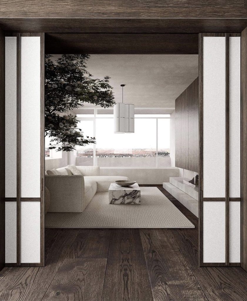
Room designed by Lassel Fragtrup. The focus is on the entire space. The furniture melts into the room so that the fireplace and coffee table take centre stage.

“Ornament is Crime” Adolph Loos

Architects are not decorative. Our focus is on the spatial. That is, how can we make our spaces better. How can we make them appealing without any decoration at all. While part of an architect’s practice absolutely focuses on dressing interiors and adding finishing touches for clients (myself included!) there is always an eye fixed on the bigger picture. The form, the function, the relationship of built areas and voids, each space as it relates to and works with the other spaces– it’s always there in the back of my mind. The dip into some HGTV buzz words, the bones of the house are equally important (and influential on the space) as the finishing touches to make a space feel yours, feel authentic. And, any decoration that is added to a space has a reason to be there. It is meaningful.
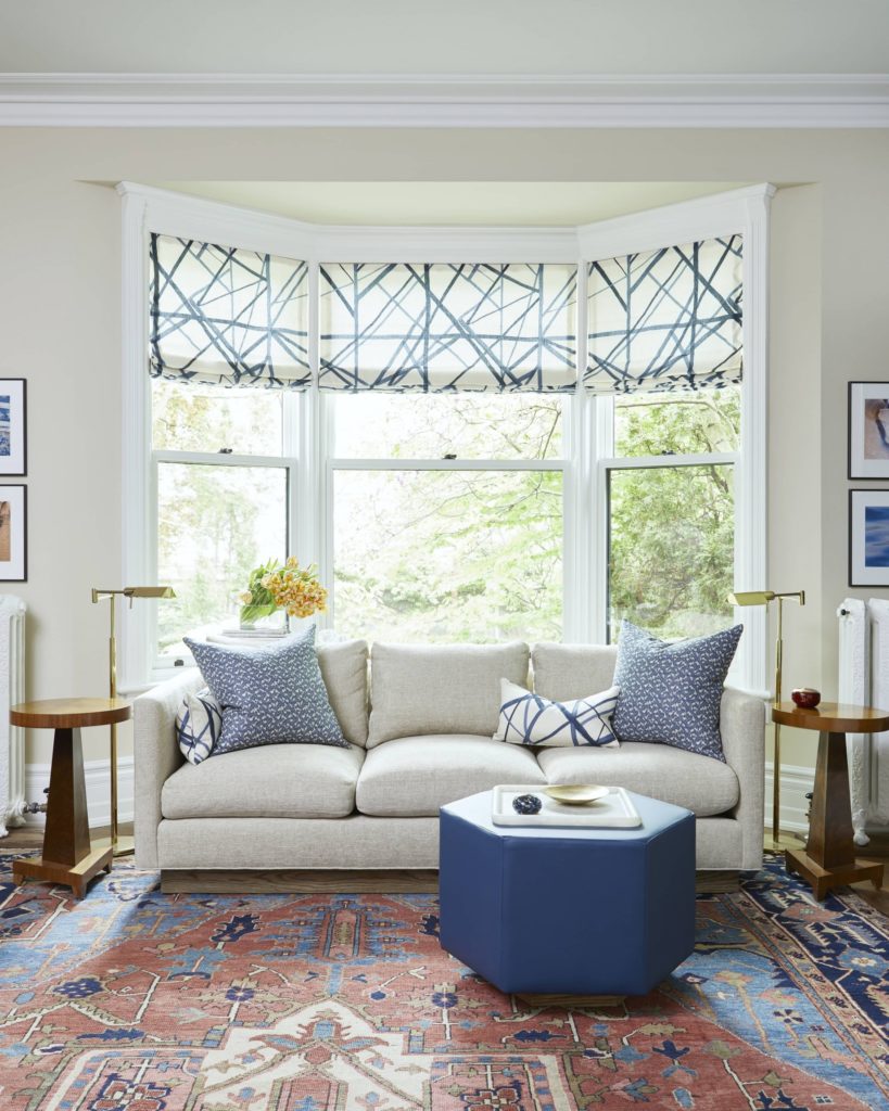
A ‘decorated’ room by Sarah Richardson. The symmetrical end tables, lamps and pictures and the matchy-matchy accessories make the room feel decorated rather than evolved. The carpet is the most spectacular thing in the room and gives some hints about the owner’s personality. I’d like to see more personal items in the space to make it feel more authentic.
This room feel more authentic. There is no symmetry or matchy-matchy in the space. The neutral backdrop allows the owner’s of objects of art to speak on behalf of the owner.

Speaking of HGTV– I’ve been thinking a lot about the many, many, interior design shows that have been on in the last 10 or 20 years. For a lot of people, either design lovers, the design curious, and (before Netflix and Hulu… HGTV is vintage!) those stuck watching TV on the couch at 2pm when sick and nothing else in on… these design shows are the first taste of ‘interior design’. 

The shows typically all work the same. You get a tour of a home that the owners love, but it needs a ‘refresh’. The TV design team comes in and whirls around with tape measures, fabric samples, a carpenter with a pencil behind their ear, and an interior designer with fantastic hair. Then, the house is a construction zone and everyone wears a hardhat (can it even be done in time?!). When the paint is dry (our first glimpse into the “makeover”) we get a lot of short and quick shots of people bringing in furniture, a pillow gets fluffed and placed just so, maybe some new candlesticks are tastefully added to a mantel or bookcase (perfectly styled), and usually a photo of the couple/family is placed somewhere with a wink and the host exclaiming ‘time to show the homeowners!’. Then we have the REVEAL. The home owners see their new home and often it’s a lot of ‘oh wow!’.
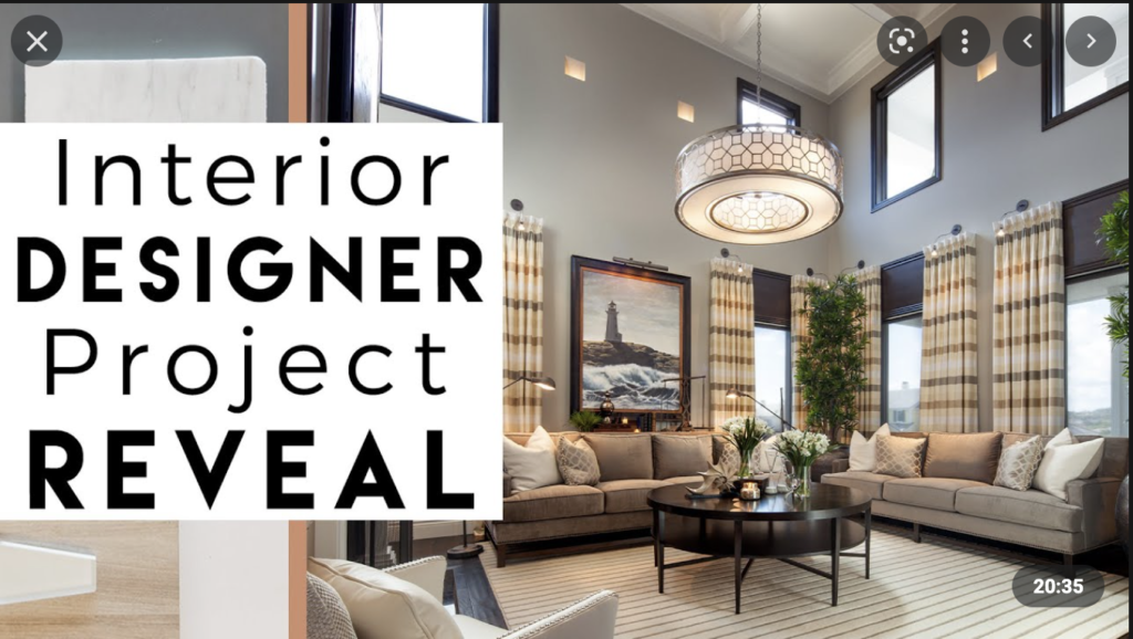
From Youtube to exemplify the idea of the ‘reveal’

I really dislike the reveal. Also called the ‘install’ by Interior Designers.

Think of it this way: It’s difficult to smooth a layer of textiles and trendy furniture (we cannot forget the ultimate trendy Matisse print!, framed or unframed, you know the one) over a room and expect it to work. It’s like trying to ice a cake in delicious home-made buttercream when the cake itself is half-cooked or tastes like cardboard. It just won’t taste the way you want it to, nor will it last (will you think back and say, hey– that cake worked great last time, let’s do it again with a bigger budget?). 

The ‘install’ feels a little like this cake. Homes feel staged. Inauthentic. Devoid of personality. The owners are presented with an ‘instant’ room. Over time I have come to learn to treat interiors with as much consideration and thought for the occupants/owners as we do the structure. It is difficult to go down a checklist of what is popular now and build a room that both feels like you and will still look good and still feel authentic in 5 or 10 years. There is a focus to make this transformation instant and exciting (which makes for good TV…) rather than considered and layered. How many people really fit and love the current trends of shiplap, a sheepskin throw, muted neutrals, and an abstract painting that a consultant selected without input? You deserve a home beyond trendy and decorative.
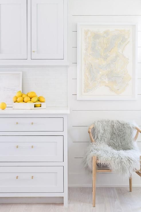
A room we have seen over and over. Shaker cabinets with sheepskin and lemons. Styled to offend no one.

Your home should feel relevant. Truly, the only way to make your home more authentically you and different from everyone else’s is to have your home evolve from your experiences, history, culture etc… The most interesting and exciting homes are those that display these unique aspects and spark questions and interests and can be the basis for a great story.
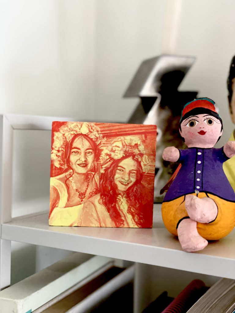
As I said, architects are not decorative. Certainly, one thing may be chosen over another for aesthetics or great lines (we all have our weaknesses), but the idea of pure decoration is a classic architectural no-go. I love homes where people have a really good foundation (great space, good colour palette, wonderful furniture– think a great cake recipe) and over time layer it with all those finishing touches a la HGTV that come from family, travels, art that you picked because you loved it– not the closest Ikea or Target (a good icing).

Everything has a connection and a story. The lamp was found next to a garbage bin in New Delhi. The sculpture is by an Indian artist found in a gallery in Varanasi.

In my own home, things are a bit idiosyncratic. But it works. We have a mix of collected ceramics, art, family photos that blend with a modern home because we made space to highlight the things that are important to us. Our personal touches get pride of place and everything has a story and a connection to my family.

Slow collecting over years from our travels. Put collections on trays to frame them.

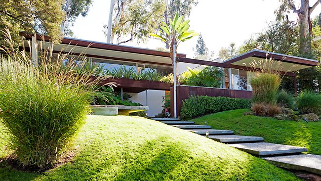
Consider the Eames Case Study house in the Pacific Palisades– a completely modern home, an absolute machine for living. And yet, it feels lived in and loved because it is filled with personal items and things from the Eames’ travels. A classic modern box dressed with absolute personality.
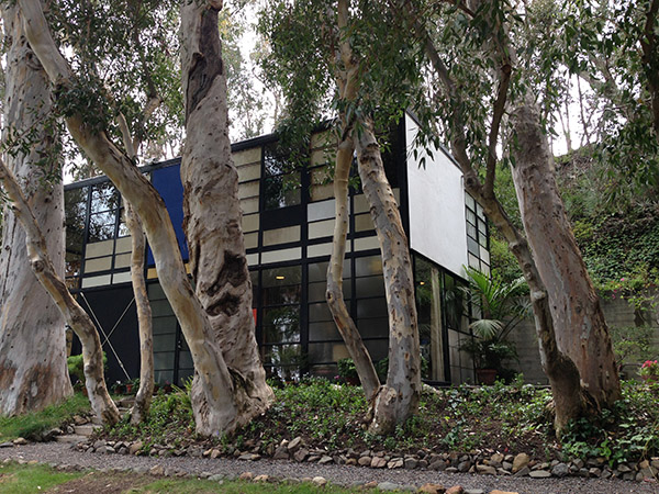
Outside of the Eames Case Study House
Inside the Eames Case Study House in Pacific Palisades
A great example of how this couple has added their personality to their home.

Another family friend has an equally striking home– lots of white and neutrals and softness that complement the taste of the owners, but the entire space is punctuated with objects they find beautiful.They set a strong foundation that showcase the things they love.

It bears repeating, architects are not decorative. We can’t help but see the relationship between everything in a space, it’s what we’re trained to do! To really build a space that works, it is a slow and involved process that should feel like you each step of the way. 
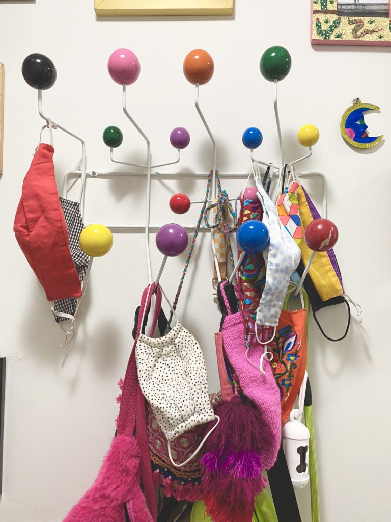
The obsession with instant fixes and trendy makeovers that build up to a ‘big reveal’ might make a space feel fresh, but does it really work? Do you really love it? Do you feel like you’re living in a magazine shoot that wasn’t built for you?
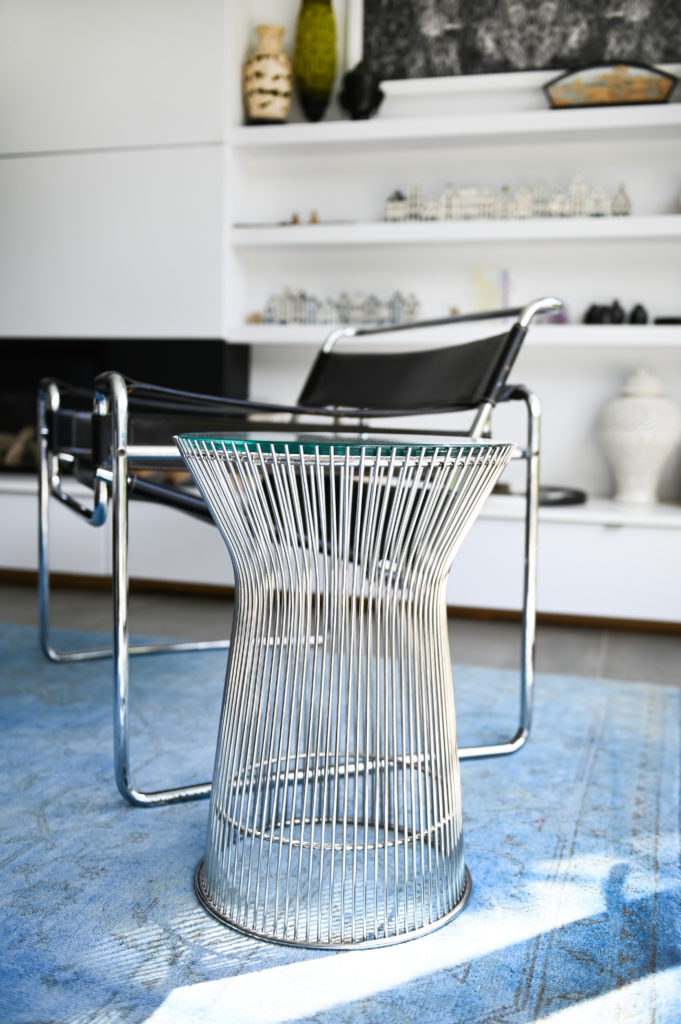
In summary, your home does not need to be perfect from the get-go. There is no downside to taking your time and layering yourself into a space with colours you like and things you love. It may not happen over a weekend, or make for great TV– but you will slowly build a space that reflects your taste, your experiences, your story. 

Architecture as Art and Sculpture

arch as suclpture 2

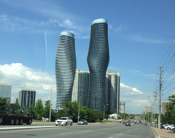
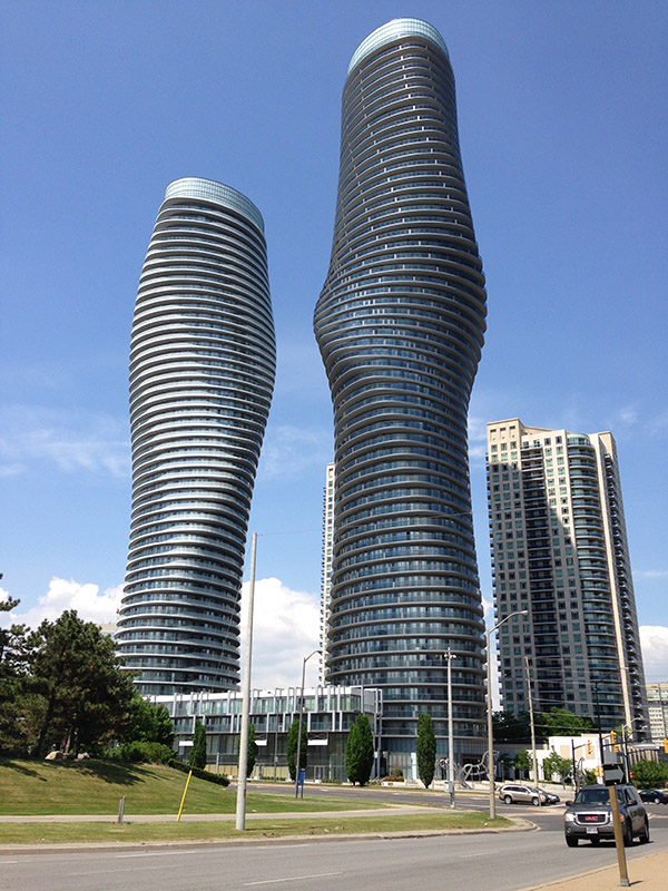
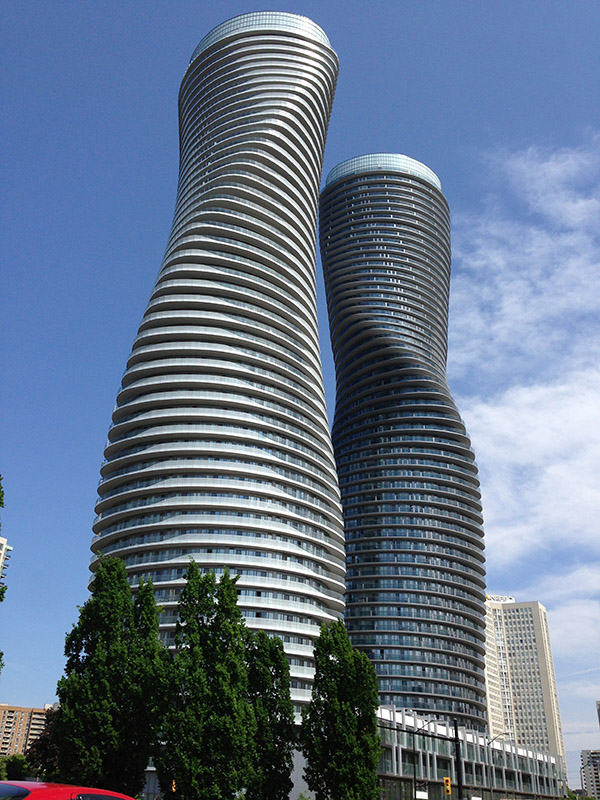
Very prominant along the GTA skyline are the “Marilyn Monroe’ Towers. On our last trip to Ontario we decided it was time to stop and have a look at these towers and their very unusual, non-rectilinear massing.

arch as scupt 1 distanceTheir undulating shape is the design of young Beijing-based architect, Ma Yansong, and his firm, MAD Architects. Ma entered an international design competition hosted by the tower’s developers Fernbrook Homes and Cityzen, and was awarded the project in 2006.

arch as sculpt 3

Within days of the announcement, the taller building had been nicknamed the “Marilyn Monroe” tower due to its curvaceous, hourglass figure likened to actress Marilyn Monroe. Burka Varacalli Architects, a Toronto firm, was hired as MAD’s local partner in April 2007.

arch as scultp 4The building represented constant challenges. In most towers, all but two of the floors are exactly the same, said engineer Yury Gelman. In this building, none of them were the same. The larger of the two towers twists 209 degrees from the base to the top. The towers are 176 metres and 158 metres tall respectively.

arch as scultpure 5It was worth the detour off the Toronto freeway to see these towers in person. They are absolutely magnificent and beautiful to look at. They are indeed works of Art.


Open House Tour in the Silver Lake Hills

silverlake viewThe design highlight of our recent trip to Los Angeles was a self-discovery architectural tour of Silver Lake. I had no idea Silver Lake was such a hot bed of architectural activity. So many of the houses, mid century modern in style, were designed by very well known architects, including Rudolf Schindler, Richard Neutra, John Lautner, and Frank Lloyd Wright to name a few.

silverlake view and table

The icing on the cake was a stop at an open house perched in the hills overlooking the Silver Lake Reservoir. The house was beautifully decorated and according to the real estate agent, Gisele Plouffe, the owners styled the house themselves. The owners of this house have really good taste. Before we take a closer look at the house I’d like to share a story told to us by Gisele.

view to hills

Gisele described a party she attended given by the current owner of Silvertop, the Lautner designed house in the hills just behind her listing.  Evidently the owner, in his 90s, told her the story of how John Lautner and Richard Neutra both had houses under construction on opposite sides of the Silverlake Reservoir, and how they tried to hide their projects from one another.  As an architect, this rivalry didn’t surprise me in the least. Architects are famous for being protective of their work. If I hadn’t stopped at this open house I would never have learned about this little known, classic story.

silvertop

2silvertop


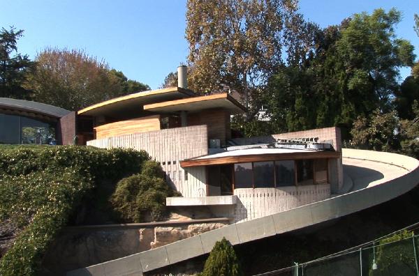
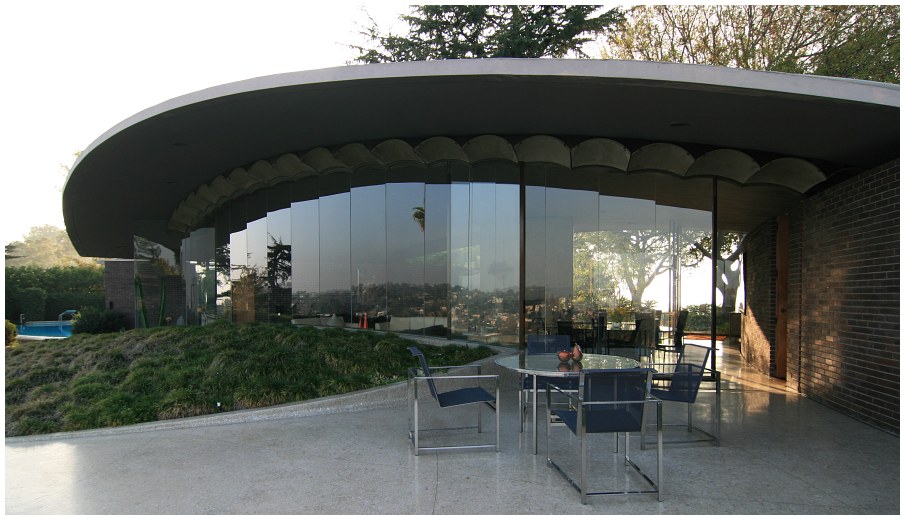
silvertop patioJohn Lautner’s Silvertop House showing the dramatic driveway up and views to the Silver Lake Reservoir from the patio.

Here is the story in Gisele’s own words:

This story was told to me at a cocktail party at Silvertop, by the original owner of the home. Talk about the perfect setting for a Lautner/Neutra story!  It all started when John Lautner was building “Silvertop” in 1957. It is such a huge masterpiece at the top of the hill, on the West side of Silver Lake. As you can imagine at that time, it stood out for all to see. This area is known as the Moreno Highlands, named after Antonio Moreno, actor, who had a huge estate there with his mistress in a home down the street. That’s another story.
“At the same time that Lautner was under construction, his rival architect, Richard Nuetra, was in the process of building a large project on the East side of Silver Lake. A cul de sac, lined with his homes. Name of the street – Neutra Place.

Silver Lake is very hilly and surrounds the lake, which enables homes to view each other from across the lake. There was quite a competitive spirit with both of these men, as well as a jealousy and mutual admiration, I suppose. Well Lautner did not want Neutra glancing across the lake to see what he was doing, perhaps stealing any ideas. So he had to do something to calm his concerns. From the street, driveway entrance to the property, you see nothing, but from across the lake it was a front row seat. He had a huge tarp designed and had it hung up to block any view to his work away from Neutra specifically. The owner thought it was ugly and ridiculous, but Lautner left it there until completion.  The end.

neutraOne of Richard Neutra’s houses in Silver Lake

The Open House:

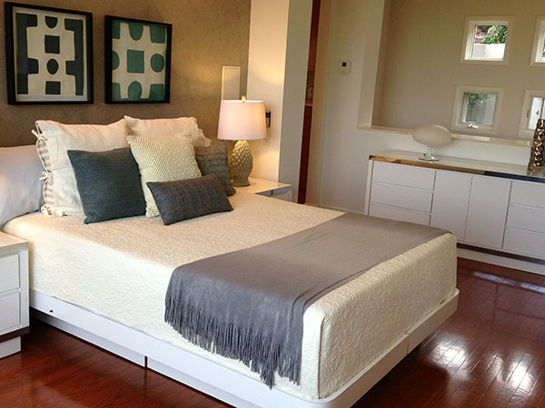
Silverlake 1 full spread

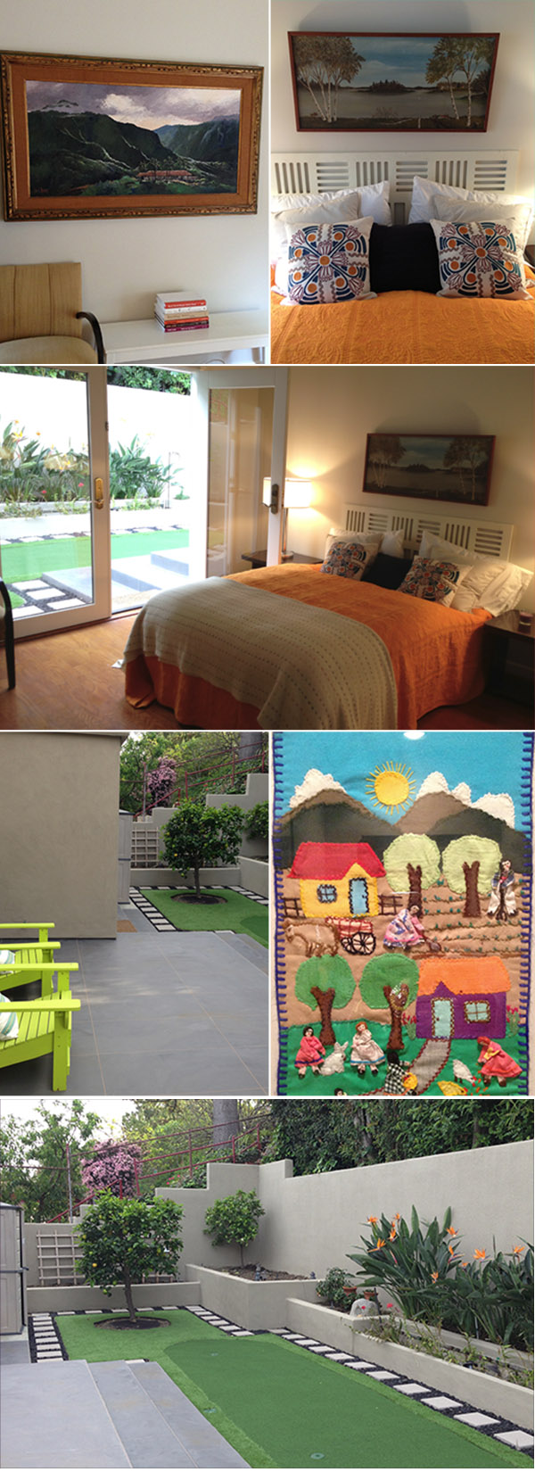
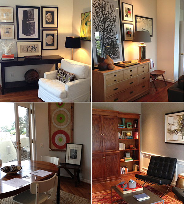
By the way, the open house was lovely, with sweeping views of the hills and the reservoir.  The house had its own putting green off the master bedroom. The owners had a fabulous collection of vintage art mixed with mid century modern pieces. In one bedroom the paintings were original, romantic, vintage Hawaiian.

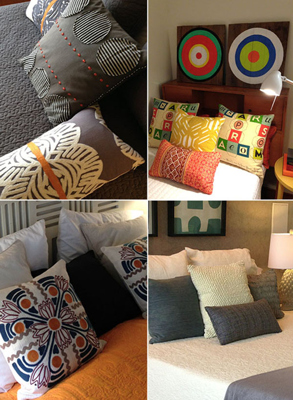
silverlake cushios details2

white bedroom fullmidcent bedroomsilverlake detailsThe whole house was a sophisticated and eclectic mix of colour, art, quirky historic artifacts and whimsical touches, well worth the steep hill and stair climb. If you need a real estate agent in the Los Angeles area, and want to hear some interesting stories give Gisele Plouffe a call!

Women and the Making of the Modern House: The Schroder House

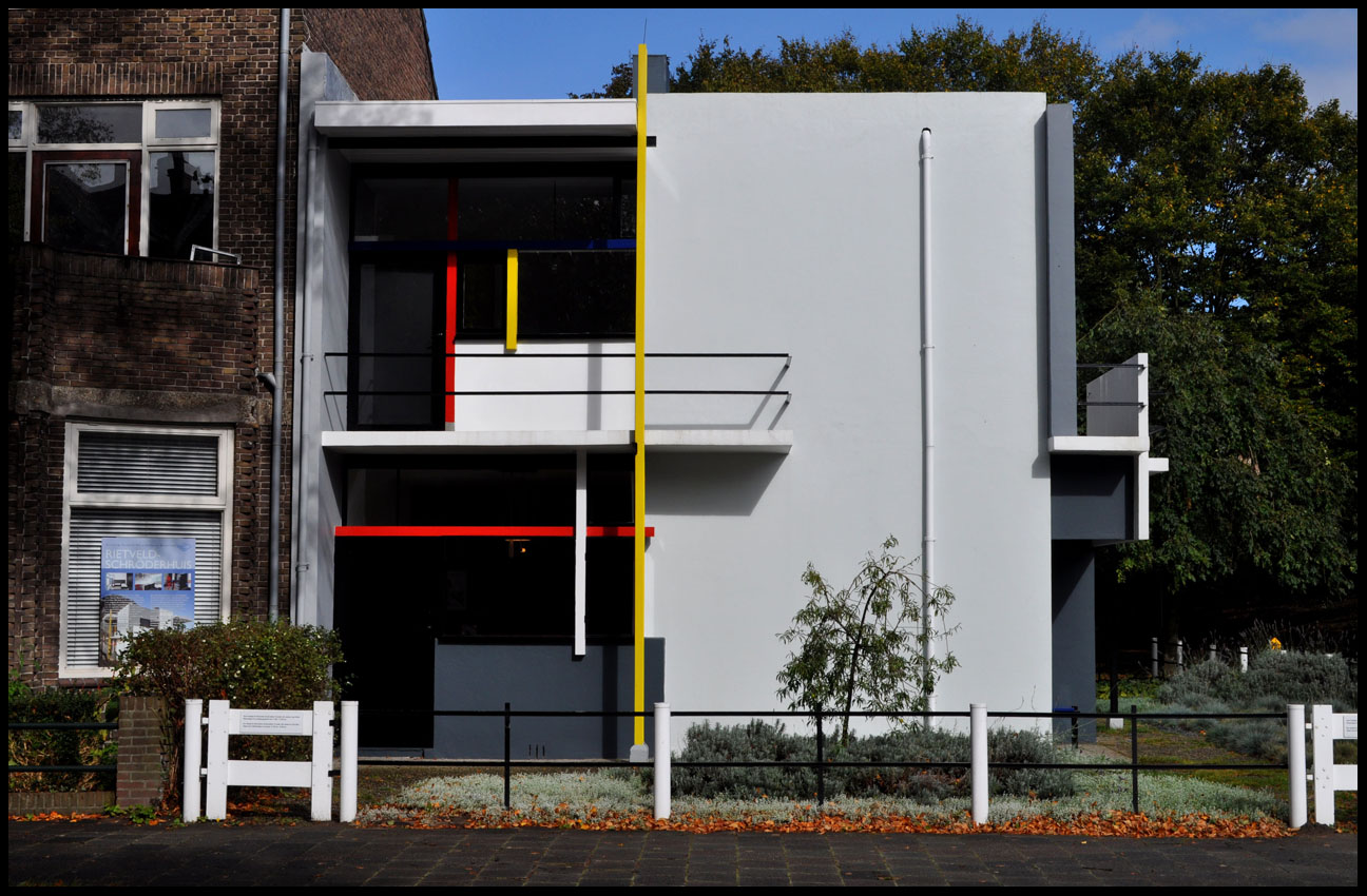
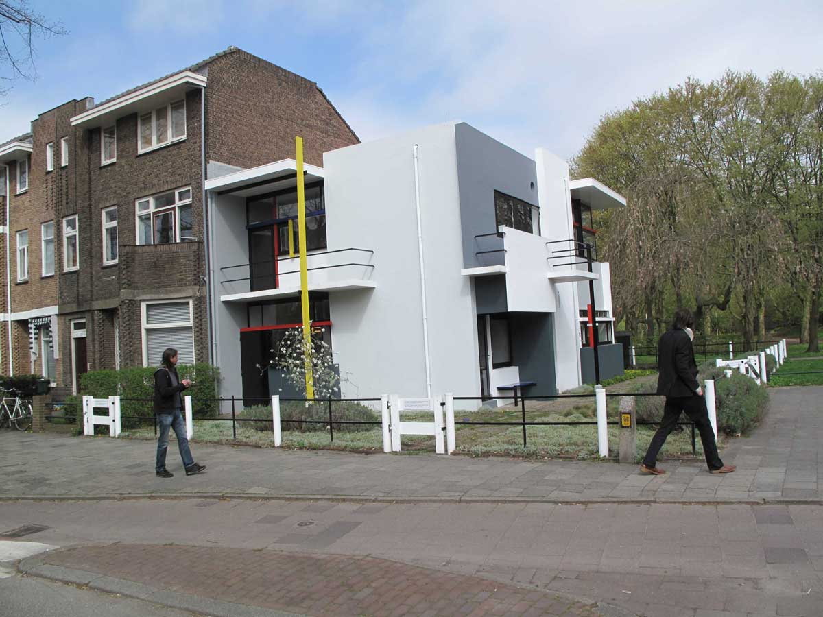
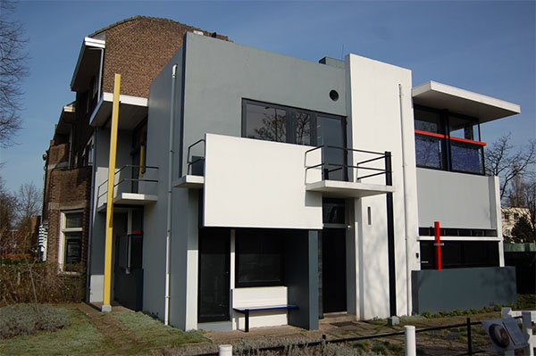
schroder houseThe second innovative house project, involving female clients and well-known architects, is the Schroder House, in Utrecht, Netherlands. The house was designed by Gerrit Rietveld for Truus Schroder in 1923-1924.

direct view of the Schroder House

This house is of particular interest to me because as an architecture student I made the pilgrimage to The Netherlands specifically to see it. I was studying in London when I made the trip to see this fine example of the De Stijl (aka Neoplasticisim) movement and icon of modern architecture.

Schroder House in context

It took a while to find it and when we did it was smaller than I had imagined but so beautiful. There it stood in all its acontextual beauty like an exotic alien species against the backdrop of austere traditional dutch architecture.

piet-mondrian

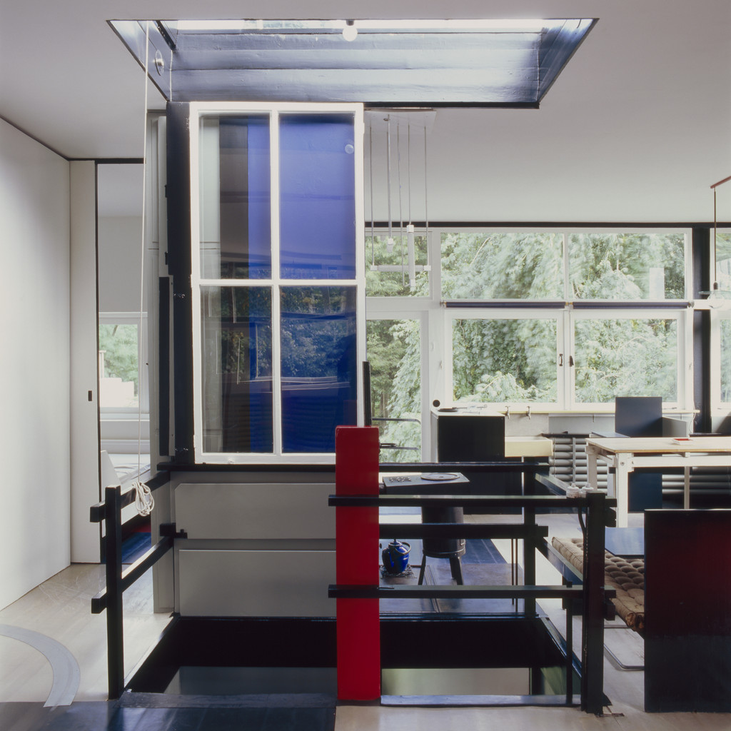
The Schroder House house looks like a 3 dimensional Piet Mondrion, De Stijl painting. The two are often compared to one another and arise from the same geometric theoretical principles of pure abstraction of horizontal and vertical forms expressed using only primary colours to achieve a kind of universality of form and expression. Ironically the Schroder, while in stark contrast to its historic neighbours, still expresses the Calvinist severity and clarity of the Dutch mind.

Rietveld_Schroder_House_Ground_PlanTruus Schroder was a young widow with 3 children when her family moved into the house. She had a vision of family life in the modern world. Friedman describes this saying “the house had a double personality-playful and carefree on the one hand, yet disciplined and even moralistic on the other-reflects the complex personalities of architect and client, and the unique nature of the collaboration between Rietveld, who had never built a building before, and Schroder, a well-to-do women with strong ideas about how and where she wanted to live.”

full size schroder-house-living-room

full sizeSchroeder_House_interior_01_691d710999The house was an opportunity to break free of ‘repressive traditions and rules-both social and architectural, and create a totally modern environment. The use of bright coloured elements represented freedom and choice.

schroder kitchen


067-schroder-house-interior

Gerrit-Rietveld-Adaptable-Rietveld-Schröder-House-Utrecht-10full size schroder disappearing corner1Truus Schroder and Gerrit Rietveld went on to work together on a number of important projects together during the 1920s and 1930s. “The work Rietveld and Schroder did together was not simply to communicate this new sense of life but literally to guide body and mind toward clearer and more actions and thoughts”

Rietveld_chair_1The Red and Blue Chair was designed in 1917 by Gerrit Rietveld. It represents one of the first explorations by the De Stijl art movement in three dimensions.

All Photos are from Google Images. All quotes are from Women and the Making of the Modern House by Alice T. Friedman

Women and the Making of the Modern House Part 2

Hollyhock House

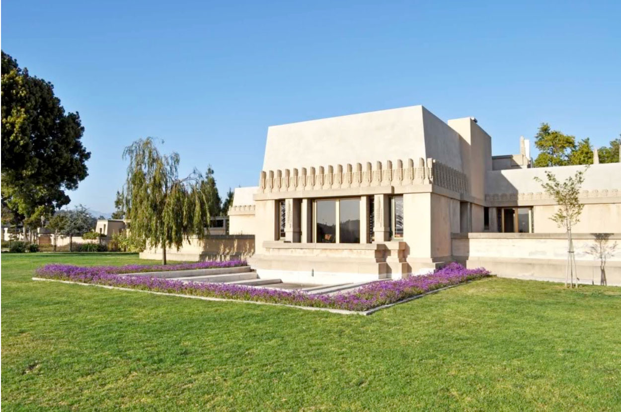
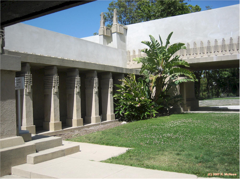
American heiress, Aline Barnsdall commissioned Frank Lloyd Wright to design Hollyhock House because she wanted to build a theatre for her newly formed theatrical company. Her goal was to use her experience and vast wealth to establish a centre for art theatre in American to rival those found in Europe. She wanted a place where her architect, Frank Lloyd Wright “could build a theatre, a community, and a home that would match her dreams with a boldness and individuality of their own.”  Aline Barnsdall hoped her experimental project for an American theatre community would grow and prosper in California.

FLW 1This collaboration between Frank Lloyd Wright and Aline Barnsdall during the period of 1915 and 1923 was unusual because it called for a rethinking of building types and challenged the “notions of house design, family life, and domesticity.”  Hollyhock House was not designed for the private life of a family but rather as a centrepeice in a public garden, and a theatre complex.  This freed up architect and client to push the boundaries of architecture including the experiences of monumental form, theatricality, and how the house framed the landscape.

flw floor plan

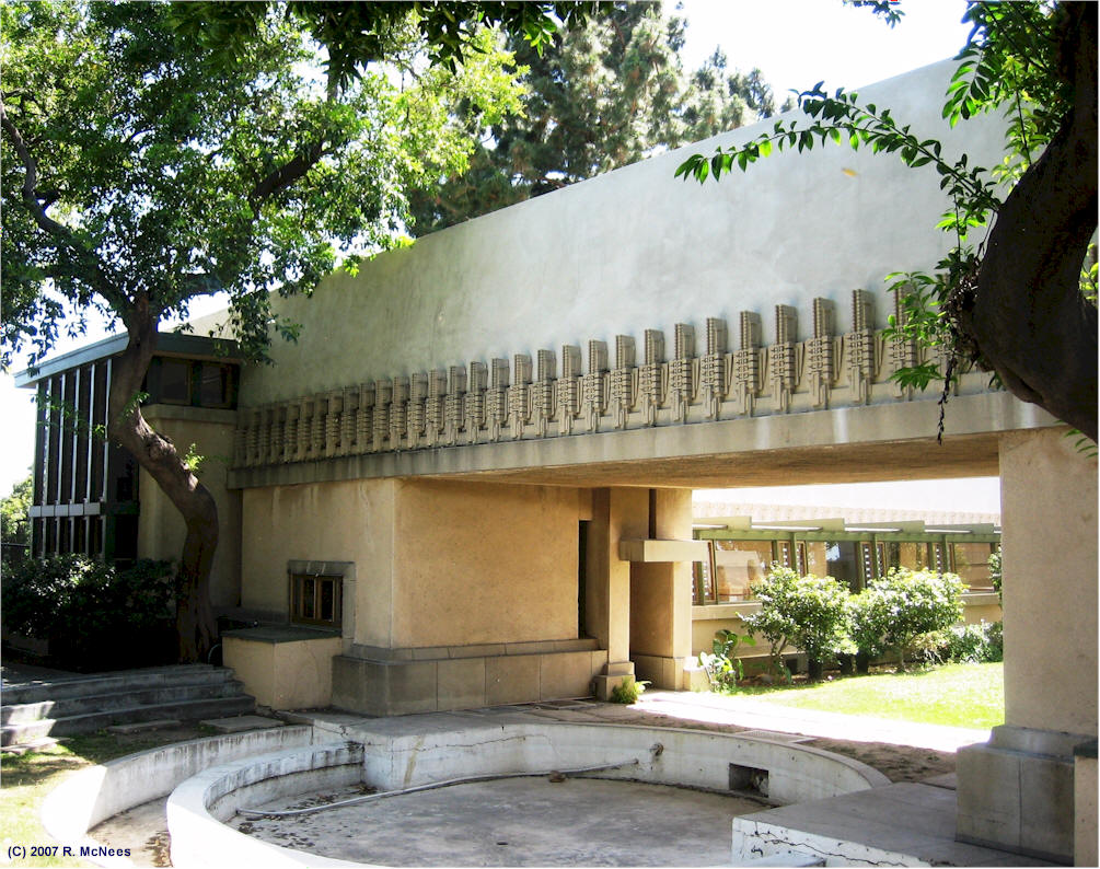
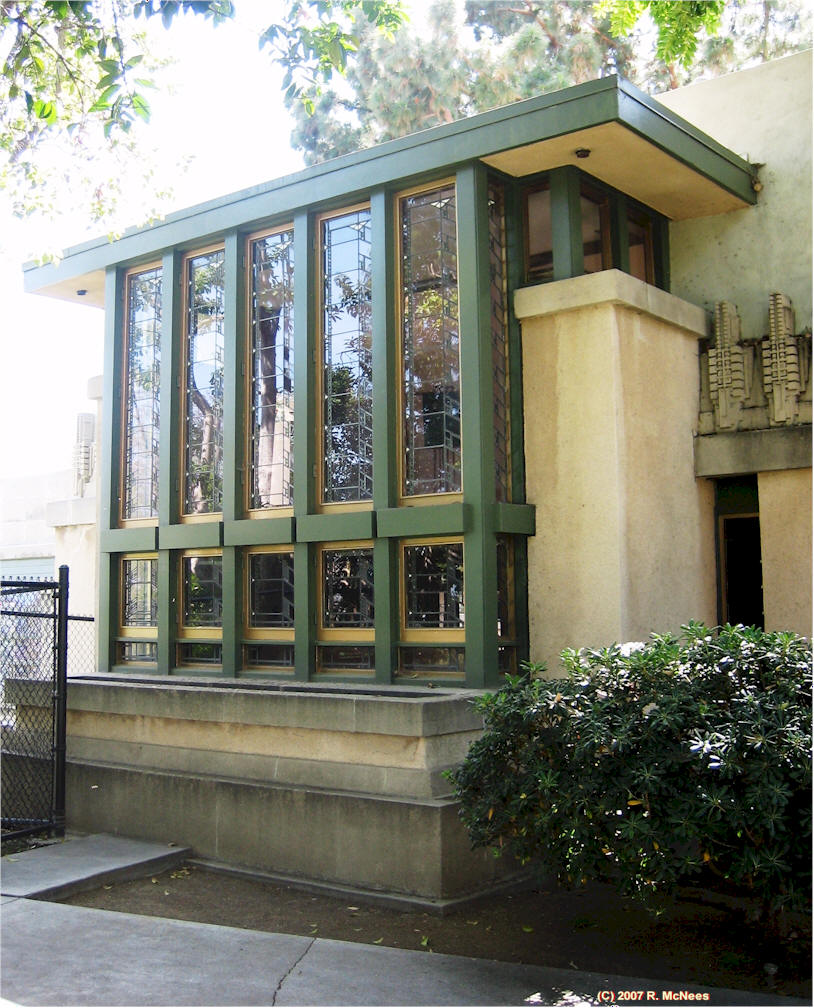
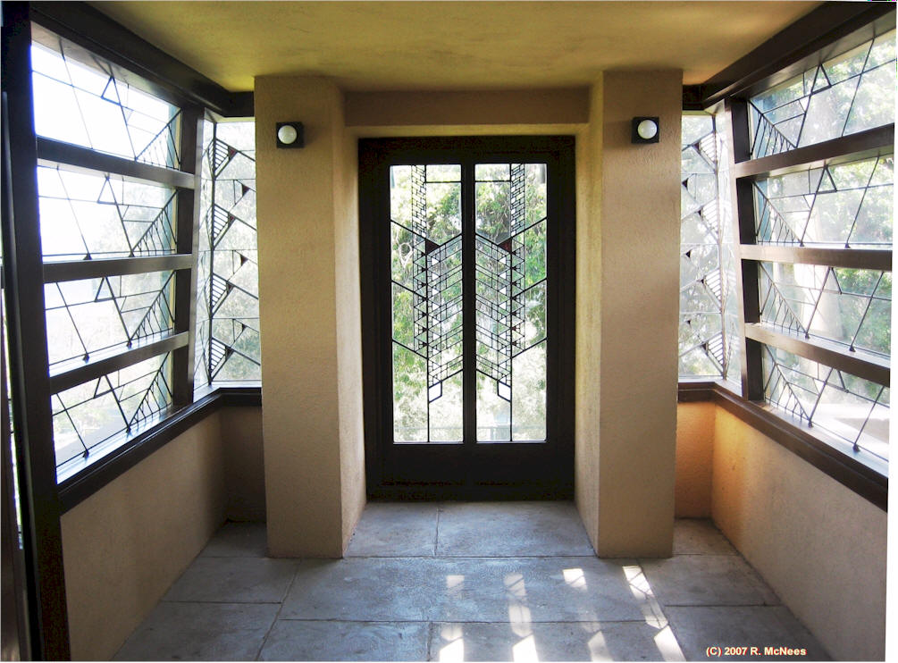
The hollyhock is used as a central theme to the house, with many symmetrical decorations adapting the plant’s general appearance. Planters are decorated with the motif and filled with the plants themselves, and Wright’s stained glass windows feature a highly-stylized hollyhock pattern.

flw_hollyhock_hse_garden_pool_remc

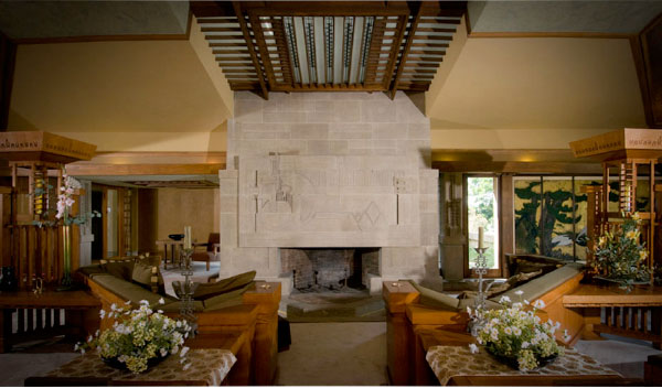
flw_hollyhock_center_court_garden_remcflw_hollyhock_hse_windows_ext_bedroom_remc flw_hollyhock_house_windows_sun-room_remcflw interiorAlice T. Friedman contends that Hollyhock has a lot to teach us about “creativity and about the sorts of new experiences that become possible when conventions of social behaviour, program, and planning are challenged.”

Disillusioned by the costs of construction and maintenance, Barnsdall donated the house to the city of Los Angeles in 1927 under the stipulation that a fifteen-year lease be given to the California Art Club for its headquarters, which it maintained until 1942.Hollyhock has been used by various organizations and has had restoration work done over the years.  The U.S. Department of the Interior designated Hollyhock House a National Historic Landmark in 2007 (Wikipedia)

All photos are from Alice T. Friedman’s book, or as noted by Rick McNees.


Women and the Making of the Modern House Part 1

Why were independent female clients such powerful catalysts for innovation in the modern house?

Women and the Making of the Modern House, written by Alice T. Friedman, is a thought-provoking book that answers this question by exploring two seemingly unrelated topics: gender roles, and architecture.

Specifically, the book focuses on 6 innovative projects, involving female clients and well-known architects. These projects are the best-known examples of unprecedented architecture that had female clientele at the forefront of each project’s innovation. It combines social and architectural history to investigate the roles played by both the architects and the clients, and explores the processes of collaboration and negotiation through which decisions about program and design were made.

A conviction shared by modern architects and their women clients was that the essence of modernity was the complete alteration of the home – its construction, materials, and interior space.

“Not only did women commission avant-garde architects to provide them with houses in which to live out their visions of a new life, but these visions rested on a redefinition of domesticity that was fundamentally spatial and physical. A powerful fusion of feminism with the forces of change in architecture thus propelled these projects into uncharted realms of originality”

The 6 innovative houses are:

Hollyhock House, Los Angeles, 1919-21, by Frank Lloyd Wright for Alice Barnsdall

FLW 1

House 2: The Schroder House, Utrecht, the Netherlands, 1923-24, by Gerrit Rietveld for Truus Schroder

rietveld houseHouse 3:  Villa Stein-de-Monzie, by Le Corbusier, was constructed from 1926-1928 and it is located in Garches, France.

Villa Stein-de-Monzie

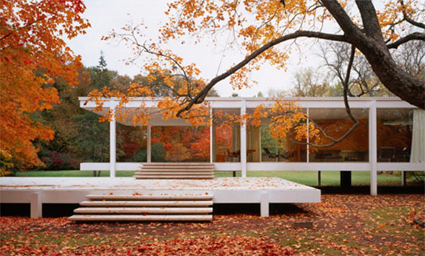
House 4: Farnsworth House by Ludwig Mies van der Rohe, Plano, Illinois, 1945-51

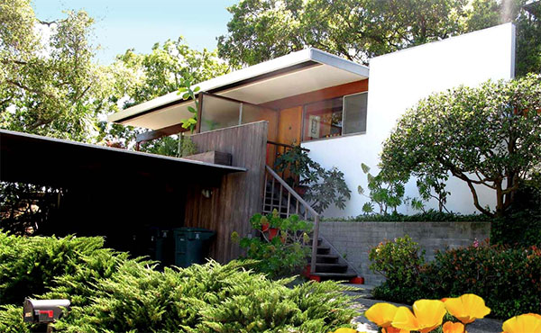
farnsowrth houseHouse 5: The Constance Perkins House by Richard Neutra in Pasadena, California, 1952-55

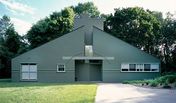
perkins houseHouse 6: Vanna Venturi House by Robert Venturi, Chestnut Hill, Pennsylvania, 1961-64

venturi houseStay tuned to learn more about these houses and how their women patrons of architecture were catalysts for innovation.

All photos are from Alice T. Friedman’s book.

Designing Everyday Objects

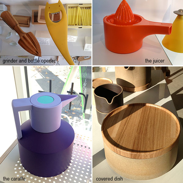
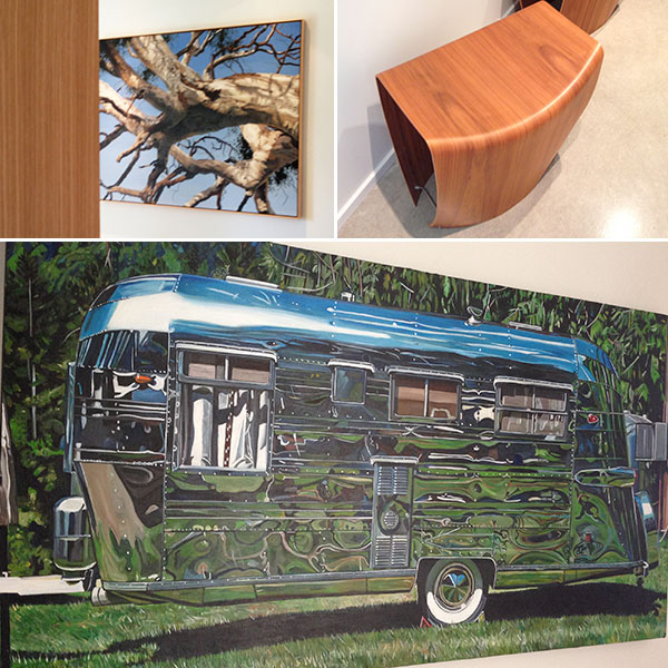
Everything is designed, even household objects we use and look at everyday. Have a look at some of the beautiful everyday objects that I found at Vancouver Special on Main Street.

everyday stuff 2

The ceramic bowl above, has a beautifully fitted wooden lid. The carafe, the juicer, and the bottle opener are all designed by Alessi, an Italian Design House. Alessi products are part of many permanent museum collections, which speaks to the quality of the designs they produce.

According to Alberto Alessi, “a true work of design must be able to move people, to convey feelings, to trigger memories, to surprise, to go against the grain… We work on expressive languages and on the expressive potential of the items… From this point of view, design intended… to conjure up images in people’s minds, which makes them a bit happier, still has tremendous potential. ”

I especially enjoy these objects’ mixture of utility and whimsy that puts the fun in functional.

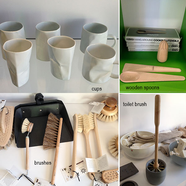
brushes

The unique ‘crumpled paper’ cups above are another example of a witty twist on the expected. Not only are they aesthetically pleasing, but they feel good in your hands.  The wooden spoons’ simple geometry are a departure from what we’re used to, but very functional and attractive. The toilet brushes and scrub brushes are all designed with wood and natural bristles. The toilet brush in particular has a kind of material gravitas that allows this often hidden object to be tastefully displayed.

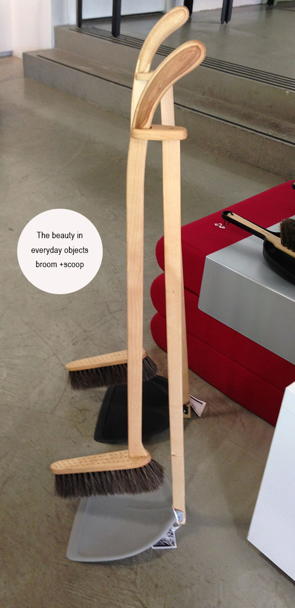
3broomYou won’t feel the need to hide the broom and scoop below because it is nice enough to show off.

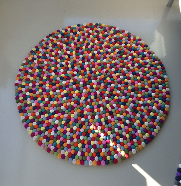
rug

This carpet is made from felted balls. Each carpet contains hundreds of felt balls, and will definitely brightens up any room while imbuing it with a hand-made human scale.

vase

These classic vases are designed by Finnish Architect, Alvar Aalto, in 1936, and are still produced by Iittala. From the Iittala website:

“The Aalto vase dates back to 1936 and was first presented at the Paris World Fair the following year. Its fluid, organic form is still mouth blown today at the Iittala factory. It takes a team of seven skilled craftsmen working as one to create one Aalto vase – an icon of modern design, Alvar Aalto is undoubtedly one of the greatest names in modern architecture and Scandinavian design.”

It’s truly amazing how clean, modern design continues to feel  fresh 77 years later.

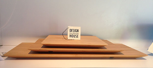
cutting boards

Next time you are about to buy an everyday used object think about how it is designed and why you chose it.  For me this kind of thoughtful connection with the design, and the designer, is part of a life well-lived.

Home Tours: Rochelle’s place in Vancouver

This is Rochelle’s fabulous home. Rochelle and her family have recently moved back to Canada after living abroad for the last 23 years, and in Hong Kong, for the last 7.  Rochelle’s interior design degree from Parson’s in New York has served her well as is evident through the house. Wanting a pied-à-terre in Vancouver while her kids finished school, Rochelle and her husband took an old Kitsilano house and undertook a massive renovation.

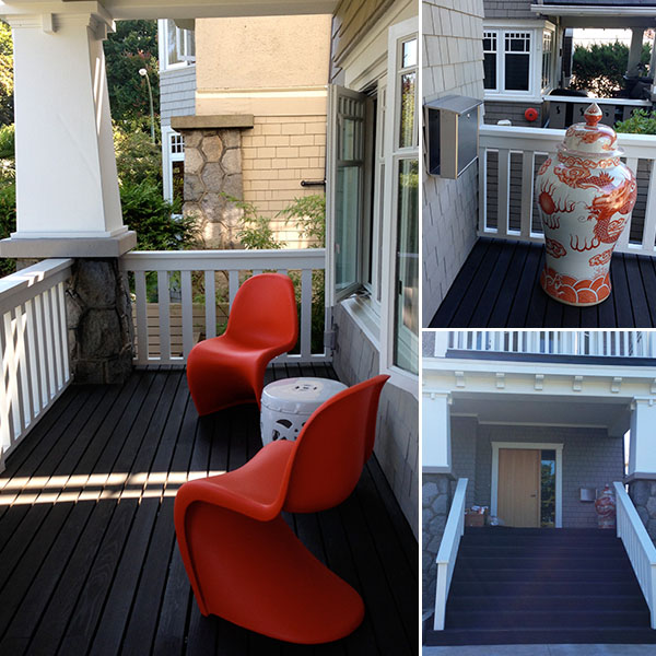
rochelle porch2They maintained the exterior character of their shingled Kitsilano house to respect the context of the neighbourhood. Only the large modern front door hints at what lies on the other side.

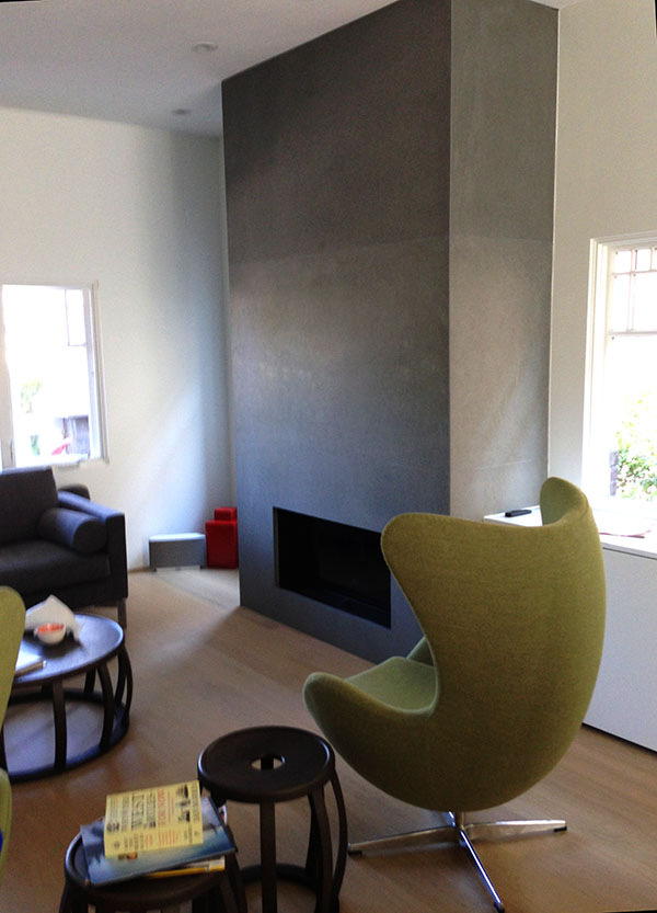
bottom of stairsfireplacelivingroom2living room

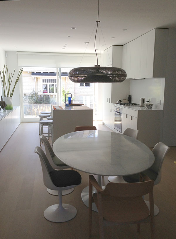
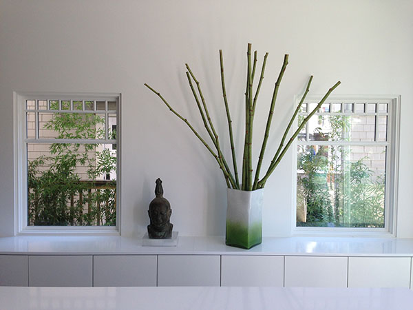
Typically homes of this vintage are comprised of small rooms where one must pass through one room to get to another. To offset this rabbit warren feel, Rochelle has opened up the rooms and totally modernized the aesthetic.  The living room, dining room and kitchen are all one large space. She recognized that with so much openness, ample storage would be a must. So all along one wall are built in storage cabinets setting a clean datum line for art and accessories.

zenscape


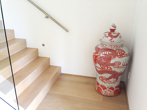
rochelle art2dog and stairsThe stairs are pure sculpture. Glass rails are bolted with stainless steel fasteners transparently enlarging the space.

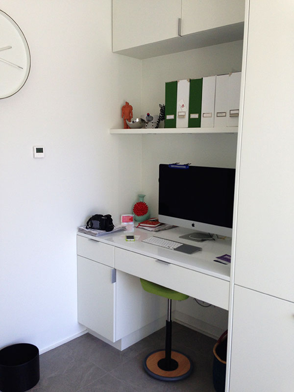
back of houseCleverly tucked away behind the kitchen is the generous ‘back of house’ where laundry, more storage, and home office reside. Recognizing that life happens, here the kids can drop their backpacks, shoes and what-have-you without impacting the pristine interiors of Rochelle’s home.

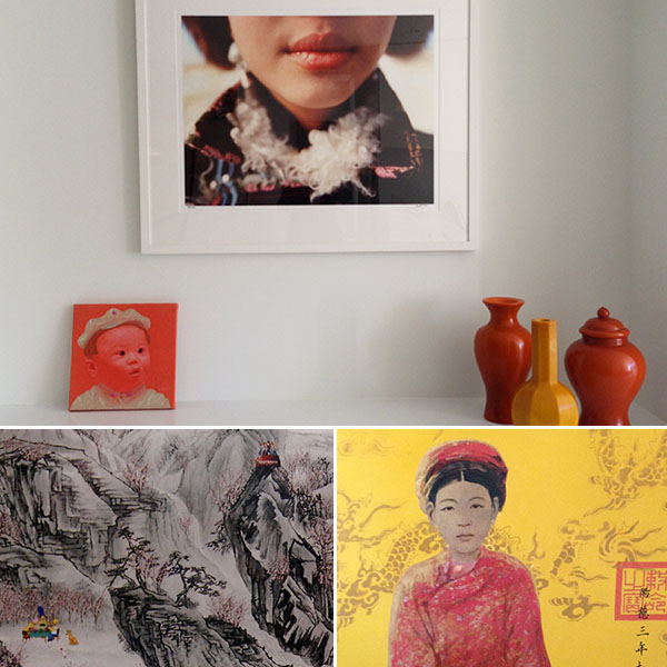
powderroomOf particular beauty is Rochelle’s homage to China and Hong Kong, manifested through artwork, ceramics and the cinnabar high-gloss tiles in the powder room.

art and suchThe couple are avid art collectors, and have acquired work ranging from graduating artists at Emily Carr to eclectic pieces that span the globe.

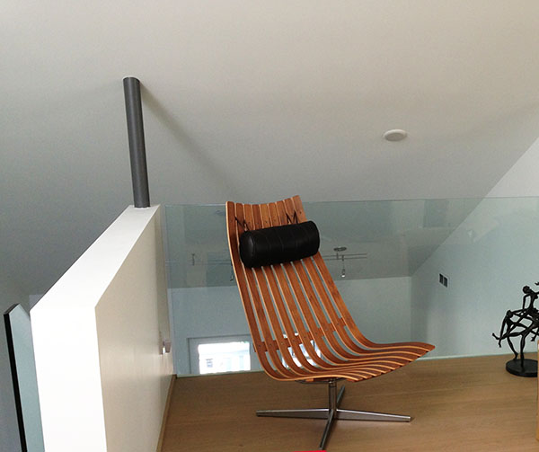
lounge chairAbove is the Scandia Easy Chair, 1957, by Hans Brattrud of Norway.  Their sophisticated design aesthetic clearly shines in their collection of classic modern furniture pieces, right from the entry porch with its Verner Panton chairs through to the Saarinen dining table with Tulip chairs, nicely rounded out by the Arne Jakobsen Egg and Saarinen’s Womb chairs.

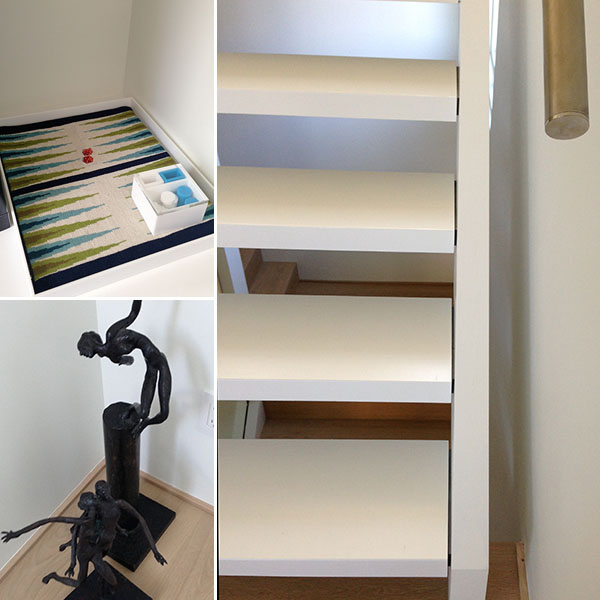
stair detailsEven family time is design accented as the family plays backgammon on a Jonathan Adler tapestry board in the casual attic lounge.

A Musician’s Home in Los Angeles

mendel exterior

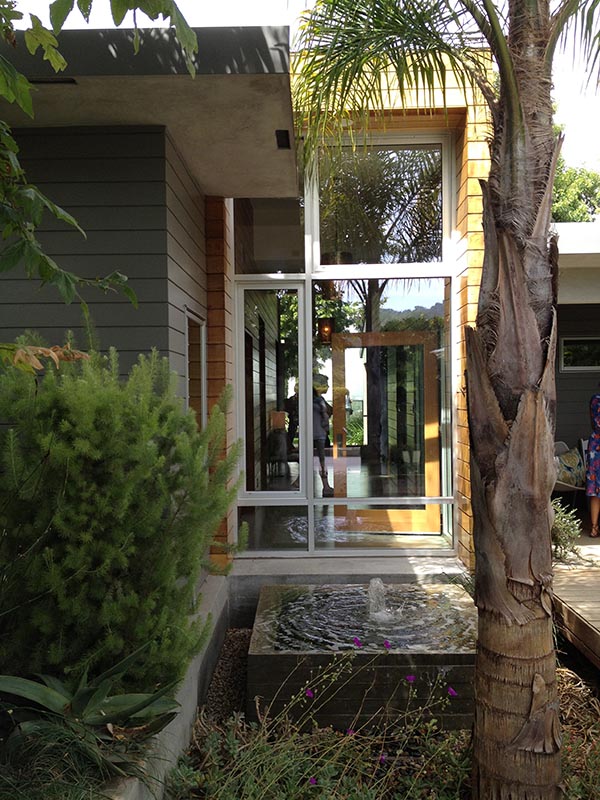
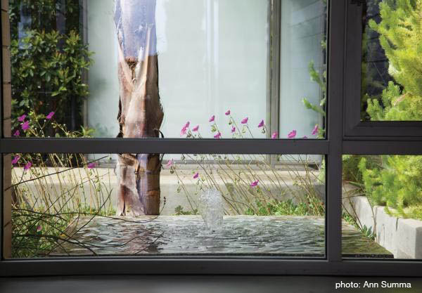
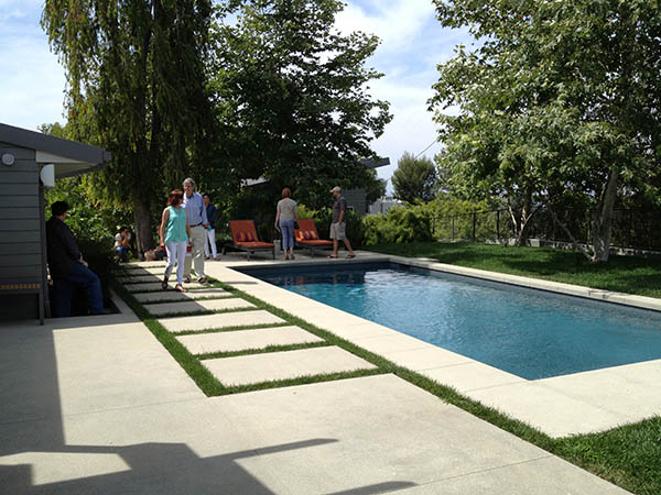
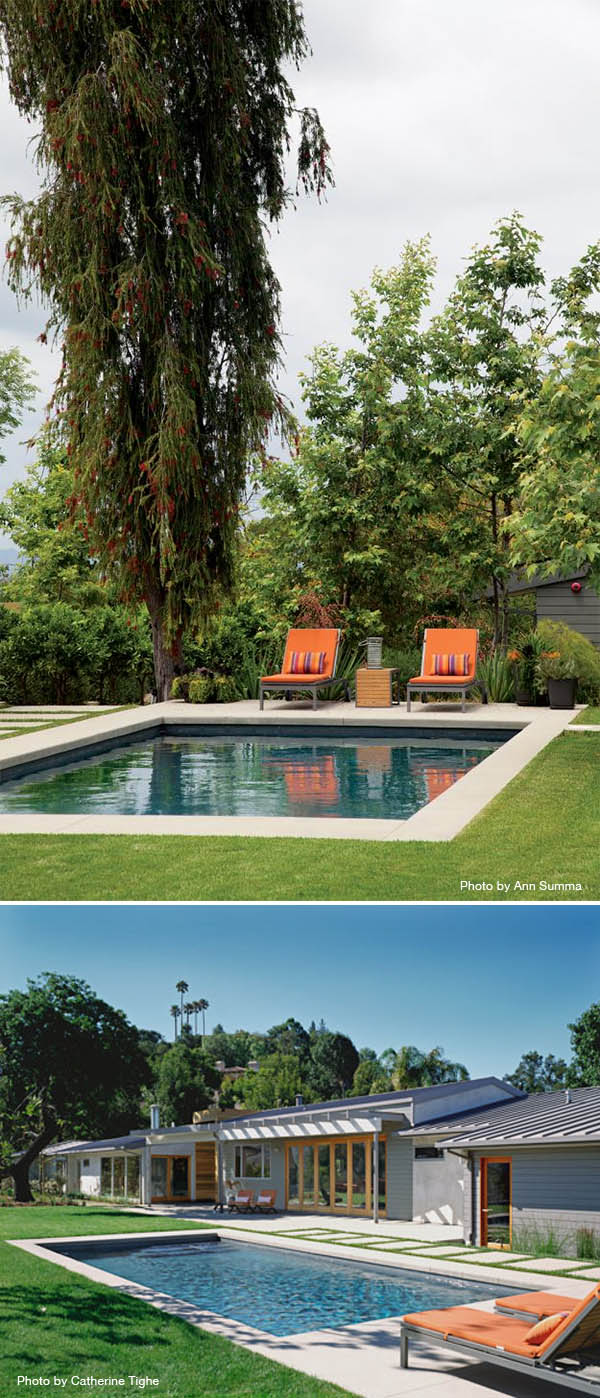
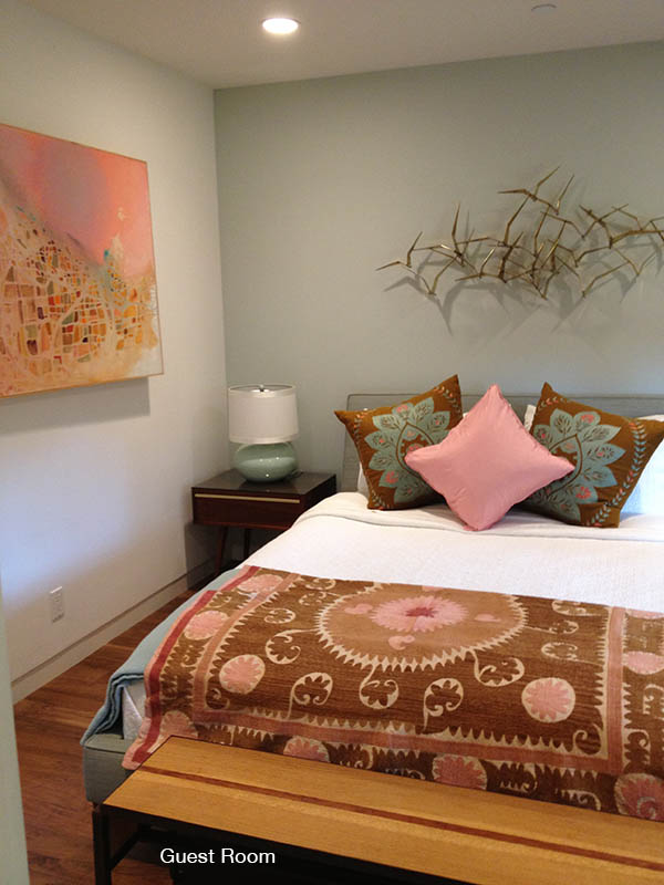
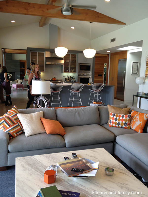
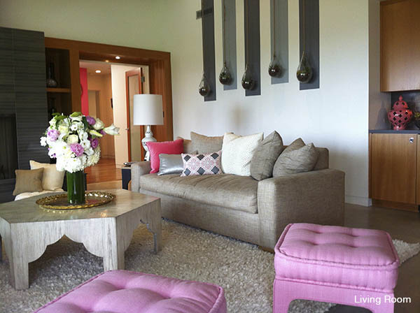
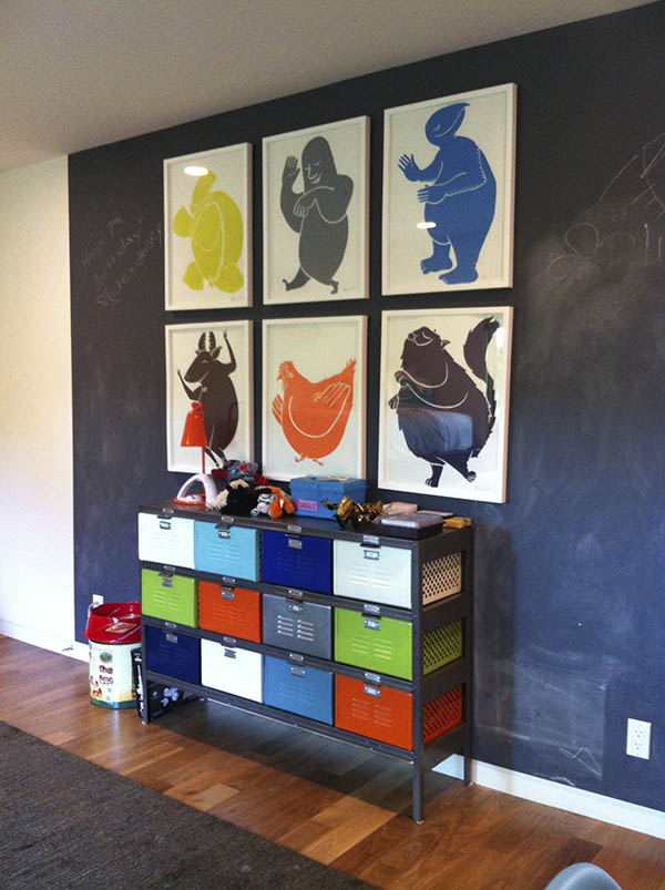
This 1950s ranch-style home in Sherman Oaks was completely renovated for Foofighter’s bassist Nate Mendel. This Mid Century Modern, was one of my favourites on the Dwell Home Tours. The home had an eclectic, tasteful decorating style with hits of colour throughout. Although the house has a new two-story studio guesthouse addition, from the street-side point of view the house sits low and unassuming. A wood-clad box demarcates the entrance. A hedge of Japanese blueberry provides privacy on the street side, “where a translucent gate opens onto a splashing fountain, and a bridge to the front door spans a sunken bed of succulents in lieu of a pond” (from Garden Design, read more).mendel fountainlooking out

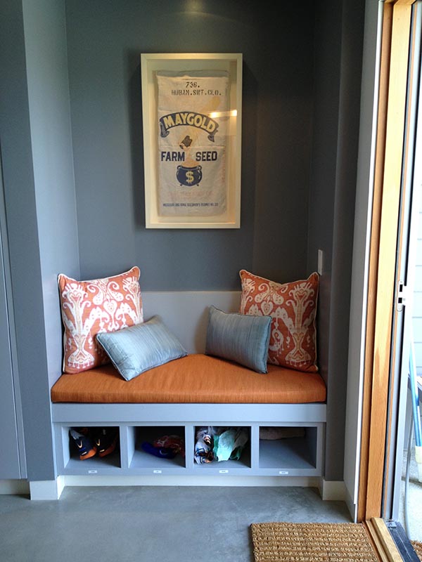
Polished concrete floors ground the interior along with warm wood accents, while huge windows and sliding glass panels offer great views of the entire Los Angeles Valley, with a backdrop of the Verdugo and San Gabriel mountains beyond.  According to the Architects, Scrafano and Gus Duffy Architects, the muted accents of a gray palette provide relief from the brilliant Los Angeles sun. The client’s desire for environmental sustainability influenced all material choices, construction practices, solar technologies as well as lighting and water fixtures (from Scrafano Architects website). The project is a collaboration between Scrafano Architect, Gus Duffy Architects and Mark Tessier Landscape Architecture.

looking at pool

nate mendel pool-Recoverednookbird sculptureguest roommendel kitchenliving room copykids roomThe bits and pieces:

bedroom bitschild's bedroomAll photographs have been taken by me unless noted on the individual photos.